


这篇文章主要介绍了CSS3 animation实现逐帧动画效果,具有一定的参考价值,感兴趣的小伙伴们可以参考一下
css3里面的animation属性非常强大,但是自己用的比较少,最近有次面试就刚好被问到了,趁现在有时间就对animation做一个小总结。同时实现一个逐帧动画的demo作为练习
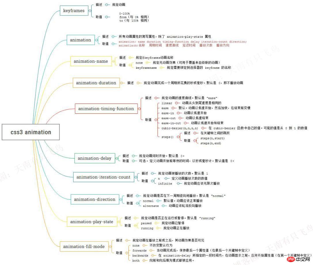
animation属性一览
因为animation属性比较多,然后在w3c上看有点蛋疼,干脆也做了一份导图,以后想查看,就一目了然了
使用animation实现逐帧动画
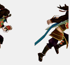
熟悉了animation的属性之后,得找个简单的小项目实现下,逐帧动画好有意思,先跑一个满足下自己
思路很简单,就是给元素一个雪碧图的背景,然后添加的帧动画更改background-position,关键代码:
@keyframes run{
    from{
        background-position: 0 0;
    }
    to{
        background-position: -1540px 0 ;
    }
}
p{
    width:140px;
    height:140px;
    background: url(run.png) ;
    animation-name:run;
    animation-duration:1s;
    animation-iteration-count:infinite;
}
但是跑起来后我们发现,每帧动画之间帧动画都是滑动,并不是我们要的效果,为什么呢?
原来animation默认以ease方式过渡,它会在每个关键帧之间插入补间动画,所以动画效果是连贯性的
知道原因就好办了,解决思路就是:
@keyframes run{
    0%, 8%{  /*动作一*/  }
    9.2%, 17.2%{  /*动作二*/  }
    ...
}
step1:动作之间停留8帧,0%设置动作一,动作一结束在8%
step2:动作之间过渡1.2帧,9.2%设置动作二,动作二结束在17.2%
完整代码:
<!DOCTYPE html>
<html lang="en">
<head>
    <meta charset="UTF-8">
    <title>css3逐帧动画</title>
    <style>
    @keyframes run{
    0%, 8%{  background-position: 0 0;  }
    9.2%, 17.2%{  background-position: -140px 0;  }
    18.4%, 26.4%{  background-position: -280px 0 ;  }
    27.6%, 35.6%{  background-position: -420px 0 ;  }
    36.8%, 44.8%{  background-position: -560px 0 ;  }
    46%, 54%{  background-position: -700px 0 ;  }
    55.2%, 63.2%{  background-position: -840px 0 ;  }
    64.4%, 72.4%{  background-position: -980px 0 ;  }
    73.6%, 81.6%{  background-position: -1120px 0 ;  }
    82.8%, 90.8%{  background-position: -1400px 0 ;  }
    92%, 100%{  background-position: -1540px 0 ;  }
    }
    @-webkit-keyframes run{
    0%, 8%{  background-position: 0 0;  }
    9.2%, 17.2%{  background-position: -140px 0;  }
    18.4%, 26.4%{  background-position: -280px 0 ;  }
    27.6%, 35.6%{  background-position: -420px 0 ;  }
    36.8%, 44.8%{  background-position: -560px 0 ;  }
    46%, 54%{  background-position: -700px 0 ;  }
    55.2%, 63.2%{  background-position: -840px 0 ;  }
    64.4%, 72.4%{  background-position: -980px 0 ;  }
    73.6%, 81.6%{  background-position: -1120px 0 ;  }
    82.8%, 90.8%{  background-position: -1400px 0 ;  }
    92%, 100%{  background-position: -1540px 0 ;  }
    }
    p{
        width:140px;
        height:140px;
        background: url(blog/754767/201606/754767-20160601000042992-1734972084.png) ;
        animation:run 1s infinite;
            -webkit-animation:run 1s infinite;
        animation-fill-mode : backwards;
            -webkit-animation-fill-mode : backwards;
    }
    </style>
</head>
<body>
    <p></p>
</body>
</html>
还有另外一个实现方法,就是利用steps(),就是帧之间的阶跃动画,这个在w3c里面没有写,先贴个图
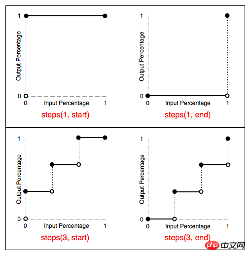
由上图可知:
steps(1,start):动画一开始就跳到 100% 直到这一帧(不是整个周期)结束
steps(1,end):保持 0% 的样式直到这一帧(不是整个周期)结束
另外也可以直接设置 animation-timing-function:step-start/step-end
step-start效果等同于steps(1,start),step-end效果等同于steps(1,end)
最终效果,因为录制的问题可能有点卡顿,有兴趣的同学可以直接复制代码去跑下:
完整代码:
<!DOCTYPE html>
    <html lang="en">
    <head>
        <meta charset="UTF-8">
        <title>css3逐帧动画</title>
        <style>
        @keyframes run{
            0%{
                background-position: 0 0;
            }
            8.333%{
                background-position: -140px 0;
            }
            16.666%{
                background-position: -280px 0 ;
            }
            25.0%{
                background-position: -420px 0 ;
            }
            33.333%{
                background-position: -560px 0 ;
            }
            41.666%{
                background-position: -700px 0 ;
            }
            50.0%{
                background-position: -840px 0 ;
            }
            58.333%{
                background-position: -980px 0 ;
            }
            66.666%{
                background-position: -1120px 0 ;
            }
            75.0%{
                background-position: -1260px 0 ;
            }
            83.333%{
                background-position: -1400px 0 ;
            }
            91.666%{
                background-position: -1540px 0 ;
            }
            100%{
                background-position: 0 0 ;
            }
        }
        @-webkit-keyframes run{
            0%{
                background-position: 0 0;
            }
            8.333%{
                background-position: -140px 0;
            }
            16.666%{
                background-position: -280px 0 ;
            }
            25.0%{
                background-position: -420px 0 ;
            }
            33.333%{
                background-position: -560px 0 ;
            }
            41.666%{
                background-position: -700px 0 ;
            }
            50.0%{
                background-position: -840px 0 ;
            }
            58.333%{
                background-position: -980px 0 ;
            }
            66.666%{
                background-position: -1120px 0 ;
            }
            75.0%{
                background-position: -1260px 0 ;
            }
            83.333%{
                background-position: -1400px 0 ;
            }
            91.666%{
                background-position: -1540px 0 ;
            }
            100%{
                background-position: 0 0 ;
            }
        }
        p{
            width:140px;
            height:140px;
            background: url(754767/201606/754767-20160601000042992-1734972084.png) ;
            animation:run 1s steps(1, start) infinite;
                -webkit-animation:run 1s steps(1, start) infinite;
        }
        </style>
    </head>
    <body>
        <p></p>
    </body>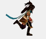
以上就是本文的全部内容,希望对大家的学习有所帮助,更多相关内容请关注PHP中文网!
相关推荐:
以上是关于CSS3的animation实现逐帧动画效果的详细内容。更多信息请关注PHP中文网其他相关文章!

 @rules具有多少特异性,例如@keyframes和@media?Apr 18, 2025 am 11:34 AM
前几天我得到了这个问题。我的第一个想法是:奇怪的问题!特异性是关于选择者的,而在符号不是选择器,那么...无关紧要?


 在NUXT应用程序中创建动态路由Apr 18, 2025 am 10:53 AM
在这篇文章中,我们将使用我构建和部署的电子商务商店演示来进行Netlify,以展示如何为传入数据制作动态路线。这是一个公平的


热AI工具

Undresser.AI Undress
人工智能驱动的应用程序,用于创建逼真的裸体照片

AI Clothes Remover
用于从照片中去除衣服的在线人工智能工具。

Undress AI Tool
免费脱衣服图片

Clothoff.io
AI脱衣机

AI Hentai Generator
免费生成ai无尽的。

热门文章
热工具

MinGW - 适用于 Windows 的极简 GNU
这个项目正在迁移到osdn.net/projects/mingw的过程中,你可以继续在那里关注我们。MinGW:GNU编译器集合(GCC)的本地Windows移植版本,可自由分发的导入库和用于构建本地Windows应用程序的头文件;包括对MSVC运行时的扩展,以支持C99功能。MinGW的所有软件都可以在64位Windows平台上运行。

适用于 Eclipse 的 SAP NetWeaver 服务器适配器
将Eclipse与SAP NetWeaver应用服务器集成。

Dreamweaver Mac版
视觉化网页开发工具

EditPlus 中文破解版
体积小,语法高亮,不支持代码提示功能

安全考试浏览器
Safe Exam Browser是一个安全的浏览器环境,用于安全地进行在线考试。该软件将任何计算机变成一个安全的工作站。它控制对任何实用工具的访问,并防止学生使用未经授权的资源。

