
利用css实现一款仿ios7的switches开关按钮

- 不言原创
- 2018-06-12 17:01:351723浏览
这篇文章主要为大家介绍了纯css实现的一款仿ios7的switches开关按钮,无需引js代码。在实现中给出了两种颜色,三种不同大小的demo,需要的朋友可以参考下
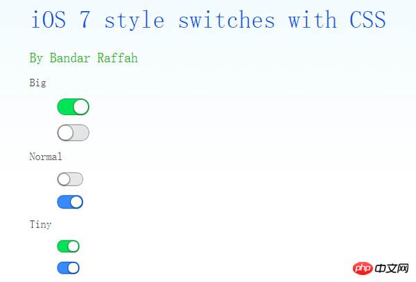
今天给大家介绍一款仿ios7的switches开关按钮。这款按钮也是纯css实现的。无需引js代码。在实现中给出了两种颜色,三种不同大小的demo。一起看下效果图:
实现的代码。
html代码:
<p class="wrap" style="width: 600px; margin: auto;">
        <h1>
            iOS 7 style switches with CSS</h1>
        <h2>
            By Bandar Raffah</h2>
        <label>
            Big<input type="checkbox" class="ios-switch green  bigswitch" checked /><p>
                <p>
                </p>
            </p>
        </label>
        <label>
            <input type="checkbox" class="ios-switch bigswitch" checked /><p>
                <p>
                </p>
            </p>
        </label>
        <label>
            Normal<input type="checkbox" class="ios-switch green" /><p>
                <p>
                </p>
            </p>
        </label>
        <label>
            <input type="checkbox" class="ios-switch" /><p>
                <p>
                </p>
            </p>
        </label>
        <label>
            Tiny<input type="checkbox" class="ios-switch green tinyswitch" checked /><p>
                <p>
                </p>
            </p>
        </label>
        <label>
            <input type="checkbox" class="ios-switch tinyswitch" checked /><p>
                <p>
                </p>
            </p>
        </label>
  </p>
css代码:
input[type="checkbox"]
        {
            position: absolute;
            opacity: 0;
        }
        /* Normal Track */
        input[type="checkbox"].ios-switch + p
        {
            vertical-align: middle;
            width: 40px;
            height: 20px;
            border: 1px solid rgba(0,0,0,.4);
            border-radius: 999px;
            background-color: rgba(0, 0, 0, 0.1);
            -webkit-transition-duration: .4s;
            -webkit-transition-property: background-color, box-shadow;
            box-shadow: inset 0 0 0 0px rgba(0,0,0,0.4);
            margin: 15px 1.2em 15px 2.5em;
        }
        /* Checked Track (Blue) */
        input[type="checkbox"].ios-switch:checked + p
        {
            width: 40px;
            background-position: 0 0;
            background-color: #3b89ec;
            border: 1px solid #0e62cd;
            box-shadow: inset 0 0 0 10px rgba(59,137,259,1);
        }
        /* Tiny Track */
        input[type="checkbox"].tinyswitch.ios-switch + p
        {
            width: 34px;
            height: 18px;
        }
        /* Big Track */
        input[type="checkbox"].bigswitch.ios-switch + p
        {
            width: 50px;
            height: 25px;
        }
        /* Green Track */
        input[type="checkbox"].green.ios-switch:checked + p
        {
            background-color: #00e359;
            border: 1px solid rgba(0, 162, 63,1);
            box-shadow: inset 0 0 0 10px rgba(0,227,89,1);
        }
        /* Normal Knob */
        input[type="checkbox"].ios-switch + p > p
        {
            float: left;
            width: 18px;
            height: 18px;
            border-radius: inherit;
            background: #ffffff;
            -webkit-transition-timing-function: cubic-bezier(.54,1.85,.5,1);
            -webkit-transition-duration: 0.4s;
            -webkit-transition-property: transform, background-color, box-shadow;
            -moz-transition-timing-function: cubic-bezier(.54,1.85,.5,1);
            -moz-transition-duration: 0.4s;
            -moz-transition-property: transform, background-color;
            box-shadow: 0px 2px 5px rgba(0, 0, 0, 0.3), 0px 0px 0 1px rgba(0, 0, 0, 0.4);
            pointer-events: none;
            margin-top: 1px;
            margin-left: 1px;
        }
        /* Checked Knob (Blue Style) */
        input[type="checkbox"].ios-switch:checked + p > p
        {
            -webkit-transform: translate3d(20px, 0, 0);
            -moz-transform: translate3d(20px, 0, 0);
            background-color: #ffffff;
            box-shadow: 0px 2px 5px rgba(0, 0, 0, 0.3), 0px 0px 0 1px rgba(8, 80, 172,1);
        }
        /* Tiny Knob */
        input[type="checkbox"].tinyswitch.ios-switch + p > p
        {
            width: 16px;
            height: 16px;
            margin-top: 1px;
        }
        /* Checked Tiny Knob (Blue Style) */
        input[type="checkbox"].tinyswitch.ios-switch:checked + p > p
        {
            -webkit-transform: translate3d(16px, 0, 0);
            -moz-transform: translate3d(16px, 0, 0);
            box-shadow: 0px 2px 5px rgba(0, 0, 0, 0.3), 0px 0px 0 1px rgba(8, 80, 172,1);
        }
        /* Big Knob */
        input[type="checkbox"].bigswitch.ios-switch + p > p
        {
            width: 23px;
            height: 23px;
            margin-top: 1px;
        }
        /* Checked Big Knob (Blue Style) */
        input[type="checkbox"].bigswitch.ios-switch:checked + p > p
        {
            -webkit-transform: translate3d(25px, 0, 0);
            -moz-transform: translate3d(16px, 0, 0);
            box-shadow: 0px 4px 8px rgba(0, 0, 0, 0.3), 0px 0px 0 1px rgba(8, 80, 172,1);
        }
        /* Green Knob */
        input[type="checkbox"].green.ios-switch:checked + p > p
        {
            box-shadow: 0px 2px 5px rgba(0, 0, 0, 0.3), 0 0 0 1px rgba(0, 162, 63,1);
        }
        /* Needless Page Decoration */
        body
        {
            -webkit-user-select: none;
            cursor: default;
            font: 18px "Helvetica Neue";
            color: rgba(0, 0, 0, 0.77);
            font-weight: 200;
            padding-left: 30px;
            padding-top: 0px;
            background: -webkit-linear-gradient(top, #f2fbff 0%, #ffffff 64%) no-repeat;
            background: -moz-linear-gradient(top, #f2fbff 0%, #ffffff 64%) no-repeat;
            background: -ms-linear-gradient(top, #f2fbff 0%, #ffffff 64%) no-repeat;
            background: linear-gradient(to bottom, #f2fbff 0%, #ffffff 64%) no-repeat;
        }
        h1
        {
            font-weight: 100;
            font-size: 40px;
            color: #135ae4;
        }
        h2
        {
            font-weight: 200;
            font-size: 22px;
            color: #03b000;
        }
        h3
        {
            font-weight: 200;
            font-size: 18px;
            color: rgba(0, 0, 0, 0.77);
            margin-top: 50px;
        }
        a:link
        {
            text-decoration: none;
            color: #f06;
        }
        a:visited
        {
            text-decoration: none;
            color: #f06;
        }
        a:hover
        {
            text-decoration: underline;
        }
        a:active
        {
            text-decoration: underline;
        }
以上就是本文的全部内容,希望对大家的学习有所帮助,更多相关内容请关注PHP中文网!
相关推荐:
以上是利用css实现一款仿ios7的switches开关按钮的详细内容。更多信息请关注PHP中文网其他相关文章!
声明:
本文内容由网友自发贡献,版权归原作者所有,本站不承担相应法律责任。如您发现有涉嫌抄袭侵权的内容,请联系admin@php.cn