


这篇文章主要为大家详细介绍了CSS3中Animation动画属性用法,教大家如何使用animation动画,感兴趣的小伙伴们可以参考一下
要使用animation动画,先要熟悉一下keyframes,Keyframes的语法规则:命名是由”@keyframes”开头,后面紧接着是这个“动画的名称”加上一对花括号“{}”,括号中就是一些不同时间段样式规则。不同关键帧是通过from(相当于0%)、to(相当于100%)或百分比来表示(为了得到最佳的浏览器支持,建议使用百分比),如下定义一个简单的动画:
@keyframes myfirst /*定义动画名*/
    {
    0%   {background:red; left:0px; top:0px;} /*定义起始帧样式,0%可以换成from*/
    25%  {background:yellow; left:200px; top:0px;}
    50%  {background:blue; left:200px; top:200px;}
    75%  {background:green; left:0px; top:200px;}
    100% {background:red; left:0px; top:0px;} /*定义结束帧样式,100%可以换成to*/
    }
@keyframes定义好了,要使其能发挥效果,必须通过animation把它绑定到一个选择器,否则动画不会有任何效果。下面列出了animation的属性:
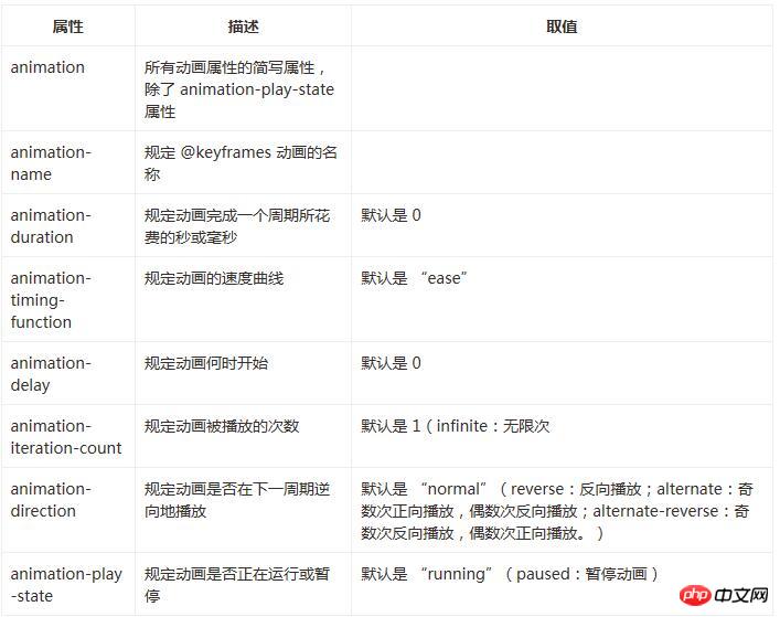
下面设置上述的所有属性
animation-name:myfirst;
animation-duration:5s;
animation-timing-function:linear;
animation-delay:1s;
animation-iteration-count:infinite;
animation-direction:alternate;
animation-play-state:running;
上述所有代码可以如下简写:
animation:myfirst 5s linear 2s infinite alternate;
animation-play-state:running;
浏览器兼容性
Internet Explorer 10、Firefox 以及 Opera 支持 @keyframes 规则和 animation 属性。
Chrome 和 Safari 需要前缀 -webkit-。
注意:Internet Explorer 9,以及更早的版本,不支持 @keyframe 规则或 animation 属性。
下面给出上面介绍的关于keyframes和animation属性的完整代码示例:
<!DOCTYPE html>
<html lang="en">
<head>
    <meta charset="UTF-8">
    <title>animation演示</title>
    <style>
    p
    {
    width:100px;
    height:100px;
    background:red;
    position:relative;
    animation-name:myfirst;
    animation-duration:5s;
    animation-timing-function:linear;
    animation-delay:1s;
    animation-iteration-count:infinite;
    animation-direction:alternate;
    animation-play-state:running;
    /* Safari and Chrome: */
    -webkit-animation-name:myfirst;
    -webkit-animation-duration:5s;
    -webkit-animation-timing-function:linear;
    -webkit-animation-delay:1s;
    -webkit-animation-iteration-count:infinite;
    -webkit-animation-direction:alternate;
    -webkit-animation-play-state:running;
    }
    @keyframes myfirst /*定义动画名*/
    {
    0%   {background:red; left:0px; top:0px;} /*定义起始帧样式,0%相当于from*/
    25%  {background:yellow; left:200px; top:0px;}
    50%  {background:blue; left:200px; top:200px;}
    75%  {background:green; left:0px; top:200px;}
    100% {background:red; left:0px; top:0px;} /*定义结束帧样式,100%相当于to*/
    }
    @-webkit-keyframes myfirst /* Safari and Chrome */
    {
    0%   {background:red; left:0px; top:0px;}
    25%  {background:yellow; left:200px; top:0px;}
    50%  {background:blue; left:200px; top:200px;}
    75%  {background:green; left:0px; top:200px;}
    100% {background:red; left:0px; top:0px;}
    }
    </style>
</head>
<body>
    <p>该实例在 Internet Explorer 9 及更早 IE 版本是无效的。</p>
    <p></p>
</body>
</html>
上面代码演示了一个正方形沿着一个正方形轨迹运动,基数次按正方向运动,偶数次按反方向运动,运动过程中还带有颜色变化。具体效果,读者可以自行运行代码观察。
以上就是本文的全部内容,希望对大家的学习有所帮助,更多相关内容请关注PHP中文网!
相关推荐:
以上是关于CSS3中Animation动画属性的用法解析的详细内容。更多信息请关注PHP中文网其他相关文章!


 Wufoo ZapierApr 13, 2025 am 11:02 AM
Wufoo一直在集成方面非常出色。他们与特定应用程序(例如广告系列显示器,MailChimp和Typekit)进行集成,但他们也


热AI工具

Undresser.AI Undress
人工智能驱动的应用程序,用于创建逼真的裸体照片

AI Clothes Remover
用于从照片中去除衣服的在线人工智能工具。

Undress AI Tool
免费脱衣服图片

Clothoff.io
AI脱衣机

AI Hentai Generator
免费生成ai无尽的。

热门文章
热工具

SublimeText3 Linux新版
SublimeText3 Linux最新版

SublimeText3 Mac版
神级代码编辑软件(SublimeText3)

ZendStudio 13.5.1 Mac
功能强大的PHP集成开发环境

适用于 Eclipse 的 SAP NetWeaver 服务器适配器
将Eclipse与SAP NetWeaver应用服务器集成。

EditPlus 中文破解版
体积小,语法高亮,不支持代码提示功能

