

这次给大家带来如何使用源生css3实现圆环加载进度条,使用源生css3实现圆环加载进度条的注意事项有哪些,下面就是实战案例,一起来看一下。
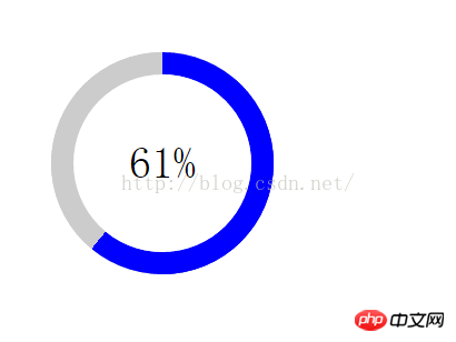
效果图:
当时的要求是让进度条以扇形渐变的效果加载。我想了半天,好像只有用border-img来做渐变图了,还有一个超笨的方法就是写50个长方形分布在进度条上。css3提供的渐变有线性渐变,径向渐变和重复渐变,想不出来怎样实现扇形渐变。不说了,上代码:
<!DOCTYPE html>
<html lang="cn">
<head>
	<meta charset="UTF-8">
	<title>Document</title>
	<style>
	*{
		margin: 0;
		padding: 0;
	}
	.wrap,.circle,.percent{
		position: absolute;
		width: 200px;
		height: 200px;
		border-radius: 50%;
	}
	.wrap{
		top:50px;
		left:50px;
		background-color: #ccc;
	}
	.circle{
		box-sizing: border-box;
		border:20px solid #ccc;
		clip:rect(0,200px,200px,100px);
	}
	.clip-auto{
		clip:rect(auto, auto, auto, auto);
	}
	.percent{
		box-sizing: border-box;
		top:-20px;
		left:-20px;
	}
	.left{
		transition:transform ease;
		border:20px solid blue;
		clip: rect(0,100px,200px,0);
	}
	.right{
		border:20px solid blue;
		clip: rect(0,200px,200px,100px);
	}
	.wth0{
		width:0;
	}
	.num{
		position: absolute;
		box-sizing: border-box;
		width: 160px;
		height: 160px;
		line-height: 160px;
		text-align: center;
		font-size: 40px;
		left: 20px;
		top: 20px;
		border-radius: 50%;
		background-color: #fff;
		z-index: 1;
	}
	</style>
	<script src="http://apps.bdimg.com/libs/zepto/1.1.4/zepto.min.js"></script>
</head>
<body>
<p class="wrap">
	<p class="circle">
		<p class="percent left"></p>
		<p class="percent right wth0"></p>
	</p>
	<p class="num"><span>0</span>%</p>
</p>
</body>
<script>
	var percent=0;
	var loading=setInterval(function(){
		if(percent>100){
			percent=0;
			$('.circle').removeClass('clip-auto');
			$('.right').addClass('wth0');
		}else if(percent>50){
			$('.circle').addClass('clip-auto');
			$('.right').removeClass('wth0');
		}
		$('.left').css("-webkit-transform","rotate("+(18/5)*percent+"deg)");
		$('.num>span').text(percent);
		percent++;
	},200);
</script>
</html>
相信看了本文案例你已经掌握了方法,更多精彩请关注php中文网其它相关文章!
推荐阅读:
以上是如何使用源生css3实现圆环加载进度条的详细内容。更多信息请关注PHP中文网其他相关文章!

 css怎么隐藏元素但不占空间Jun 01, 2022 pm 07:15 PM
两种方法:1、利用display属性,只需给元素添加“display:none;”样式即可。2、利用position和top属性设置元素绝对定位来隐藏元素,只需给元素添加“position:absolute;top:-9999px;”样式。
 原来利用纯CSS也能实现文字轮播与图片轮播!Jun 10, 2022 pm 01:00 PM
怎么制作文字轮播与图片轮播?大家第一想到的是不是利用js,其实利用纯CSS也能实现文字轮播与图片轮播,下面来看看实现方法,希望对大家有所帮助!
 css3什么是自适应布局Jun 02, 2022 pm 12:05 PM
自适应布局又称“响应式布局”,是指可以自动识别屏幕宽度、并做出相应调整的网页布局;这样的网页能够兼容多个不同的终端,而不是为每个终端做一个特定的版本。自适应布局是为解决移动端浏览网页而诞生的,能够为使用不同终端的用户提供很好的用户体验。
 css3如何实现鼠标点击图片放大Apr 25, 2022 pm 04:52 PM
实现方法:1、使用“:active”选择器选中鼠标点击图片的状态;2、使用transform属性和scale()函数实现图片放大效果,语法“img:active {transform: scale(x轴放大倍数,y轴放大倍数);}”。
 css3动画效果有变形吗Apr 28, 2022 pm 02:20 PM
css3中的动画效果有变形;可以利用“animation:动画属性 @keyframes ..{..{transform:变形属性}}”实现变形动画效果,animation属性用于设置动画样式,transform属性用于设置变形样式。
 css3怎么设置动画旋转速度Apr 28, 2022 pm 04:32 PM
在css3中,可以利用“animation-timing-function”属性设置动画旋转速度,该属性用于指定动画将如何完成一个周期,设置动画的速度曲线,语法为“元素{animation-timing-function:速度属性值;}”。
 css3线性渐变可以实现三角形吗Apr 25, 2022 pm 02:47 PM
css3线性渐变可以实现三角形;只需创建一个45度的线性渐变,设置渐变色为两种固定颜色,一个是三角形的颜色,另一个为透明色即可,语法“linear-gradient(45deg,颜色值,颜色值 50%,透明色 50%,透明色 100%)”。
 一文了解CSS3中的新特性 ::target-text 选择器Apr 12, 2022 am 11:24 AM
本篇文章带大家一起深入了解一下CSS3中的新特性::target-text 选择器,聊聊该选择器的作用和使用方法,希望对大家有所帮助!


热AI工具

Undresser.AI Undress
人工智能驱动的应用程序,用于创建逼真的裸体照片

AI Clothes Remover
用于从照片中去除衣服的在线人工智能工具。

Undress AI Tool
免费脱衣服图片

Clothoff.io
AI脱衣机

AI Hentai Generator
免费生成ai无尽的。

热门文章
热工具

DVWA
Damn Vulnerable Web App (DVWA) 是一个PHP/MySQL的Web应用程序,非常容易受到攻击。它的主要目标是成为安全专业人员在合法环境中测试自己的技能和工具的辅助工具,帮助Web开发人员更好地理解保护Web应用程序的过程,并帮助教师/学生在课堂环境中教授/学习Web应用程序安全。DVWA的目标是通过简单直接的界面练习一些最常见的Web漏洞,难度各不相同。请注意,该软件中

SublimeText3 Mac版
神级代码编辑软件(SublimeText3)

PhpStorm Mac 版本
最新(2018.2.1 )专业的PHP集成开发工具

安全考试浏览器
Safe Exam Browser是一个安全的浏览器环境,用于安全地进行在线考试。该软件将任何计算机变成一个安全的工作站。它控制对任何实用工具的访问,并防止学生使用未经授权的资源。

禅工作室 13.0.1
功能强大的PHP集成开发环境

