

这次给大家带来2D模拟实现摩天轮旋转动画特效,使用2D模拟实现摩天轮旋转动画特效的注意事项有哪些,下面就是实战案例,一起来看一下。
先看效果图:

由于上传的大小原因,只能录制成这种效果,原图是无限循环的转圈。
代码:
<span style="font-size:18px;"><!DOCTYPE html>
<html>
<head>
    <meta charset="utf-8" />
    <title>模拟摩天轮动画</title>
    <style>
    *{margin:0;padding:0;}
    .image{width:80px;height:80px;}
    .image1{width:620px;height:620px;}
    .p1{position:relative;margin:10px auto;width:638px;
            animation:run 20s linear infinite;
            -webkit-animation:run 20s linear infinite;
            -moz-animation:run 20s linear infinite;
            -o-animation:run 20s linear infinite;
        }
    img:nth-child(2){
            position:absolute;top:25px;left:270px;opacity:0.7;
            animation:run2 20s linear infinite;
            -webkit-animation:run2 20s linear infinite;
            -moz-animation:run2 20s linear infinite;
            -o-animation:run2 20s linear infinite;
            transform-origin:top center;
            -webkit-transform-origin:top center;
            -moz-transform-origin:top center;
            -o-transform-origin:top center;
        }
        img:nth-child(3){
            position:absolute;top:580px;left:270px;opacity:0.7;
            animation:run2 20s linear infinite;
            -webkit-animation:run2 20s linear infinite;
            -moz-animation:run2 20s linear infinite;
            -o-animation:run2 20s linear infinite;
            transform-origin:top center;
            -webkit-transform-origin:top center;
            -moz-transform-origin:top center;
            -o-transform-origin:top center;
        }
        img:nth-child(4){
            position:absolute;top:300px;left:550px;opacity:0.7;
            animation:run2 20s linear infinite;
            -webkit-animation:run2 20s linear infinite;
            -moz-animation:run2 20s linear infinite;
            -o-animation:run2 20s linear infinite;
            transform-origin:top center;
            -webkit-transform-origin:top center;
            -moz-transform-origin:top center;
            -o-transform-origin:top center;
        }
        img:nth-child(5){
            position:absolute;top:300px;left:0px;opacity:0.7;
            animation:run2 20s linear infinite;
            -webkit-animation:run2 20s linear infinite;
            -moz-animation:run2 20s linear infinite;
            -o-animation:run2 20s linear infinite;
            transform-origin:top center;
            -webkit-transform-origin:top center;
            -moz-transform-origin:top center;
            -o-transform-origin:top center;
        }
        @keyframes run
        {
            0%{transform:rotate(0deg)}
            100%{transform:rotate(360deg)}
        }
        @-webkit-keyframes run
        {
            0%{-webkit-transform:rotate(0deg)}
            100%{-webkit-transform:rotate(360deg)}
        }
        @-moz-keyframes run
        {
            0%{-moz-transform:rotate(0deg)}
            100%{-moz-transform:rotate(360deg)}
        }
        @-o-keyframes run
        {
            0%{-o-transform:rotate(0deg)}
            100%{-o-transform:rotate(360deg)}
        }

        @keyframes run2
        {
            0%{transform:rotate(0deg)}
            100%{transform:rotate(-360deg)}
        }
        @-webkit-keyframes run2
        {
            0%{-webkit-transform:rotate(0deg)}
            100%{-webkit-transform:rotate(-360deg)}
        }
        @-moz-keyframes run2
        {
            0%{-moz-transform:rotate(0deg)}
            100%{-moz-transform:rotate(-360deg)}
        }
        @-o-keyframes run2
        {
            0%{-o-transform:rotate(0deg)}
            100%{-o-transform:rotate(-360deg)}
        }
    </style>
</head>
<body>
    <p class="p1">
        <img src="1.png" class="image1">
        <img src="1.jpg" class="image">
        <img src="2.jpg" class="image">
        <img src="3.jpg" class="image">
        <img src="4.jpg" class="image">

    </p>
</body>
</html></span>
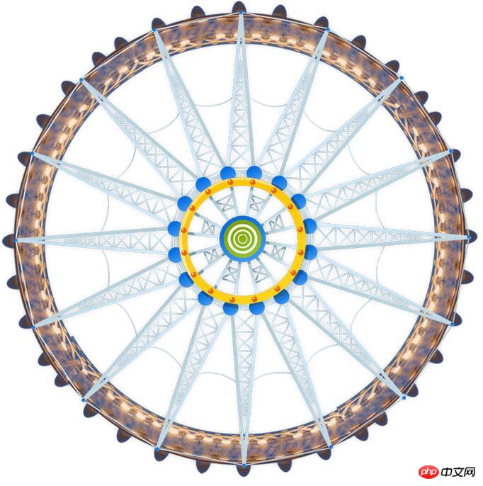
摩天轮原图:
注释:transform-origin 属性允许您改变被转换元素的位置。
这个属性主要的作用就是选择一个位置,然后绕着这个位置旋转。
相信看了本文案例你已经掌握了方法,更多精彩请关注php中文网其它相关文章!
推荐阅读:
以上是2D模拟实现摩天轮旋转动画特效的详细内容。更多信息请关注PHP中文网其他相关文章!


 通过Astro Action和Fuse.js为搜索提供动力Apr 22, 2025 am 11:41 AM
对于Astro,我们可以在构建过程中生成大部分网站,但是有一小部分服务器端代码可以使用Fuse.js之类的搜索功能来处理搜索功能。在此演示中,我们将使用保险丝搜索一组个人“书签”


热AI工具

Undresser.AI Undress
人工智能驱动的应用程序,用于创建逼真的裸体照片

AI Clothes Remover
用于从照片中去除衣服的在线人工智能工具。

Undress AI Tool
免费脱衣服图片

Clothoff.io
AI脱衣机

Video Face Swap
使用我们完全免费的人工智能换脸工具轻松在任何视频中换脸!

热门文章
热工具

适用于 Eclipse 的 SAP NetWeaver 服务器适配器
将Eclipse与SAP NetWeaver应用服务器集成。

VSCode Windows 64位 下载
微软推出的免费、功能强大的一款IDE编辑器

SecLists
SecLists是最终安全测试人员的伙伴。它是一个包含各种类型列表的集合,这些列表在安全评估过程中经常使用,都在一个地方。SecLists通过方便地提供安全测试人员可能需要的所有列表,帮助提高安全测试的效率和生产力。列表类型包括用户名、密码、URL、模糊测试有效载荷、敏感数据模式、Web shell等等。测试人员只需将此存储库拉到新的测试机上,他就可以访问到所需的每种类型的列表。

记事本++7.3.1
好用且免费的代码编辑器

安全考试浏览器
Safe Exam Browser是一个安全的浏览器环境,用于安全地进行在线考试。该软件将任何计算机变成一个安全的工作站。它控制对任何实用工具的访问,并防止学生使用未经授权的资源。

