

这次给大家带来实现多背景模拟动态边框,实现多背景模拟动态边框的注意事项有哪些,下面就是实战案例,一起来看一下。
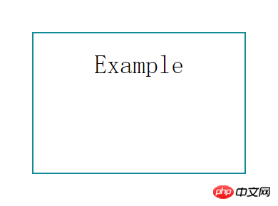
首先来看看要实现的效果图

实现方法如下
我首先想到的是border属性,可是border属性不能设置长度。如果用border实现,需要用其他元素来模拟,比较麻烦。后来突然想起以前在网上看到有人用CSS3的多背景来模拟边框,就试了一下。
css3 背景
CSS3对于background做了一些修改,最明显的一个就是采用设置多背景,不但添加了4个新属性,并且还对目前的属性进行了调整增强。
1、 多个背景图片
在css3里面,你可以再一个标签元素里应用多个背景图片。代码类似与css2.0版本的写法,但引用图片之间需用“,”逗号隔开。第一个图片是定位在元素最上面的背景,后面的背景图片依次在它下面显示,如下:
background-image: url(top-image.jpg), url(middle-image.jpg), url(bottom-image.jpg);
2、新属性:Background Clip
此讨论让我们回到文章开始提到的关于背景被border边框遮挡的问题。background-clip的添加让我们完全能够控制背景显示的位置。
属性值如下:
background-clip: border; 背景在border边框下开始显示
background-clip: padding; 背景在padding下开始显示,而不是border边框下开始
background-clip: content; 背景在内容区域下开始显示,而不是border边框下开始或padding下开始。
background-clip: no-clip; 默认属性值,类似与background-clip: border;
3、新属性: Background Origin
此属性需要与background-position配合使用。你可以用background-position计算定位是从border,padding或content boxes内容区域算起。(类似background-clip)
background-origin:border; 从border边框位置算起
background-origin:padding; 从padding位置算起
background-origin:content; 从content-box内容区域位置算起;
background-clip和background-origin的不同之处www.CSS3.info网站给做了很好的分析讲解。
4、新属性:Background Size
Background Size属性用来重设你的背景图片。
有几个属性值:
background-size: contain; 缩小背景图片使其适应标签元素(主要是像素方面的比率)
background-size: cover; 让背景图片放大延伸到整个标签元素大小(主要是像素方面的比率)
background-size: 100px 100px; 标明背景图片缩放的尺寸大小
background-size: 50% 100%; 百分比是根据内容标签元素大小,来缩放图片的尺寸大小
你可以去CSS 3 specifications站点看一下简单的案例说明。
5、新属性:Background Break
css3里标签元素能被分在不同区域(如:让内联元素span跨多行),background-break属性能够控制背景在不同区域显示。
属性值:
Background-break: continuous; 此属性是默认值,忽视区域之间的间隔空隙(给它们应用图片就好像把它们看成一个区域一样)
Background-break: bounding-box; 重新考虑区域之间的间隔
Background-break: each-box; 对每一个独立的标签区域进行背景的重新划分。
6、背景颜色的调整
background-color属性在css3版本里面稍微做了增强,除了指定background color背景颜色之外,还可以对不使用的标签元素背景图片进行去色处理。
background-color: green / blue;此例子里,这背景颜色可能是绿色,然而,如果底部背景图片无效的话,蓝色将代替绿色来显示。如果你没有指定某个颜色的话,它将其视为透明。
7、背景重复的调整
css2里当设置背景的时候,它经常被标签元素截取而显示不全,css3介绍了2个新属性来修复此问题。 space:图片以相同的间距平铺且填充整个标签元素 round:图片自动缩放直到适应且填充整个标签元素
CSS 3 specifications网站对background-repeat: space的使用就是一个现成的例子。
8、Background Attachment 的调整
Background Attachment有了一个新属性值:local,当标签元素滚动时它才有效(如设置overflow:scroll;),当background-attachment设置为scroll时,背景图片是不随内容滚条滚动的。现在,有了background-attachment:local,就可以做到让背景随元素内容滚动而滚动了。
css3 多背景模拟元素边框
我们这里主要使用了background-img、background-size 和 background-position 三个属性。
background-image: [background-image], [background-image], [background-image];
background-position: [background-position], [background-position], [background-position];
background-repeat: [background-repeat], [background-repeat], [background-repeat];
简写形式如下:
background: [background-image] [background-position] [background-repeat],
[background-image] [background-position] [background-repeat],
[background-image] [background-position] [background-repeat];
现在我们用多背景来模拟一个元素的边框
/*CSS*/
.exammple {
    background: linear-gradient(0, #108b96 2px, #108b96 2px) no-repeat,
                linear-gradient(-90deg, #108b96 2px, #108b96 2px) no-repeat,
                linear-gradient(-180deg, #108b96 2px, #108b96 2px) no-repeat,
                linear-gradient(-270deg, #108b96 2px, #108b96 2px) no-repeat;
    background-size: 100% 2px, 2px 100%, 100% 2px, 2px 100%;
    background-position: left top, right top, right bottom, left bottom;
}
<p class="exammple"></p>
我们用四个渐变的背景来模拟四个边框(为什么我们要用渐变而不是直接的Color呢?这是由于Css的多背景只能是background-image, background-color不支持多个值,所有即便是纯色的边框,我们也只能使用渐变)。
接下来我们让边框动起来
/*CSS*/
.exammple {
    transition: ease-in .3s;
    background: linear-gradient(0, #108b96 2px, #108b96 2px) no-repeat,
                linear-gradient(-90deg, #108b96 2px, #108b96 2px) no-repeat,
                linear-gradient(-180deg, #108b96 2px, #108b96 2px) no-repeat,
                linear-gradient(-270deg, #108b96 2px, #108b96 2px) no-repeat;
    background-size: 0 2px, 2px 0, 0 2px, 2px 0;
    background-position: left top, right top, right bottom, left bottom;
}
.exammple:hover {
    background-size: 100% 2px,  2px 100%, 100% 2px, 2px 100%;
}
相信看了本文案例你已经掌握了方法,更多精彩请关注php中文网其它相关文章!
推荐阅读:
以上是实现多背景模拟动态边框的详细内容。更多信息请关注PHP中文网其他相关文章!

 CSS Flexbox与网格:全面评论May 12, 2025 am 12:01 AM
选择Flexbox还是Grid取决于布局需求:1)Flexbox适用于一维布局,如导航栏;2)Grid适合二维布局,如杂志式布局。两者在项目中可结合使用,提升布局效果。
 Flexbox vs Grid:我应该学习两者吗?May 10, 2025 am 12:01 AM
是的,youshouldlearnbothflexboxandgrid.1)flexboxisidealforone-demensional,flexiblelayoutslikenavigationmenus.2)gridexcelstcelsintwo-dimensional,confffferDesignssignssuchasmagagazineLayouts.3)blosebothenHancesSunHanceSlineHancesLayOutflexibilitibilitibilitibilitibilityAnderibilitibilityAndresponScormentilial anderingStruction
 轨道力学(或我如何优化CSS KeyFrames动画)May 09, 2025 am 09:57 AM
重构自己的代码看起来是什么样的?约翰·瑞亚(John Rhea)挑选了他写的一个旧的CSS动画,并介绍了优化它的思维过程。
 CSS动画:很难创建它们吗?May 09, 2025 am 12:03 AM
CSSanimationsarenotinherentlyhardbutrequirepracticeandunderstandingofCSSpropertiesandtimingfunctions.1)Startwithsimpleanimationslikescalingabuttononhoverusingkeyframes.2)Useeasingfunctionslikecubic-bezierfornaturaleffects,suchasabounceanimation.3)For
 @KeyFrames CSS:最常用的技巧May 08, 2025 am 12:13 AM
@keyframesispopularduetoitsversatoryand and powerincreatingsmoothcssanimations.keytricksinclude:1)definingsmoothtransitionsbetnestates,2)使用AnimatingmatematingmultationmatingMultationPropertiessimultane,3)使用使用4)使用BombingeNtibalibility,4)使用BombingingWithjavofofofofofoffo
 CSS计数器:自动编号的综合指南May 07, 2025 pm 03:45 PM
CSSCOUNTERSAREDOMANAGEAUTOMANAMBERINGINWEBDESIGNS.1)他们可以使用forterablesofcontents,ListItems,and customnumbering.2)AdvancedsincludenestednumberingSystems.3)挑战挑战InclassINCludeBrowsEccerCerceribaliblesibility andperformiballibility andperformissises.4)创造性
 使用卷轴驱动动画的现代滚动阴影May 07, 2025 am 10:34 AM
使用滚动阴影,尤其是对于移动设备,是克里斯以前涵盖的一个微妙的UX。杰夫(Geoff)涵盖了一种使用动画限制属性的新方法。这是另一种方式。


热AI工具

Undresser.AI Undress
人工智能驱动的应用程序,用于创建逼真的裸体照片

AI Clothes Remover
用于从照片中去除衣服的在线人工智能工具。

Undress AI Tool
免费脱衣服图片

Clothoff.io
AI脱衣机

Video Face Swap
使用我们完全免费的人工智能换脸工具轻松在任何视频中换脸!

热门文章
热工具

适用于 Eclipse 的 SAP NetWeaver 服务器适配器
将Eclipse与SAP NetWeaver应用服务器集成。

记事本++7.3.1
好用且免费的代码编辑器

EditPlus 中文破解版
体积小,语法高亮,不支持代码提示功能

MinGW - 适用于 Windows 的极简 GNU
这个项目正在迁移到osdn.net/projects/mingw的过程中,你可以继续在那里关注我们。MinGW:GNU编译器集合(GCC)的本地Windows移植版本,可自由分发的导入库和用于构建本地Windows应用程序的头文件;包括对MSVC运行时的扩展,以支持C99功能。MinGW的所有软件都可以在64位Windows平台上运行。

ZendStudio 13.5.1 Mac
功能强大的PHP集成开发环境

