

这次给大家带来在CSS实现Footer置底的几种方式,在CSS实现Footer置底的注意事项有哪些,下面就是实战案例,一起来看一下。
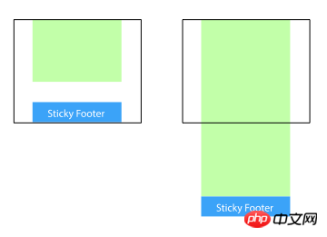
页脚置底(Sticky footer)就是让网页的footer部分始终在浏览器窗口的底部。
当网页内容足够长以至超出浏览器可视高度时,页脚会随着内容被推到网页底部;但如果网页内容不够长,置底的页脚就会保持在浏览器窗口底部。
方法一:将内容部分的margin-bottom设为负数
<p class="wrapper">
    <!-- content -->
    <p class="push"></p>
</p>
<p class="footer">footer</p>
html, body {
  margin: 0;
  padding: 0;
  height: 100%;
}
.wrapper {
  min-height: 100%;
  margin-bottom: -50px; /* 等于footer的高度 */
}
.footer, .push {
  height: 50px;
}
1、这个方法需要容器里有额外的占位元素(p.push)。
2、p.wrapper的margin-bottom需要和p.footer的-height值一样,注意是负height。
方法二:将页脚的margin-top设为负数
给内容外增加父元素,并让内容部分的padding-bottom与页脚的height相等。
<p class="content">
  <p class="content-inside">
    <!-- content -->
  </p>
</p>
<p class="footer">footer</p>
html, body {
  margin: 0;
  padding: 0;
  height: 100%;
}
.content {
  min-height: 100%;
}
.content-inside {
  padding: 20px;
  padding-bottom: 50px;
}
.footer {
  height: 50px;
  margin-top: -50px;
}
方法三:使用calc()设置内容高度
<p class="content">
  <!-- content -->
</p>
<p class="footer">footer</p>
.content {
  min-height: calc(100vh - 70px);
}
.footer {
  height: 50px;
}
这里假设p.content和p.footer之间有20px的间距,所以70px=50px+20px
方法四:使用flexbox弹性盒布局
以上三种方法的footer高度都是固定的,如果footer的内容太多则可能会破坏布局。
<p class="content">
  <!-- content -->
</p>
<p class="footer">footer</p>
html {
  height: 100%;
}
body {
  min-height: 100%;
  display: flex;
  flex-direction: column;
}
.content {
  flex: 1;
}
方法五:使用Grid网格布局
<p class="content">
  <!-- content -->
</p>
<p class="footer">footer</p>
html {
  height: 100%;
}
body {
  min-height: 100%;
  display: grid;
  grid-template-rows: 1fr auto;
}
.footer {
  grid-row-start: 2;
  grid-row-end: 3;
}
相信看了本文案例你已经掌握了方法,更多精彩请关注php中文网其它相关文章!
推荐阅读:
css的background-attachment进阶使用方法
以上是在CSS实现Footer置底的几种方式的详细内容。更多信息请关注PHP中文网其他相关文章!

 @KeyFrames CSS:最常用的技巧May 08, 2025 am 12:13 AM
@keyframesispopularduetoitsversatoryand and powerincreatingsmoothcssanimations.keytricksinclude:1)definingsmoothtransitionsbetnestates,2)使用AnimatingmatematingmultationmatingMultationPropertiessimultane,3)使用使用4)使用BombingeNtibalibility,4)使用BombingingWithjavofofofofofoffo
 CSS计数器:自动编号的综合指南May 07, 2025 pm 03:45 PM
CSSCOUNTERSAREDOMANAGEAUTOMANAMBERINGINWEBDESIGNS.1)他们可以使用forterablesofcontents,ListItems,and customnumbering.2)AdvancedsincludenestednumberingSystems.3)挑战挑战InclassINCludeBrowsEccerCerceribaliblesibility andperformiballibility andperformissises.4)创造性
 使用卷轴驱动动画的现代滚动阴影May 07, 2025 am 10:34 AM
使用滚动阴影,尤其是对于移动设备,是克里斯以前涵盖的一个微妙的UX。杰夫(Geoff)涵盖了一种使用动画限制属性的新方法。这是另一种方式。


 什么是CSS Flexbox?Apr 30, 2025 pm 03:20 PM
文章讨论了CSS FlexBox,这是一种布局方法,用于有效地对齐和分布响应设计中的空间。它说明了FlexBox用法,将其与CSS网格进行了比较,并详细浏览了浏览器支持。
 我们如何使用CSS使网站迅速响应?Apr 30, 2025 pm 03:19 PM
本文讨论了使用CSS创建响应网站的技术,包括视口元标签,灵活的网格,流体媒体,媒体查询和相对单元。它还涵盖了使用CSS网格和Flexbox一起使用,并推荐CSS框架


热AI工具

Undresser.AI Undress
人工智能驱动的应用程序,用于创建逼真的裸体照片

AI Clothes Remover
用于从照片中去除衣服的在线人工智能工具。

Undress AI Tool
免费脱衣服图片

Clothoff.io
AI脱衣机

Video Face Swap
使用我们完全免费的人工智能换脸工具轻松在任何视频中换脸!

热门文章
热工具

Atom编辑器mac版下载
最流行的的开源编辑器

SublimeText3 Mac版
神级代码编辑软件(SublimeText3)

SublimeText3汉化版
中文版,非常好用

SublimeText3 Linux新版
SublimeText3 Linux最新版

VSCode Windows 64位 下载
微软推出的免费、功能强大的一款IDE编辑器

