


这次给大家带来css3的聊天气泡样式,做出css3的聊天气泡样式的注意事项有哪些,下面就是实战案例,一起来看一下。
在聊天的场景中,聊天内容需要用到气泡修饰,如下图。下面一一讲解。
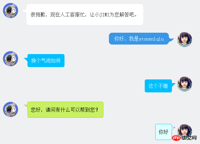
图片式:
第一个样式是京东客服,气泡的圆角和钩子都是用了图片。使用了一个table组合成了一个圆角的框框。lm样式拼出了钩子。
 <p class="jimi_lists clearfix">
                <p class="header_img jimi3 fl"></p>
                <table class="msg" cellspacing="0" cellpadding="0">
                    <tbody><tr><td class="lt"></td><td class="tt"></td><td class="rt"></td></tr>
                    <tr><td class="lm"><span></span></td><td class="mm"><span class="wel"><span class="visitor"><p>很抱歉,现在人工客服忙,让小JIMI为您解答吧。</p></span></span></td><td class="rm"></td></tr>
                    <tr><td class="lb"></td><td class="bm"></td><td class="rb"></td></tr><tr><td></td></tr>
                    </tbody>
                </table>
            </p>
            <p class="customer_lists clearfix">
                <p class="header_img jimi3" style="background: url(img/mine.jpg) no-repeat center;">
                    <p class="header_img_hover"></p>
                </p>
                <table class="msg" cellspacing="0" cellpadding="0"><tbody><tr><td class="lt"></td><td class="tt"></td><td class="rt"></td></tr><tr><td class="lm"></td><td class="mm">你好,我是stoneniqiu</td><td class="rm"><span></span></td></tr><tr><td class="lb"></td><td class="bm"></td><td class="rb"></td></tr><tr><td></td><td class="time"></td><td></td></tr></tbody></table>
            </p>
样式:
 .jimi_lists {
    margin: 0 -10px 20px 10px;
    position: relative;
}
 .jimi_lists .header_img.jimi3 {
    background: url(../img/jimi_50_3.png) no-repeat 0 0;
}
 .jimi_lists .header_img {
    width: 50px;
    height: 50px;
    position: absolute;
    top: 0;
    left: 0;
}.fl {
    float: left;
}
 .jimi_lists .msg {
    margin-left: 59px;
    margin-right: 40px;
    margin-top: 2px;
    float: left;
    display: inline;
}
 .jimi_lists .lt {
    background: url(../img/msg_bg_lr.png) no-repeat 0 0;
    width: 26px;
    height: 10px;
}
 .jimi_lists .tt {
    background: url(../img/msg_bg_tb.png) repeat-x 0 -23px;
    height: 10px;
}.jimi_lists .rt {
    background: url(../img/msg_bg_lr.png) no-repeat -35px 0;
    width: 10px;
    height: 10px;
}.jimi_lists .lm {
    background: url(../img/msg_bg_lr.png) repeat-y -94px 0;
    width: 26px;
    vertical-align: top;
    position: relative;
}.jimi_lists .mm {
    padding: 0 5px;
    background-color: #FFF;
    word-break: break-all;
    word-wrap: break-word;
    color: #333;
    line-height: 20px;
}.jimi_lists .lm span {
    background: url(../img/msg_bg_lr.png) no-repeat 0 -14px;
    display: inline-block;
    width: 26px;
    height: 16px;
    position: absolute;
    top: 5px;
}.jimi_lists .rm {
    background: url(../img/msg_bg_lr.png) repeat-y -113px 0;
    width: 10px;
}.jimi_lists .lb {
    background: url(../img/msg_bg_lr.png) no-repeat 0 -43px;
    width: 10px;
    height: 10px;
}.jimi_lists .bm {
    background: url(../img/msg_bg_tb.png) repeat-x 0 -25px;
    height: 10px;
}.jimi_lists .rb {
    background: url(../img/msg_bg_lr.png) no-repeat -35px -43px;
    width: 10px;
    height: 10px;
}.customer_lists {
    position: relative;
    margin: 0 12px 20px 20px;
}.customer_lists .msg {
    float: right;
    margin-right: 73px;
    _margin-right: 38px;
    margin-top: 2px;
}.customer_lists .lt {
    background: url(../img/msg_bg_lr.png) no-repeat -47px -0;
    width: 10px;
    height: 10px;
}.customer_lists .tt {
    background: url(../img/msg_bg_tb.png) repeat-x 0 0;
    height: 10px;
}.customer_lists .rt {
    background: url(../img/msg_bg_lr.png) no-repeat -63px 0;
    width: 26px;
    height: 10px;
}.customer_lists .lm {
    background: url(../img/msg_bg_lr.png) repeat-y -126px 0;
    width: 10px;
}.customer_lists .mm {
    padding: 1px 8px;
    background-color: #3897E7;
    word-break: break-all;
    word-wrap: break-word;
    color: #FFF;
}.customer_lists .rm {
    background: url(../img/msg_bg_lr.png) repeat-y -129px 0;
    width: 26px;
    vertical-align: top;
    position: relative;
}.customer_lists .lb {
    background: url(../img/msg_bg_lr.png) no-repeat -47px -36px;
    width: 10px;
    height: 10px;
}.customer_lists .bm {
    background: url(../img/msg_bg_tb.png) repeat-x -106px -4px;
    height: 10px;
}.customer_lists .rb {
    background: url(../img/msg_bg_lr.png) no-repeat -63px -36px;
    width: 26px;
    height: 10px;
}.customer_lists .rm span {
    background: url(../img/msg_bg_lr.png) no-repeat -63px -14px;
    display: inline-block;
    width: 26px;
    height: 16px;
    position: absolute;
    top: 5px;
}.customer_lists .header_img_hover {
    position: absolute;
    background: url(../img/avatar_mask_01.png);
    top: 0;
    width: 50px;
    height: 50px;
}.customer_lists .header_img {
    position: absolute;
    top: 0;
    right: 14px;
    width: 50px;
    height: 50px;
}
 .clearfix:after {
    content: " .";
    display: block;
    clear: both;
    visibility: hidden;
    height: 0;
}
View Code
背景式:
第二种主要是使用了:before伪类画出了三角形,然后用定位拼在了一起。
  <p class="jimi_lists clearfix">
                <p class="header_img jimi3 fl"></p>
                <p class="bkbubble right">
                     <p>换个气泡如何</p>
                </p>
            </p>
            <p class="customer_lists clearfix">
                <p class="header_img jimi3" style="background: url(img/mine.jpg) no-repeat center;">
                    <p class="header_img_hover"></p>
                </p>
                <p class="bkbubble left">
                    <p>这个不错</p>
                </p>
            </p>
样式:
  .bkbubble.right p:before, .bkbubble.left p:before {
      width: 0;
    position: absolute;
    top: 12px;
    border-style: solid;
    content: "";
  }
  .bkbubble.left {
      text-align: right;
  }
 .bkbubble.right p:before {
     left: -12px;
    border-color: transparent #00bfff;
    border-width: 0 12px 12px 0; }
 .bkbubble.left p:before {
     right: -12px;
    border-color: transparent #00bfff;
    border-width: 0 0 12px 12px ; }
更多三角形:http://www.cnblogs.com/lhb25/p/css-and-css3-triangle.html
边框式:
如果要求边框颜色和背景颜色不一样呢?上面的方法就不行了,因为用:before画三角形是利用border的原理,也就是说,在上面这种方式下,气泡边上的小三形是无法呈现两种颜色的,因为他只有一个border的颜色。那就要想办法凑出一个有边框的三角形了。
  <p class="jimi_lists lim_operator clearfix">
                <p class="header_img jimi3 fl"></p>
                <p class="lim_bubble lim_shadow"><p class="lim_dot">您好,请问有什么可以帮到您?</p></p>
                <p class="lim_tale"><p class="radiusborder"></p></p>
            </p>
1.先画一个小矩形。
.lim_operator .lim_tale {
    left: -1px;
    background-color: #c8f064;
    border-color: #a5d01b;
    margin-left: 70px;
}.lim_tale {
    position: absolute;
    width: 12px;
    height: 8px;
    overflow: hidden !important;
    top: 10px;
    z-index: 2;
    border-top-style: solid;
    border-top-width: 1px;
}
2.画出斜线。
css里面是没有斜线的,这里是用了一个园的弧形拼出来的。在一个大圆上,截取一段弧,就是一条斜线了。
.lim_operator .radiusborder {
    position: absolute;
    background-color: #EFF0F2;
    top: -29px;
    left: -94px;
    height: 160px;
    width: 160px;
    border-top-style: solid;
    border-top-width: 1px;
    border-right-style: solid;
    border-right-width: 1px;
    border-top-right-radius: 154px;
    border-color: #a5d01b;
}
叠加式:
原理就是相当于用before先画出一个有色背景,再用after画出一个白色背景,然后叠加错开顶部1-2px,这样就出现了一个有边框有背景的三角形。web 微信就是这种做法
.expression:before {
    content: '';
    position: absolute;
    left: 16px;
    top: 100%;
    margin-left: -7px;
    border: 7px solid transparent;
    border-top-color: #CFCFCF}.expression:after {
    content: '';
    position: absolute;
    left: 16px;
    top: 100%;
    margin-left: -7px;
    margin-top: -1px;
    border: 7px solid transparent;
    border-top-color: #FFF}
相信看了本文案例你已经掌握了方法,更多精彩请关注php中文网其它相关文章!
推荐阅读:
JavaScript的var与this,{}与function
以上是css3的聊天气泡样式的详细内容。更多信息请关注PHP中文网其他相关文章!

 具有自定义属性的颜色的上下文实用课程Apr 18, 2025 am 09:36 AM
在CSS中,我们有能力访问CurrentColor,这非常有用。可悲的是,我们无法访问CurrentBackgroundColor之类的东西,


 Draggin&#039;和droppin&#039;在反应中Apr 17, 2025 am 11:52 AM
React生态系统为我们提供了许多库,所有库都集中在拖放的相互作用上。我们有反应,反应,可爱dnd,


热AI工具

Undresser.AI Undress
人工智能驱动的应用程序,用于创建逼真的裸体照片

AI Clothes Remover
用于从照片中去除衣服的在线人工智能工具。

Undress AI Tool
免费脱衣服图片

Clothoff.io
AI脱衣机

AI Hentai Generator
免费生成ai无尽的。

热门文章
热工具

记事本++7.3.1
好用且免费的代码编辑器

禅工作室 13.0.1
功能强大的PHP集成开发环境

SecLists
SecLists是最终安全测试人员的伙伴。它是一个包含各种类型列表的集合,这些列表在安全评估过程中经常使用,都在一个地方。SecLists通过方便地提供安全测试人员可能需要的所有列表,帮助提高安全测试的效率和生产力。列表类型包括用户名、密码、URL、模糊测试有效载荷、敏感数据模式、Web shell等等。测试人员只需将此存储库拉到新的测试机上,他就可以访问到所需的每种类型的列表。

Dreamweaver CS6
视觉化网页开发工具

ZendStudio 13.5.1 Mac
功能强大的PHP集成开发环境

