


本文主要介绍了css3实现冲击波效果的示例代码,小编觉得挺不错的,现在分享给大家,也给大家做个参考。一起跟随小编过来看看吧,希望能帮助到大家。
近日,很多浏览器按钮点击会出现以下冲击波效果,出于好奇,参考网上的资料,将这个效果研究实现下。

实现思路:
观察波由小变大,涉及的css3属性变化有width,height,left,top,opacity,首先通过伪类实现冲击波层,同时需要设置冲击波前后的中心点位置(这里涉及一点点数学知识:画图计算两个点的位置),最后设置transition-duration: 0实现瞬间变化,ps学习到用a:active可以模拟鼠标实现点击的效果
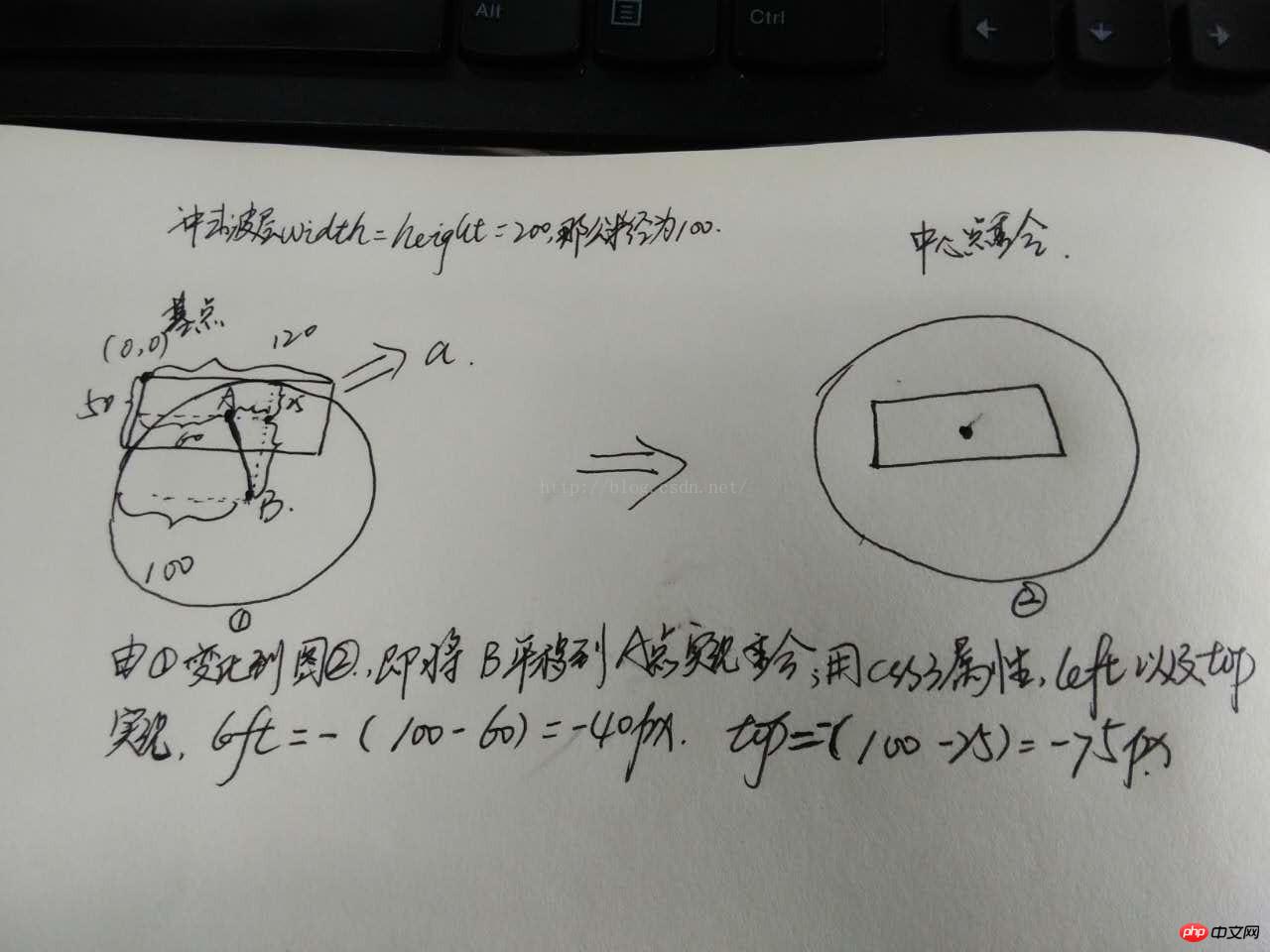
简单画下图(很菜):
实现的代码:
  <html>
  <head>
  <meta charset="UTF-8">
  <title>实现冲击波--数学知识很重要</title>
  <style>
  *{
  margin:0;
  padding:0;
  box-sizing:border-box;
  }
  html,body{
  font-family:"微软雅黑";
  }
  .wave{
  position:relative;
  float:left;
  width:50%;
  height:420px;
  }
  .wave a{
  position:absolute;
  top:50%;
  left:50%;
  transform:translate(-50%,-50%);
  display:inline-block;
  width:120px;
  height:50px;
  /*margin-left:-60px;
  margin-top:-25px;*/
  line-height:50px;
  text-align:center;
  border-radius:5px;
  color:#fff;
  font-size:16px;
  cursor:pointer;
  /*overflow:hidden;*/

  }
  #wave1{
  background-color:#00BFFF;
  }
  #wave2{
  background-color:#009955;
  }
  #wave1 a{
  background-color:burlywood;
  }
  #wave2 a{/*宽度不确定长度*/
  width:50%;
  height:50px;
  background-color:cadetblue;
  }
  .wave a:after{
  /*画图
 ,假设left:0;top:0然后画出两个中心点的水平和垂直距离*/
  content: "";
  display: block;
  position: absolute;
  left: -40px;
  top: -75px;
  width: 200px;
  height: 200px;
  background: rgba(255,255,255,0.8);
  border-radius: 50%;
  opacity:0;
  transition: all 1s;
  }
  .wave a:active:after{
  /*位于中间即是a的中点*/
  width: 0;
  height: 0;
  left:60px;
  top: 25px;
  opacity: 1;
  transition-duration: 0s;
  }

  #wave2 a:after{
  left:50%;
  top:50%;
  transform:translate(-50%,-50%);
  }
  #wave2 a:active:after{
  left:50%;
  top:50%;
  transform:translate(-50%,-50%);
  }
  </style>
  </head>
  <body>
  <!--实现冲击波按钮确定长度-->
  <p class="wave" id="wave1">
  <a>点我</a>
  </p>
  <!--实现冲击波按钮不确定长度时-->
  <p class="wave" id="wave2">
  <a>点我哈哈</a>
  </p>
  </body>
  </html>
实现的效果:

相关推荐:
以上是css3实现冲击波效果的详细内容。更多信息请关注PHP中文网其他相关文章!

 Flexbox vs Grid:我应该学习两者吗?May 10, 2025 am 12:01 AM
是的,youshouldlearnbothflexboxandgrid.1)flexboxisidealforone-demensional,flexiblelayoutslikenavigationmenus.2)gridexcelstcelsintwo-dimensional,confffferDesignssignssuchasmagagazineLayouts.3)blosebothenHancesSunHanceSlineHancesLayOutflexibilitibilitibilitibilitibilityAnderibilitibilityAndresponScormentilial anderingStruction
 轨道力学(或我如何优化CSS KeyFrames动画)May 09, 2025 am 09:57 AM
重构自己的代码看起来是什么样的?约翰·瑞亚(John Rhea)挑选了他写的一个旧的CSS动画,并介绍了优化它的思维过程。
 CSS动画:很难创建它们吗?May 09, 2025 am 12:03 AM
CSSanimationsarenotinherentlyhardbutrequirepracticeandunderstandingofCSSpropertiesandtimingfunctions.1)Startwithsimpleanimationslikescalingabuttononhoverusingkeyframes.2)Useeasingfunctionslikecubic-bezierfornaturaleffects,suchasabounceanimation.3)For
 @KeyFrames CSS:最常用的技巧May 08, 2025 am 12:13 AM
@keyframesispopularduetoitsversatoryand and powerincreatingsmoothcssanimations.keytricksinclude:1)definingsmoothtransitionsbetnestates,2)使用AnimatingmatematingmultationmatingMultationPropertiessimultane,3)使用使用4)使用BombingeNtibalibility,4)使用BombingingWithjavofofofofofoffo
 CSS计数器:自动编号的综合指南May 07, 2025 pm 03:45 PM
CSSCOUNTERSAREDOMANAGEAUTOMANAMBERINGINWEBDESIGNS.1)他们可以使用forterablesofcontents,ListItems,and customnumbering.2)AdvancedsincludenestednumberingSystems.3)挑战挑战InclassINCludeBrowsEccerCerceribaliblesibility andperformiballibility andperformissises.4)创造性
 使用卷轴驱动动画的现代滚动阴影May 07, 2025 am 10:34 AM
使用滚动阴影,尤其是对于移动设备,是克里斯以前涵盖的一个微妙的UX。杰夫(Geoff)涵盖了一种使用动画限制属性的新方法。这是另一种方式。


热AI工具

Undresser.AI Undress
人工智能驱动的应用程序,用于创建逼真的裸体照片

AI Clothes Remover
用于从照片中去除衣服的在线人工智能工具。

Undress AI Tool
免费脱衣服图片

Clothoff.io
AI脱衣机

Video Face Swap
使用我们完全免费的人工智能换脸工具轻松在任何视频中换脸!

热门文章
热工具

PhpStorm Mac 版本
最新(2018.2.1 )专业的PHP集成开发工具

适用于 Eclipse 的 SAP NetWeaver 服务器适配器
将Eclipse与SAP NetWeaver应用服务器集成。

禅工作室 13.0.1
功能强大的PHP集成开发环境

WebStorm Mac版
好用的JavaScript开发工具

SublimeText3汉化版
中文版,非常好用

