


本文主要介绍了浅谈css网页的几种布局的相关资料,小编觉得挺不错的,现在分享给大家,也给大家做个参考。一起跟随小编过来看看吧,希望能帮助到大家。
2018年已经过了一周,总结一下2017年在公司wiki上写的一篇关于css布局的知识,当时也借鉴了几个大神写的css布局知识,和自己在项目中遇到的坑。废话不多说。请看以下的干货。
1、左边固定,右边自适应布局的两种实现方式
效果图如下:
大屏展示:
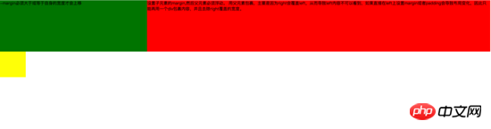
小屏展示:
第一种实现方式通过负边距与浮动 实现左边固定,右边自适应的布局。 主要代码如下:
<style type="text/css">
	.left{
		float: left;
		width: 100%;
		height: 200px;
		background-color: red;
	}
	.left-content{
		margin-left: 30%;
	}
	.right{
		float: left;
		width: 30%;
		margin-left: -100%;
		height: 200px;
		background-color: green;
	}
	.layout0{
		clear: both;
		width: 100px;
		height: 100px;
		background-color: yellow;
	}
</style>
<body>
	<p id="body">
		<p class="left">
			<p class="left-content">
				设置子元素的margin,然后父元素必须浮动。
				用父元素包裹,主要是因为right会覆盖left,从而导致left内容不可以看到,如果直接在left上设置margin或者padding会导致布局变化,因此只能再用一个p包裹内容,并且去除right覆盖的宽度。
			</p>
		</p>
		<p class="right">-margin必须大于或等于自身的宽度才会上移</p>
		<p class="layout0"></p>
	</p>
</body>
实现过程中需要注意的是:
1.自适应的容器需要容器包裹住,否则容器内的内容会被覆盖。
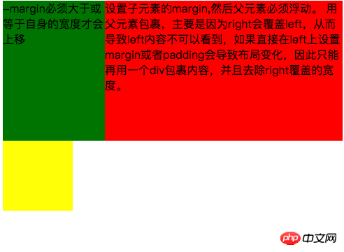
2.right容器的负边距必须大于或等于自身的宽度才会上移。
3.如果right容器负边距等于自身的宽度它会靠右对齐,如果负边距等于-100%,则会靠左对齐。
第二种 通过浮动布局来实现左边固定,右边自适应的布局
主要的代码如下:
<style type="text/css">
	.left{
		float: left;
		width: 200px;
		height: 200px;
		background-color: yellow;
	}
	.right{
		padding-left: 200px;
		height: 200px;
		background-color: red;
	}
	@media (min-width: 650px) and (max-width: 1000px){
		.left{
			width: 150px;
		}
		.right{
			margin-left: 150px;
		}
	}
	@media (max-width: 640px){
		.left{
			width: 100px;
		}
		.right{
			margin-left: 100px;
		}
	}
</style>
<body>
	<p id="main">
		<p class="left">左边固定宽度,右边自适应</p>
		<p class="right"></p>
	</p>
</body>
实现过程中需要注意的是: 1. left需要脱离文档流,而right只需要正常显示就可以。
2.left只是覆盖在right上边,因此想要让right内容完整显示需要给right padding-left或者margin-left。
大屏展示:
小屏展示:
主要代码如下:
<style type="text/css">
#head{
height: 200px;
background-color: yellow;
}
#body{
width: 100%;
float: left;
}
.main{
background-color: green;
min-height: 200px;
margin: 0 210px;
}
.left{
float: left;
background-color: red;
width: 200px;
height: 200px;
margin-left: -100%;
}
.right{
float: right;
background-color: blue;
width: 200px;
height: 200px;
margin-left: -200px;
}
#footer{
clear: both;
height: 200px;
background-color: orange;
}
</style>
<body>
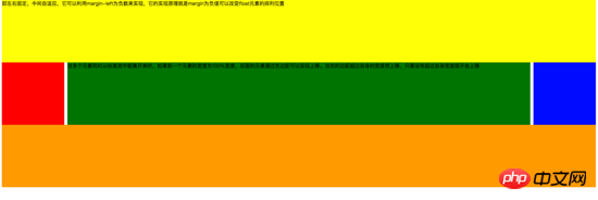
<p id="head">即左右固定,中间自适应,它可以利用margin-left为负数来实现,它的实现原理就是margin为负值可以改变float元素的排列位置</p>
<p id="body">
<p class="main">当多个元素同时从标准流中脱离开来时,如果前一个元素的宽度为100%宽度,后面的元素通过负边距可以实现上移。当负的边距超过自身的宽度将上移,只要没有超过自身宽度就不会上移</p>
</p>
<p class="left"></p>
<p class="right"></p>
<p id="footer"></p>
</body>实现过程中需要注意:
1.中间自适应的p需要放在left和right容器前面并且内容p需要用父容器包裹
2.left和right容器向同一个方向浮动。
主要代码如下:
<style type="text/css">
#head{
height: 200px;
background-color: yellow;
}
#body{
overflow: hidden;
}
.left{
float: left;
background-color: red;
width: 200px;
height: 200px;
}
.right{
float: right;
background-color: blue;
width: 200px;
height: 200px;
}
.main{
background-color: green;
height: 200px;
margin: 0 210px;
}
#footer{
clear: both;
height: 200px;
background-color: orange;
}
</style>
<body>
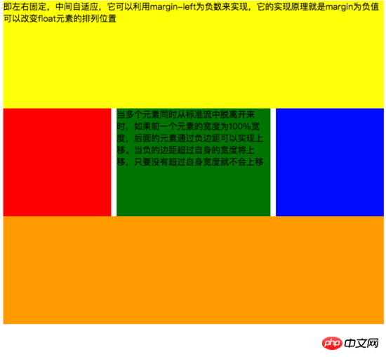
<p id="head">左右固定宽度并且向两边浮动,中间的p设置两边的margin</p>
<p id="body">
<p class="left"></p>
<p class="right"></p>
<p class="main">该方案有一个缺陷,在小屏幕情况下回导致right被挤下去,main没有了</p>
</p>
<p id="footer"></p>
</body>实现过程中需要注意:
1.该方式只需要注意中间自适应的p需要放在left和right容器的后面。
2.left和right容器向两边浮动。
主要代码如下:
<!DOCTYPE html>
<html>
<meta charset="utf-8">
<head>
	<title>使用flex 实现“双飞翼布局”</title>
</head>
<style type="text/css">
	#main{
		display: flex;
		display: -webkit-flex;//谷歌浏览器加前缀
		flex-flow: row nowrap;
		justify-content: flex-start;
		align-items: center;
	}
	.left{
		flex: 0 0 auto;
		width:100px;
		height: 200px;
		background-color: red;
		word-wrap: break-word;
		overflow: hidden;
	}
	.main{
		flex: 1 1 auto;
		height: 200px;
		background-color: green;
	}
	.right{
		flex: 0 0 auto;
		width: 100px;
		height: 200px;
		background-color: yellow;
	}
</style>
<body>
	<p id="main">
		<p class="left">flex 语法我参照了阮一峰关于flex语法介绍 http://www.ruanyifeng.com/blog/2015/07/flex-grammar.html</p>
		<p class="main"></p>
		<p class="right"></p>
	</p>
</body>
</html>
如果未了解过flex布局请移至文末点击链接查看 阮一峰大神写的关于flex语法
3、定位布局
这边就不絮絮叨叨的讲一些基础的css定位知识了(ps:不会的请自行到w3c官网查阅),我主要来讲解一下工作中遇到的坑。以免其他人和我一样掉入坑中。
第一:使用多个fixed时,注意自己需要基于什么定位,因为如果父级有用transform属性时,可能会导致子元素的fixed基于父元素容器定位,而不是基于body定位。效果如下:
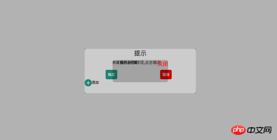
在上图中我可以发现中间黑色的小框是基于父级来定位,并且宽度也基于父容器的50%。详细的请看下面代码:
<!DOCTYPE html>
<html>
<head>
<title>关于position的定位的坑</title>
</head>
<style type="text/css">
body{
margin: 0;
padding: 0;
}
i{
font-style: normal;
cursor: pointer;
}
#delete-button{
position: absolute;
left: 45%;
top: 45%;
text-align: center;
vertical-align: middle;
height: 50px;
margin: auto;
cursor: pointer;
}
#delete-button > i{
display: inline-block;
width: 32px;
height: 32px;
border-radius: 16px;
background-color: orange;
color: red;
font-size: 32px;
vertical-align: middle;
line-height: 28px;
}
/*第一个模态框的样式*/
#layout{
display: none;
width: 100%;
height: 100%;
}
/*使用flex布局水平竖直居中*/
/*#layout-box{
position: fixed;
width: 100%;
height: 100%;
left: 0;
top: 0;
display: flex;
display: -webkit-flex;
flex-flow: column nowrap;
justify-content: center;
align-items: center;
background-color: rgba(0,0,0,0.3);
}*/
/*使用postion 和 transform 水平垂直居中*/
#layout-box{
position: fixed;
width: 100%;
height: 100%;
background-color: rgba(0,0,0,0.3);
}
.modal-dialog{
position: absolute;
left: 50%;
top: 50%;
width: 500px;
height: 200px;
border-radius: 10px;
transform: translate(-50%, -50%);
-webkit-transform: translate(-50%, -50%);
-moz-transform: translate(-50%, -50%);
-o-transform: translate(-50%, -50%);
background-color: #fff;
}
.dialog-title{
text-align: center;
color: #333;
font-size: 28px;
margin-bottom: 10px;
}
.dialog-content{
text-align: center;
color: #666;
font-size: 18px;
}
.dialog-button{
margin-top: 20px;
width: 100%;
color: #333;
}
.dialog-button >.button-box{
display: inline-block;
width: 48%;
text-align: center;
}
.button-box span{
display: inline-block;
padding: 10px;
color: #fff;
border-radius: 6px;
cursor: pointer;
}
#confirm{
background-color: #27ad9a;
}
#cancel{
background-color: red;
}
/*添加按钮的样式*/
#add-button > i{
display: inline-block;
width: 32px;
height: 32px;
border-radius: 16px;
background-color: #27ad9a;
color: #fff;
font-size: 32px;
vertical-align: middle;
line-height: 28px;
text-align: center;
}
#add-button{
display: inline-block;
cursor: pointer;
}
/*第二个模态框的样式*/
.layout2{
display: none;
position: fixed;
width: 100%;
height: 100%;
left: 0;
top: 0;
background-color: rgba(0,0,0,0.2);
}
.modal-dialog2{
position: fixed;
left: 50%;
top: 50%;
width: 50%;
height: 50%;
border-radius: 10px;
transform: translate(-50%, -50%);
-webkit-transform: translate(-50%, -50%);
-moz-transform: translate(-50%, -50%);
-o-transform: translate(-50%, -50%);
background-color: rgba(0,0,0,0.2);
}
.modal-dialog2 > span{
display: block;
}
.modal-text{
float: left;
}
#close{
color: red;
font-size: 24px;
float: right;
cursor: pointer;
}
</style>
<body>
<p id="delete-button"><i>-</i>删除</p>
<p id="layout">
<p id="layout-box">
<p class="modal-dialog">
<p class="dialog-title">提示</p>
<p class="dialog-content">是否删除该项,点击确定</p>
<p class="dialog-button">
<p class="button-box">
<span id="confirm">确定</span>
</p>
<p class="button-box">
<span id="cancel">取消</span>
</p>
</p>
<p id="add-button"><i>+</i>添加</p>
<p class="layout2">
<p class="modal-dialog2">
<span class="modal-text">你是我的小可爱</span>
<span id="close">关闭</span>
</p>
</p>
</p>
</p>
</p>
</body>
<script type="text/javascript">
document.getElementById("delete-button").onclick= function(){
var layout = document.getElementById("layout")
layout.style.display = "block"
}
document.getElementById("confirm").onclick=function(){
var layout = document.getElementById("layout")
layout.style.display = "none"
}
document.getElementById("cancel").onclick=function(){
var layout = document.getElementById("layout")
layout.style.display = "none"
}
document.getElementById("add-button").onclick=function(){
var layout = document.getElementsByClassName("layout2")
layout[0].style.display = "block"
}
document.getElementById("close").onclick=function(){
var layout = document.getElementsByClassName("layout2")
layout[0].style.display = "none"
}
</script>
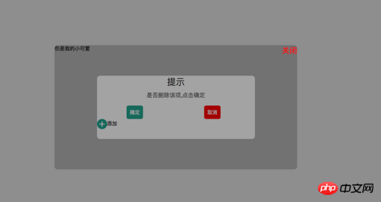
</html>如果我们尝试把父容器上的transform属性去除,我们可以看到 子容器没有基于父容器定位,而是基于body定位的,宽度也是基于body给的50%宽度。效果图如下:
详细请看代码:
<!DOCTYPE html>
<html>
<head>
    <title>关于position的定位的坑</title>
</head>
<style type="text/css">
    body{
        margin: 0;
        padding: 0;
    }
    i{
        font-style: normal;
        cursor: pointer;
    }
    #delete-button{
        position: absolute;
        left: 45%;
        top: 45%;
        text-align: center;
        vertical-align: middle;
        height: 50px;
        margin: auto;
        cursor: pointer;
    }
    #delete-button > i{
        display: inline-block;
        width: 32px;
        height: 32px;
        border-radius: 16px;
        background-color: orange;
        color: red;
        font-size: 32px;
        vertical-align: middle;
        line-height: 28px;
    }
    /*第一个模态框的样式*/
    #layout{
        display: none;
        width: 100%;
        height: 100%;
    }
    /*使用flex布局水平竖直居中*/
    #layout-box{
        position: fixed;
        width: 100%;
        height: 100%;
        left: 0;
        top: 0;
        display: flex;
        display: -webkit-flex;
        flex-flow: column nowrap;
        justify-content: center;
        align-items: center;
        background-color: rgba(0,0,0,0.3);
    }
    /*使用postion 和 transform 水平垂直居中*/
    .modal-dialog{
        width: 500px;
        height: 200px;
        border-radius: 10px;
        background-color: #fff;
    }
    .dialog-title{
        text-align: center;
        color: #333;
        font-size: 28px;
        margin-bottom: 10px;
    }
    .dialog-content{
        text-align: center;
        color: #666;
        font-size: 18px;
    }
    .dialog-button{
        margin-top: 20px;
        width: 100%;
        color: #333;
    }
    .dialog-button >.button-box{
        display: inline-block;
        width: 48%;
        text-align: center;
    }
    .button-box span{
        display: inline-block;
        padding: 10px;
        color: #fff;
        border-radius: 6px;
        cursor: pointer;
    }
    #confirm{
        background-color: #27ad9a;
    }
    #cancel{
        background-color: red;
    }
    /*添加按钮的样式*/
    #add-button > i{
        display: inline-block;
        width: 32px;
        height: 32px;
        border-radius: 16px;
        background-color: #27ad9a;
        color: #fff;
        font-size: 32px;
        vertical-align: middle;
        line-height: 28px;
        text-align: center;
    }
    #add-button{
        display: inline-block;
        cursor: pointer;
    }
    /*第二个模态框的样式*/
    .layout2{
        display: none;
        position: fixed;
        width: 100%;
        height: 100%;
        left: 0;
        top: 0;
        background-color: rgba(0,0,0,0.2);
    }
    .modal-dialog2{
        position: fixed;
        left: 50%;
        top: 50%;
        width: 50%;
        height: 50%;
        border-radius: 10px;
        transform: translate(-50%, -50%);
        -webkit-transform: translate(-50%, -50%);
        -moz-transform: translate(-50%, -50%);
        -o-transform: translate(-50%, -50%);
        background-color: rgba(0,0,0,0.2);
    }
    .modal-dialog2 > span{
        display: block;
    }
    .modal-text{
        float: left;
    }
    #close{
        color: red;
        font-size: 24px;
        float: right;
        cursor: pointer;
    }
</style>
<body>
    <p id="delete-button"><i>-</i>删除</p>
    <p id="layout">
        <p id="layout-box">
            <p class="modal-dialog">
                <p class="dialog-title">提示</p>
                <p class="dialog-content">是否删除该项,点击确定</p>
                <p class="dialog-button">
                    <p class="button-box">
                        <span id="confirm">确定</span>
                    </p>
                    <p class="button-box">
                        <span id="cancel">取消</span>
                    </p>
                </p>
                <p id="add-button"><i>+</i>添加</p>
                <p class="layout2">
                    <p class="modal-dialog2">
                        <span class="modal-text">你是我的小可爱</span>
                        <span id="close">关闭</span>
                    </p>
                </p>
            </p>
        </p>
    </p>
</body>
<script type="text/javascript">
    document.getElementById("delete-button").onclick= function(){
        var layout = document.getElementById("layout")
        layout.style.display = "block"
    }
    document.getElementById("confirm").onclick=function(){
        var layout = document.getElementById("layout")
        layout.style.display = "none"
    }
    document.getElementById("cancel").onclick=function(){
        var layout = document.getElementById("layout")
        layout.style.display = "none"
    }
    document.getElementById("add-button").onclick=function(){
        var layout = document.getElementsByClassName("layout2")
        layout[0].style.display = "block"
    }
    document.getElementById("close").onclick=function(){
        var layout = document.getElementsByClassName("layout2")
        layout[0].style.display = "none"
    }
</script>
</html>
第二:解决在手机上的抖动问题(ps:这个问题我参照了网上大神写的一篇博客请移至文末查看)
**一、**在webkit内核浏览器中 给fixed加上防抖样式 - webkit - transform: translateZ(0);
**二、**设置html 和body 的css {height:100%;overflow:auto;margin:0;} 这个影响全局样式不建议使用。
三、在fiexd内设置position:absolute,如下:
<p style="position:fiexd;bottom:0px;">
  <p style="position:absolute;">
  </p>
</p>
4、百分比布局 主要通过设置元素的宽度为百分比或者高度为百分比。比如:width:50%; height:50%; 这样的写法。
5、响应式布局(主要使用媒体查询来实现响应式设计) 主要使用CSS3 @media 来做不同终端的响应式设计
主要在css文件中写入
@media screen and (max-width:600px){
    写入当屏幕小于或等于600px时的样式
}
@media screen and (min-width:900px){
    写入当屏幕大于或等于900px时的样式
}
@media screen and (min-width:600px) and (max-width:900px){
    写入当屏幕在600px-900px之间的样式
}
@media screen and (max-device-width: 480px){
    写入最大设备宽度为480px,比如说iPhone上的显示,这里的max-device-width所指的是设备的实际分辨率,也就是指可视面积分辨率
}
@media only screen and (-webkit-min-device-pixel-ratio: 2){
    写入专门针对iPhone4的移动设备样式
}
@media all and (orientation:portrait){
    写入设备在纵向时的样式
}
@media all and (orientation:landscape){
    写入设备在横向时的样式
}
@media not print and (max-width: 1200px){
    not是用来排除某种制定的媒体类型
    写入在除打印设备和设备宽度小于1200px下的所有设备的样式
}
@media only screen and (max-device-width:240px){
    only用来定某种特定的媒体类型,可以用来排除不支持媒体查询的浏览器。
    写入只能在最大设备宽度为240px的屏幕下使用的样式
}
相关推荐:
以上是css网页的几种布局实例的详细内容。更多信息请关注PHP中文网其他相关文章!

 Draggin&#039;和droppin&#039;在反应中Apr 17, 2025 am 11:52 AM
React生态系统为我们提供了许多库,所有库都集中在拖放的相互作用上。我们有反应,反应,可爱dnd,

 带有背景折叠的嵌套梯度Apr 17, 2025 am 11:47 AM
我可以说我经常使用背景折叠。 IT Wager IT几乎从未在日常CSS工作中使用。但是在斯特凡·朱迪斯(Stefan Judis)的帖子中,我想起了它,
 使用React Hooks使用requestAnimationFrameApr 17, 2025 am 11:46 AM
使用RequestAnimationFrame进行动画化应该很容易,但是如果您还没有彻底阅读React的文档,那么您可能会遇到一些事情

 最好的(GraphQl)API是您编写的APIApr 17, 2025 am 11:36 AM
听着,我不是GraphQL专家,但我确实喜欢与之合作。作为前端开发人员,它向我曝光数据的方式非常酷。它就像一个菜单


热AI工具

Undresser.AI Undress
人工智能驱动的应用程序,用于创建逼真的裸体照片

AI Clothes Remover
用于从照片中去除衣服的在线人工智能工具。

Undress AI Tool
免费脱衣服图片

Clothoff.io
AI脱衣机

AI Hentai Generator
免费生成ai无尽的。

热门文章
热工具

MinGW - 适用于 Windows 的极简 GNU
这个项目正在迁移到osdn.net/projects/mingw的过程中,你可以继续在那里关注我们。MinGW:GNU编译器集合(GCC)的本地Windows移植版本,可自由分发的导入库和用于构建本地Windows应用程序的头文件;包括对MSVC运行时的扩展,以支持C99功能。MinGW的所有软件都可以在64位Windows平台上运行。

记事本++7.3.1
好用且免费的代码编辑器

WebStorm Mac版
好用的JavaScript开发工具

Dreamweaver Mac版
视觉化网页开发工具

SublimeText3 Mac版
神级代码编辑软件(SublimeText3)

