


我们知道css可以美化前端页面,本文我们就和大家分享纯Css代码美化checkbox复选框、radios单选框和滑动按钮的简单方法,希望能帮助到大家。
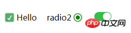
效果预览
1. 复选框
<html>

<head>
    <style type="text/css">
        .switch {
            margin: 20px 20px 0 0;
            display: flex;
            align-items: center;
            width: auto;
        }
        .checkbox-input {
            display: none
        }
        .checkbox {
            -webkit-transition: background-color 0.3s;
            transition: background-color 0.3s;
            background-color: #fff;
            border: 1px solid #d7d7d7;
            border-radius: 3px;
            width: 16px;
            height: 16px;
            vertical-align:middle;
            margin: 0 5px;
        }
        .checkbox-input:checked+.checkbox {
            background-color: #57ad68;
        }
        .checkbox-input:checked+.checkbox:after {
            content: "\2714";
            display: inline-block;
            height: 100%;
            width: 100%;
            color: #fff;
            text-align: center;
            line-height: 16px;
            font-size: 12px;
            box-shadow: 0 0 4px #57ad68;
        }
    </style>
</head>

<body>
    <label class="switch">
        <input class="checkbox-input" id="checkbox" type="checkbox" name="demo-checkbox1">
        <label class="checkbox" for="checkbox"></label>
        <span>Hello</span>
    </label>
</body>

</html>
2. 单选框
<html>

<head>
    <style type="text/css">
        .switch {
            display: flex;
            align-items: center;
            width: auto;
            float: left;
        }
        .radio-beauty-container .radio-beauty {
            width: 16px;
            height: 16px;
            box-sizing: border-box;
            display: inline-block;
            border: 1px solid #d7d7d7;
            margin: 0 5px;
            border-radius: 50%;
            transition: 0.2s;
        }
        .radio-beauty-container input[type="radio"]:checked+.radio-beauty {
            border: solid 1px green;
            padding: 3px;
            background-color: green;
            background-clip: content-box;
            box-shadow: inset 0 0 1px rgba(0,128,0, 0.2), 0 0 3px green;
        }
    </style>
</head>

<body>
    <p class="radio-beauty-container">
        <label class="switch">
            <span class="radio-name">radio2</span>
            <input type="radio" name="radioName" id="radioName2" hidden/>
            <label for="radioName2" class="radio-beauty"></label>
        </label>
        <label class="switch">
            <span class="radio-name">radio3</span>
            <input type="radio" name="radioName" id="radioName3" hidden/>
            <label for="radioName3" class="radio-beauty"></label>
        </label>
    </p>
</body>

</html>
3. 滑动按钮
<html>

<head>
    <style type="text/css">
        .switch-slide-label {
            display: block;
            width: 34px;
            height: 18px;
            background: #ccc;
            border-radius: 30px;
            cursor: pointer;
            position: relative;
            -webkit-transition: 0.3s ease;
            transition: 0.3s ease;
        }

        .switch-slide-label:after {
            content: '';
            display: block;
            width: 16px;
            height: 16px;
            border-radius: 100%;
            background: #fff;
            box-shadow: 0 1px 1px rgba(0, 0, 0, .1);
            position: absolute;
            left: 1px;
            top: 1px;
            -webkit-transform: translateZ(0);
            transform: translateZ(0);
            -webkit-transition:0.3s ease;
            transition:0.3s ease;
        }

        .switch-slide input:checked+label {
            background: #34bf49;
            transition: 0.3s ease;
        }
        .switch-slide input:checked+label:after {
            left: 17px;
        }

    </style>
</head>

<body>
    <p class="radio-beauty-container">
            <label class="switch-slide">
                <input type="checkbox" id="menu-right" hidden>
                <label for="menu-right" class="switch-slide-label"></label>
            </label>
    </p>
</body>

</html>
最简洁的代码美化复选框、单选框和滑动按钮
效果预览
1. 复选框
<html>

<head>
    <style type="text/css">
        .switch {
            margin: 20px 20px 0 0;
            display: flex;
            align-items: center;
            width: auto;
        }
        .checkbox-input {
            display: none
        }
        .checkbox {
            -webkit-transition: background-color 0.3s;
            transition: background-color 0.3s;
            background-color: #fff;
            border: 1px solid #d7d7d7;
            border-radius: 3px;
            width: 16px;
            height: 16px;
            vertical-align:middle;
            margin: 0 5px;
        }
        .checkbox-input:checked+.checkbox {
            background-color: #57ad68;
        }
        .checkbox-input:checked+.checkbox:after {
            content: "\2714";
            display: inline-block;
            height: 100%;
            width: 100%;
            color: #fff;
            text-align: center;
            line-height: 16px;
            font-size: 12px;
            box-shadow: 0 0 4px #57ad68;
        }
    </style>
</head>

<body>
    <label class="switch">
        <input class="checkbox-input" id="checkbox" type="checkbox" name="demo-checkbox1">
        <label class="checkbox" for="checkbox"></label>
        <span>Hello</span>
    </label>
</body>

</html>
2. 单选框
<html>

<head>
    <style type="text/css">
        .switch {
            display: flex;
            align-items: center;
            width: auto;
            float: left;
        }
        .radio-beauty-container .radio-beauty {
            width: 16px;
            height: 16px;
            box-sizing: border-box;
            display: inline-block;
            border: 1px solid #d7d7d7;
            margin: 0 5px;
            border-radius: 50%;
            transition: 0.2s;
        }
        .radio-beauty-container input[type="radio"]:checked+.radio-beauty {
            border: solid 1px green;
            padding: 3px;
            background-color: green;
            background-clip: content-box;
            box-shadow: inset 0 0 1px rgba(0,128,0, 0.2), 0 0 3px green;
        }
    </style>
</head>

<body>
    <p class="radio-beauty-container">
        <label class="switch">
            <span class="radio-name">radio2</span>
            <input type="radio" name="radioName" id="radioName2" hidden/>
            <label for="radioName2" class="radio-beauty"></label>
        </label>
        <label class="switch">
            <span class="radio-name">radio3</span>
            <input type="radio" name="radioName" id="radioName3" hidden/>
            <label for="radioName3" class="radio-beauty"></label>
        </label>
    </p>
</body>

</html>
3. 滑动按钮
<html>

<head>
    <style type="text/css">
        .switch-slide-label {
            display: block;
            width: 34px;
            height: 18px;
            background: #ccc;
            border-radius: 30px;
            cursor: pointer;
            position: relative;
            -webkit-transition: 0.3s ease;
            transition: 0.3s ease;
        }

        .switch-slide-label:after {
            content: '';
            display: block;
            width: 16px;
            height: 16px;
            border-radius: 100%;
            background: #fff;
            box-shadow: 0 1px 1px rgba(0, 0, 0, .1);
            position: absolute;
            left: 1px;
            top: 1px;
            -webkit-transform: translateZ(0);
            transform: translateZ(0);
            -webkit-transition:0.3s ease;
            transition:0.3s ease;
        }

        .switch-slide input:checked+label {
            background: #34bf49;
            transition: 0.3s ease;
        }
        .switch-slide input:checked+label:after {
            left: 17px;
        }

    </style>
</head>

<body>
    <p class="radio-beauty-container">
            <label class="switch-slide">
                <input type="checkbox" id="menu-right" hidden>
                <label for="menu-right" class="switch-slide-label"></label>
            </label>
    </p>
</body>

</html>
相关推荐:
HTML页面中的的美化checkbox_html/css_WEB-ITnose
使用jquery与图片美化checkbox和radio控件的代码(打包下载)_jquery
以上是纯Css代码美化checkbox复选框、radios单选框和滑动按钮简单方法的详细内容。更多信息请关注PHP中文网其他相关文章!

 @KeyFrames CSS:最常用的技巧May 08, 2025 am 12:13 AM
@keyframesispopularduetoitsversatoryand and powerincreatingsmoothcssanimations.keytricksinclude:1)definingsmoothtransitionsbetnestates,2)使用AnimatingmatematingmultationmatingMultationPropertiessimultane,3)使用使用4)使用BombingeNtibalibility,4)使用BombingingWithjavofofofofofoffo
 CSS计数器:自动编号的综合指南May 07, 2025 pm 03:45 PM
CSSCOUNTERSAREDOMANAGEAUTOMANAMBERINGINWEBDESIGNS.1)他们可以使用forterablesofcontents,ListItems,and customnumbering.2)AdvancedsincludenestednumberingSystems.3)挑战挑战InclassINCludeBrowsEccerCerceribaliblesibility andperformiballibility andperformissises.4)创造性
 使用卷轴驱动动画的现代滚动阴影May 07, 2025 am 10:34 AM
使用滚动阴影,尤其是对于移动设备,是克里斯以前涵盖的一个微妙的UX。杰夫(Geoff)涵盖了一种使用动画限制属性的新方法。这是另一种方式。


 什么是CSS Flexbox?Apr 30, 2025 pm 03:20 PM
文章讨论了CSS FlexBox,这是一种布局方法,用于有效地对齐和分布响应设计中的空间。它说明了FlexBox用法,将其与CSS网格进行了比较,并详细浏览了浏览器支持。
 我们如何使用CSS使网站迅速响应?Apr 30, 2025 pm 03:19 PM
本文讨论了使用CSS创建响应网站的技术,包括视口元标签,灵活的网格,流体媒体,媒体查询和相对单元。它还涵盖了使用CSS网格和Flexbox一起使用,并推荐CSS框架


热AI工具

Undresser.AI Undress
人工智能驱动的应用程序,用于创建逼真的裸体照片

AI Clothes Remover
用于从照片中去除衣服的在线人工智能工具。

Undress AI Tool
免费脱衣服图片

Clothoff.io
AI脱衣机

Video Face Swap
使用我们完全免费的人工智能换脸工具轻松在任何视频中换脸!

热门文章
热工具

Dreamweaver CS6
视觉化网页开发工具

PhpStorm Mac 版本
最新(2018.2.1 )专业的PHP集成开发工具

SecLists
SecLists是最终安全测试人员的伙伴。它是一个包含各种类型列表的集合,这些列表在安全评估过程中经常使用,都在一个地方。SecLists通过方便地提供安全测试人员可能需要的所有列表,帮助提高安全测试的效率和生产力。列表类型包括用户名、密码、URL、模糊测试有效载荷、敏感数据模式、Web shell等等。测试人员只需将此存储库拉到新的测试机上,他就可以访问到所需的每种类型的列表。

SublimeText3 Mac版
神级代码编辑软件(SublimeText3)

MinGW - 适用于 Windows 的极简 GNU
这个项目正在迁移到osdn.net/projects/mingw的过程中,你可以继续在那里关注我们。MinGW:GNU编译器集合(GCC)的本地Windows移植版本,可自由分发的导入库和用于构建本地Windows应用程序的头文件;包括对MSVC运行时的扩展,以支持C99功能。MinGW的所有软件都可以在64位Windows平台上运行。

