


初探Matplotlib
例子来自此书: 《Python编程从入门到实战》【美】Eric Matthes
使用pyplot绘图,一般的导入方法import matplotlib.pyplot as plt
以下代码均在Jupyter Notebook中运行
折线图
先看一个简单的例子
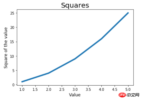
import matplotlib.pyplot as plt

in_values = [1, 2 ,3, 4, 5]
squares = [1, 4, 9 ,16, 25]# 第一个参数是X轴输入,第二个参数是对应的Y轴输出;linewidth绘制线条的粗细plt.plot(in_values, squares, linewidth=4)# 标题、X轴、Y轴plt.title('Squares', fontsize=20)
plt.xlabel('Value', fontsize=12)
plt.ylabel('Square of the value', fontsize=12)# plt.tick_params(axis='both', labelsize=15)plt.show()
图如下,可以看到x轴太密了,甚至都有小数。
如果想x轴只出现我们的样本值,可以使用tick_params函数修改刻度标记的大小。把上面代码中的倒数第二行取消注释,得到下面的图像。
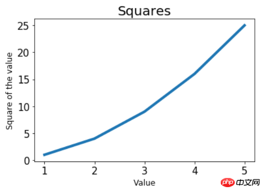
plt.tick_params(axis='both', labelsize=15),其中axis=both表示同时影响x、y轴的刻度,labelsize指定了刻度的字号,字号变大,同一长度下显示的坐标点数越少,反之亦反。由于将labelsize设置得比默认大了,故x、y轴显示的坐标点数变少。更符合这个例子。
散点图
还是上面的平方例子。这次使用散点图绘制。
in_values = [1, 2 ,3, 4, 5]
squares = [1, 4, 9 ,16, 25]# s参数为点的大小plt.scatter(in_values, squares, s=80)
plt.title('Squares', fontsize=20)
plt.xlabel('Value', fontsize=12)
plt.ylabel('Square of the value', fontsize=12)
plt.tick_params(axis='both', labelsize=15)
plt.show()
可以看到,只是将plt.plot换成了plt.scatter,其余的代码基本没变。

若输入和输出的点比较多,可使用列表推导式。同时可以指定点的颜色及点的轮廓颜色。默认点的颜色为蓝色,轮廓为黑色。
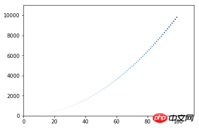
x_values = list(range(1, 100))
y_values = [x**2 for x in x_values]# c参数指定点的颜色,轮廓的颜色不进行设置(none)plt.scatter(x_values, y_values, c='red', edgecolors='none' ,s=5)# x、y轴的坐标范围,注意提供一个列表,前两个是x轴的范围,后两个是y轴的范围plt.axis([0, 110, 0, 11000])
plt.show()
颜色的自定义还可以使用RGB的模式,传递一个元组给参数c。元组里面包含三个[0, 1]之间的数,分别代表(R, G, B),数字越靠近0颜色越淡,越靠近1颜色越深。比如c=(0, 0 , 0.6)表示的是一种浅蓝色。
依然是平方的图,人懒就不写标题了。

颜色映射
颜色映射通常是一系列颜色的渐变。在可视化中,颜色映射可反应数据的规律,比如颜色浅的值比较小,颜色深的值比较大。
看一个很简单的例子,以y轴坐标值的大小映射。
x_values = list(range(1, 100))
y_values = [x**2 for x in x_values]# 颜色映射,按照y轴的值从浅到深,颜色采用蓝色plt.scatter(x_values, y_values, c=x_values, cmap=plt.cm.Blues, edgecolors='none' ,s=5)
plt.axis([0, 110, 0, 11000])# 取代show方法,保存图片到文件所在目录,bbox_inches='tight'可裁去多余的白边plt.savefig('squares_plot.png', bbox_inches='tight')
可以看到,y值小的点,颜色很浅,几乎看不到了;随着y值则增大,颜色越来越深。
随机漫步模拟
先写一个随机漫步的类,目的是随机选择前进的方向
from random import choicedef get_step():"""    获得移动的步长    """# 分别代表正半轴和负半轴direction = choice([1, -1])# 随机选择一个距离distance = choice([0, 1, 2, 3, 4])
    step = direction * distancereturn stepclass RandomWalk:"""    一个生成随机漫步数据的类    """# 默认漫步5000步def __init__(self, num_points=5000):self.num_points = num_pointsself.x_values = [0]self.y_values = [0]def fill_walk(self):"""        计算随机漫步包含的所有点        """while len(self.x_values) < self.num_points:
            x_step = get_step()
            y_step = get_step()# 没有位移,跳过不取if x_step == 0 and y_step == 0:continue# 计算下一个点的x和y, 第一次为都0,以前的位置 + 刚才的位移 = 现在的位置next_x = self.x_values[-1] + x_step
            next_y = self.y_values[-1] + y_stepself.x_values.append(next_x)self.y_values.append(next_y)
开始绘制
import matplotlib.pyplot as plt


rw = RandomWalk()
rw.fill_walk()# figure的调用在plot或者scatter之前# plt.figure(dpi=300, figsize=(10, 6))# 这个列表包含了各点的漫步顺序,第一个元素将是漫步的起点,最后一个元素是漫步的终点point_numbers = list(range(rw.num_points))# 使用颜色映射绘制颜色深浅不同的点,浅色的是先漫步的,深色是后漫步的,因此可以反应漫步轨迹plt.scatter(rw.x_values, rw.y_values, c=point_numbers, cmap=plt.cm.Blues, s=1)# 突出起点plt.scatter(0, 0, c='green', edgecolors='none', s=50)# 突出终点plt.scatter(rw.x_values[-1], rw.y_values[-1], c='red', s=50)# 隐藏坐标轴plt.axes().get_xaxis().set_visible(False)
plt.axes().get_yaxis().set_visible(False)# 指定分辨率和图像大小,单位是英寸plt.show()
生成的图片,密密麻麻的点。远远看去还挺好看。绿色的是漫步起点,红色的是漫步的终点。

但是图片有点不清晰,把rw.fill_walk()的下面一行注释取消。通常在绘图前调用。
plt.figure(dpi=300, figsize=(10, 6)),dpi=300即是300像素/英寸,这个适当调高可获得清晰的图片。figsize=(10, 6)传入的参数是元组,表示绘图窗口的尺寸,也就是图片的尺寸了,单位英寸。
高清大图,爽不爽?

处理CSV数据
我们也许需要分析别人提供的数据。一般是json和csv两种格式的文件。这里有个天气的数据sitka_weather_2014.csv,是2014年美国锡特卡的天气数据。这里用matplotlib来处理csv文件,json文件的处理放到pygal中。
下载该数据sitka_weather_2014.csv
csv文件的第一行通常是是表头,真正的数据从第二行开始。我们先看下表头包含哪些数据。
import csv

filename = 'F:/Jupyter Notebook/matplotlib_pygal_csv_json/sitka_weather_2014.csv'with open(filename) as f:
    reader = csv.reader(f)# 只调用了一次next,得到第一行表头header_row = next(reader)for index, column_header in enumerate(header_row):print(index, column_header)
打印如下
0 AKST
1 Max TemperatureF
2 Mean TemperatureF
3 Min TemperatureF
4 Max Dew PointF
5 MeanDew PointF
6 Min DewpointF
7 Max Humidity
8  Mean Humidity
9  Min Humidity
...
我们对最高温度和最低温度感兴趣,只需要获得第1列和第3列的数据就行。另外日期数据在第1列。
接下来不难了。从第二行开始,将最高气温放入highs列表,最低气温放入lows列表,日期放入dates列表我们想要在x轴显示日期,引入datetime模块。
import csvimport matplotlib.pyplot as pltfrom datetime import datetime

filename = 'F:/Jupyter Notebook/matplotlib_pygal_csv_json/sitka_weather_2014.csv'with open(filename) as f:
    reader = csv.reader(f)# 只调用了一次next,得到第一行表头header_row = next(reader)# 第一列是最高气温,由于上面next读取过一行了,这里实际从第二行开始,也是数据开始的那行# reader只能读取一次,所以如下写法dates为空#     highs = [int(row[1]) for row in reader]#     dates= [row[0] for row in reader]dates, highs, lows = [], [], []for row in reader:# 捕获异常,防止出现数据为空的情况try:
            date = datetime.strptime(row[0], '%Y-%m-%d')# 第1列最高气温,读取到是字符串,转为inthigh = int(row[1])# 第3列最低气温low = int(row[3])except ValueError:print(date, 'missing data')else:
            dates.append(date)
            highs.append(high)
            lows.append(low)# figure在plot之前调用fig = plt.figure(dpi=300, figsize=(10, 6))# 最高气温的折线图plt.plot(dates, highs, c='red')# 最低气温的折线图plt.plot(dates, lows, c='blue')# 在两个y值之间填充颜色,facecolor为填充的颜色,alpha参数可指定颜色透明度,0.1表示颜色很浅接近透明plt.fill_between(dates, highs, lows, facecolor='blue', alpha=0.1)
plt.title('Daily high and low temperatures - 2014', fontsize=20)
plt.xlabel('', fontsize=16)
plt.ylabel('Temperature(F)', fontsize=16)# x轴的日期调整为斜着显示fig.autofmt_xdate()
plt.tick_params(axis='both',labelsize=15)
plt.show()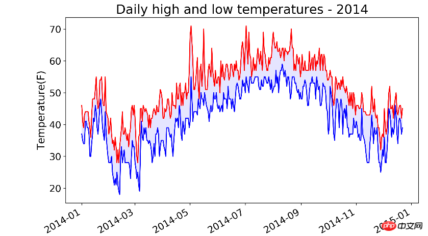
看以看出,7月到9月都很热,但是5月出现过非常高的气温!
上面的代码有一行date = datetime.strptime(row[0], '%Y-%m-%d')。注意%Y-%m-%d要和row[0]字符串的格式一致。举个例子
# 下面这句报错time data '2017/6/23' does not match format '%Y-%m-%d'print(datetime.strptime('2017/6/22', '%Y-%m-%d'))
print(datetime.strptime('2017-6-22', '%Y-%m-%d'))
%Y指的是四位的年份, %y是两位年份,%m是数字表示的月份,%d数字表示的月份中的一天。
by @sunhaiyu
2017.6.22
以上是初识Matplotlib的详细内容。更多信息请关注PHP中文网其他相关文章!

 Python:深入研究汇编和解释May 12, 2025 am 12:14 AM
pythonisehybridmodelofcompilationand interpretation:1)thepythoninterspretercompilesourcececodeintoplatform- interpententbybytecode.2)thepytythonvirtualmachine(pvm)thenexecuteCutestestestesteSteSteSteSteSteSthisByTecode,BelancingEaseofuseWithPerformance。
 Python是一种解释或编译语言,为什么重要?May 12, 2025 am 12:09 AM
pythonisbothinterpretedAndCompiled.1)它的compiledTobyTecodeForportabilityAcrosplatforms.2)bytecodeisthenInterpreted,允许fordingfordforderynamictynamictymictymictymictyandrapiddefupment,尽管Ititmaybeslowerthananeflowerthanancompiledcompiledlanguages。
 对于python中的循环时循环与循环:解释了关键差异May 12, 2025 am 12:08 AM
在您的知识之际,而foroopsareideal insinAdvance中,而WhileLoopSareBetterForsituations则youneedtoloopuntilaconditionismet
 循环时:实用指南May 12, 2025 am 12:07 AM
ForboopSareSusedwhenthentheneMberofiterationsiskNownInAdvance,而WhileLoopSareSareDestrationsDepportonAcondition.1)ForloopSareIdealForiteratingOverSequencesLikelistSorarrays.2)whileLeleLooleSuitableApeableableableableableableforscenarioscenarioswhereTheLeTheLeTheLeTeLoopContinusunuesuntilaspecificiccificcificCondond
 Python:它是真正的解释吗?揭穿神话May 12, 2025 am 12:05 AM
pythonisnotpuroly interpred; itosisehybridablectofbytecodecompilationandruntimeinterpretation.1)PythonCompiLessourceceCeceDintobyTecode,whitsthenexecececected bytybytybythepythepythepythonvirtirtualmachine(pvm).2)
 与同一元素的Python串联列表May 11, 2025 am 12:08 AM
concateNateListsinpythonwithTheSamelements,使用:1)operatototakeepduplicates,2)asettoremavelemavphicates,or3)listCompreanspearensionforcontroloverduplicates,每个methodhasdhasdifferentperferentperferentperforentperforentperforentperfortenceandordormplications。
 解释与编译语言:Python的位置May 11, 2025 am 12:07 AM
pythonisanterpretedlanguage,offeringosofuseandflexibilitybutfacingperformancelanceLimitationsInCricapplications.1)drightingedlanguageslikeLikeLikeLikeLikeLikeLikeLikeThonexecuteline-by-line,允许ImmediaMediaMediaMediaMediaMediateFeedBackAndBackAndRapidPrototypiD.2)compiledLanguagesLanguagesLagagesLikagesLikec/c thresst
 循环时:您什么时候在Python中使用?May 11, 2025 am 12:05 AM
Useforloopswhenthenumberofiterationsisknowninadvance,andwhileloopswheniterationsdependonacondition.1)Forloopsareidealforsequenceslikelistsorranges.2)Whileloopssuitscenarioswheretheloopcontinuesuntilaspecificconditionismet,usefulforuserinputsoralgorit


热AI工具

Undresser.AI Undress
人工智能驱动的应用程序,用于创建逼真的裸体照片

AI Clothes Remover
用于从照片中去除衣服的在线人工智能工具。

Undress AI Tool
免费脱衣服图片

Clothoff.io
AI脱衣机

Video Face Swap
使用我们完全免费的人工智能换脸工具轻松在任何视频中换脸!

热门文章
热工具

SublimeText3 Linux新版
SublimeText3 Linux最新版

ZendStudio 13.5.1 Mac
功能强大的PHP集成开发环境

SecLists
SecLists是最终安全测试人员的伙伴。它是一个包含各种类型列表的集合,这些列表在安全评估过程中经常使用,都在一个地方。SecLists通过方便地提供安全测试人员可能需要的所有列表,帮助提高安全测试的效率和生产力。列表类型包括用户名、密码、URL、模糊测试有效载荷、敏感数据模式、Web shell等等。测试人员只需将此存储库拉到新的测试机上,他就可以访问到所需的每种类型的列表。

WebStorm Mac版
好用的JavaScript开发工具

PhpStorm Mac 版本
最新(2018.2.1 )专业的PHP集成开发工具

