


相对于WPF/Silverlight,UWP的动画系统可以说有大幅提高,不过本文无意深入讨论这些动画API,本文将介绍使用Shape做一些进度、等待方面的动画,除此之外也会介绍一些相关技巧。
1. 使用StrokeDashOffset做等待提示动画
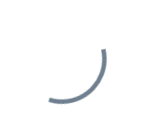
圆形的等待提示动画十分容易做,只要让它旋转就可以了:
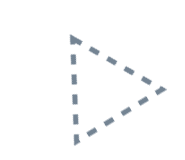
但是圆形以外的形状就不容易做了,例如三角形,总不能让它单纯地旋转吧:
要解决这个问题可以使用StrokeDashOffset。StrokeDashOffset用于控制虚线边框的第一个短线相对于Shape开始点的位移,使用动画控制这个数值可以做出边框滚动的效果:
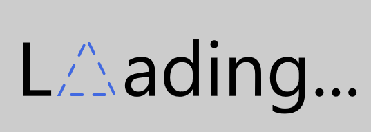
<Page.Resources><Storyboard x:Name="ProgressStoryboard"><DoubleAnimationUsingKeyFrames EnableDependentAnimation="True"
Storyboard.TargetProperty="(Shape.StrokeDashOffset)"
Storyboard.TargetName="triangle"><EasingDoubleKeyFrame KeyTime="0:1:0"
Value="-500" /></DoubleAnimationUsingKeyFrames></Storyboard></Page.Resources><Grid Background="#FFCCCCCC"><Grid Height="100"
HorizontalAlignment="Center"><StackPanel Orientation="Horizontal"
VerticalAlignment="Center"><TextBlock Text="L"
FontSize="55"
Margin="0,0,5,4" /><local:Triangle x:Name="triangle"
Height="40"
Width="40"
StrokeThickness="2"
Stroke="RoyalBlue"
StrokeDashArray="4.045 4.045"
StrokeDashOffset="0.05"
StrokeDashCap="Round" /><TextBlock Text="ading..."
FontSize="55"
Margin="5,0,0,4" /></StackPanel></Grid></Grid>
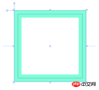
需要注意的是Shape的边长要正好能被StrokeDashArray中短线和缺口的和整除,即 满足边长 / StrokeThickness % Sum( StrokeDashArray ) = 0,这是因为在StrokeDashOffset=0的地方会截断短线,如下图所示:
另外注意的是边长的计算,如Rectangle,边长并不是(Height + Width) * 2,而是(Height - StrokeThickness) * 2 + (Width- StrokeThickness) * 2,如下图所示,边长应该从边框正中间开始计算:
有一些Shape的边长计算还会受到Stretch影响,如上一篇中自定义的Triangle:
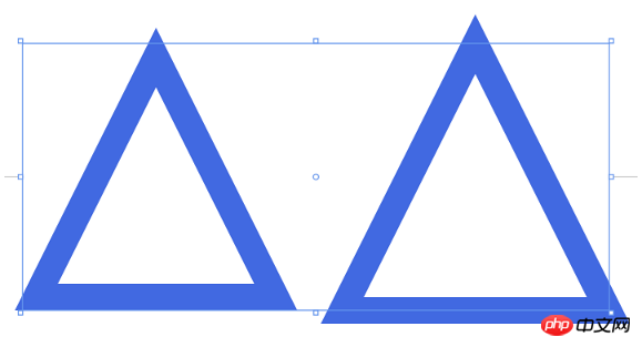
<StackPanel Orientation="Horizontal" HorizontalAlignment="Center"><Grid Height="50"
Width="50"><local:Triangle Stretch="Fill"
StrokeThickness="5"
Stroke="RoyalBlue" /></Grid><Grid Height="50"
Width="50"
Margin="10,0,0,0"><local:Triangle Stretch="None"
StrokeThickness="5"
Stroke="RoyalBlue" /></Grid></StackPanel>
2. 使用StrokeDashArray做进度提示动画
StrokeDashArray用于将Shape的边框变成虚线,StrokeDashArray的值是一个double类型的有序集合,里面的数值指定虚线中每一段以StrokeThickness为单位的长度。用StrokeDashArray做进度提示的基本做法就是将进度Progress通过Converter转换为分成两段的StrokeDashArray,第一段为实线,表示当前进度,第二段为空白。假设一个Shape的边长是100,当前进度为50,则将StrokeDashArray设置成{50,double.MaxValue}两段。
做成动画如下图所示:
<Page.Resources><Style TargetType="TextBlock"><Setter Property="FontSize"
Value="12" /></Style><local:ProgressToStrokeDashArrayConverter x:Key="ProgressToStrokeDashArrayConverter"
TargetPath="{Binding ElementName=Triangle}" /><local:ProgressToStrokeDashArrayConverter2 x:Key="ProgressToStrokeDashArrayConverter2"
TargetPath="{Binding ElementName=Triangle}" />
<toolkit:StringFormatConverter x:Key="StringFormatConverter" /><local:ProgressWrapper x:Name="ProgressWrapper" /><Storyboard x:Name="Storyboard1"><DoubleAnimation Duration="0:0:5"
To="100"
Storyboard.TargetProperty="Progress"
Storyboard.TargetName="ProgressWrapper"
EnableDependentAnimation="True" /></Storyboard></Page.Resources><Grid Background="{ThemeResource ApplicationPageBackgroundThemeBrush}"><Viewbox Height="150"><StackPanel Orientation="Horizontal"><Grid><local:Triangle Height="40"
Width="40"
StrokeThickness="2"
Stroke="DarkGray" /><local:Triangle x:Name="Triangle"
Height="40"
Width="40"
StrokeThickness="2"
Stroke="RoyalBlue"
StrokeDashArray="{Binding Progress,Source={StaticResource ProgressWrapper},Converter={StaticResource ProgressToStrokeDashArrayConverter}}" /><TextBlock Text="{Binding Progress,Source={StaticResource ProgressWrapper},Converter={StaticResource StringFormatConverter},ConverterParameter='{}{0:0}'}"
HorizontalAlignment="Center"
VerticalAlignment="Center"
Margin="0,15,0,0" /></Grid><Grid Margin="20,0,0,0"><local:Triangle Height="40"
Width="40"
StrokeThickness="2"
Stroke="DarkGray" /><local:Triangle x:Name="Triangle2"
Height="40"
Width="40"
StrokeThickness="2"
Stroke="RoyalBlue"
StrokeDashArray="{Binding Progress,Source={StaticResource ProgressWrapper},Converter={StaticResource ProgressToStrokeDashArrayConverter2}}" /><TextBlock Text="{Binding Progress,Source={StaticResource ProgressWrapper},Converter={StaticResource StringFormatConverter},ConverterParameter='{}{0:0}'}"
HorizontalAlignment="Center"
VerticalAlignment="Center"
Margin="0,15,0,0" /></Grid></StackPanel></Viewbox></Grid>其中ProgressToStrokeDashArrayConverter和ProgressToStrokeDashArrayConverter2的代码如下:
public class ProgressToStrokeDashArrayConverter : DependencyObject, IValueConverter
{/// <summary>/// 获取或设置TargetPath的值/// </summary>  public Path TargetPath
    {
    get { return (Path)GetValue(TargetPathProperty);
     }
    set {
     SetValue(TargetPathProperty, value);
    }
    }/// <summary>/// 标识 TargetPath 依赖属性。///
    </summary>public static readonly DependencyProperty TargetPathProperty =
        DependencyProperty.Register("TargetPath", typeof(Path), typeof(ProgressToStrokeDashArrayConverter), new PropertyMetadata(null));public virtual object Convert(object value, Type targetType, object parameter, string language)
    {
    if (value is double == false)return null;

        var progress = (double)value;if (TargetPath == null)return null;var totalLength = GetTotalLength();
        var firstSection = progress * totalLength / 100 / TargetPath.StrokeThickness;if (progress == 100)
            firstSection = Math.Ceiling(firstSection);var result = new DoubleCollection {
            firstSection, double.MaxValue };return result;
    }public object ConvertBack(object value, Type targetType, object parameter, string language)
    {throw new NotImplementedException();
    }protected double GetTotalLength()
    {var geometry = TargetPath.Data as PathGeometry;
    if (geometry == null)
    return 0;
    if (geometry.Figures.Any() == false)return 0;
    var figure = geometry.Figures.FirstOrDefault();
    if (figure == null)
    return 0;
    var totalLength = 0d;
    var point = figure.StartPoint;
    foreach (var item in figure.Segments)
        {
        var segment = item as LineSegment;
        if (segment == null)
        return 0;

            totalLength += Math.Sqrt(Math.Pow(point.X - segment.Point.X, 2) + Math.Pow(point.Y - segment.Point.Y, 2));
            point = segment.Point;
        }

        totalLength += Math.Sqrt(Math.Pow(point.X - figure.StartPoint.X, 2) + Math.Pow(point.Y - figure.StartPoint.Y, 2));
        return totalLength;
    }
}
public class ProgressToStrokeDashArrayConverter2 : ProgressToStrokeDashArrayConverter
{
public override object Convert(object value, Type targetType, object parameter, string language)
    {
    if (value is double == false)return null;

        var progress = (double)value;
        if (TargetPath == null)
        return null;
        var totalLength = GetTotalLength();
        totalLength = totalLength / TargetPath.StrokeThickness;
        var thirdSection = progress * totalLength / 100;
        if (progress == 100)
            thirdSection = Math.Ceiling(thirdSection);

        var secondSection = (totalLength - thirdSection) / 2;
        var result = new DoubleCollection { 0, secondSection, thirdSection, double.MaxValue };
        return result;
    }
}由于代码只是用于演示,protected double GetTotalLength()写得比较将就。可以看到这两个Converter继承自DependencyObject,这是因为这里需要通过绑定为TargetPath赋值。
这里还有另一个类ProgressWrapper:
public class ProgressWrapper : DependencyObject
{/// <summary>/// 获取或设置Progress的值/// </summary>  public double Progress
    {get { return (double)GetValue(ProgressProperty); }set { SetValue(ProgressProperty, value); }
    }/// <summary>/// 标识 Progress 依赖属性。///
    </summary>public static readonly DependencyProperty ProgressProperty =
        DependencyProperty.Register("Progress", typeof(double), typeof(ProgressWrapper), new PropertyMetadata(0d));
}
因为这里没有可供Storyboard操作的double属性,所以用这个类充当Storyboard和StrokeDashArray的桥梁。UWPCommunityToolkit中也有一个差不多用法的类BindableValueHolder,这个类通用性比较强,可以参考它的用法。
3. 使用Behavior改进进度提示动画代码
只是做个动画而已,又是Converter,又是Wrapper,又是Binding,看起来十分复杂,如果Shape上面有Progress属性就方便多了。这时候首先会考虑附加属性,在XAML用法如下:
<UserControl.Resources>
  <Storyboard x:Name="Storyboard1"><DoubleAnimation Duration="0:0:5"
  To="100"
  Storyboard.TargetProperty="(local:PathExtention.Progress)"
  Storyboard.TargetName="Triangle" />
  </Storyboard></UserControl.Resources><Grid x:Name="LayoutRoot"
  Background="White"><local:Triangle x:Name="Triangle"
  Height="40"
  local:PathExtention.Progress="0"
  Width="40"
  StrokeThickness="2"
  Stroke="RoyalBlue" ></local:Triangle></Grid>
但其实这是行不通的,XAML有一个存在了很久的限制:However, an existing limitation of the Windows Runtime XAML implementation is that you cannot animate a custom attached property.。这个限制决定了XAML不能对自定义附加属性做动画。不过,这个限制只限制了不能对自定义附加属性本身做动画,但对附加属性中的类的属性则可以,例如以下这种写法应该是行得通的:
<UserControl.Resources>
  <Storyboard x:Name="Storyboard1"><DoubleAnimation Duration="0:0:5"
  To="100"
  Storyboard.TargetProperty="(local:PathExtention.Progress)"
  Storyboard.TargetName="TrianglePathExtention" />
  </Storyboard></UserControl.Resources><Grid x:Name="LayoutRoot"
  Background="White"><local:Triangle x:Name="Triangle"
  Height="40"
  Width="40"
  StrokeThickness="2"
  Stroke="RoyalBlue" >  <local:PathHelper><local:PathExtention x:Name="TrianglePathExtention"
  Progress="0" />  </local:PathHelper></local:Triangle></Grid>
更优雅的写法是利用XamlBehaviors,这篇文章很好地解释了XamlBehaviors的作用:
XAML Behaviors非常重要,因为它们提供了一种方法,让开发人员能够以一种简洁、可重复的方式轻松地向UI对象添加功能。
他们无需创建控件的子类或重复编写逻辑代码,只要简单地增加一个XAML代码片段。
要使用Behavior改进现有代码,只需实现一个PathProgressBehavior:
public class PathProgressBehavior : Behavior<UIElement>
{protected override void OnAttached()
    {base.OnAttached();UpdateStrokeDashArray();
    }/// <summary>/// 获取或设置Progress的值/// </summary>  public double Progress
    {get { return (double)GetValue(ProgressProperty); }set { SetValue(ProgressProperty, value); }
    }/*Progress DependencyProperty*/protected virtual void OnProgressChanged(double oldValue, double newValue)
    {UpdateStrokeDashArray();
    }protected virtual double GetTotalLength(Path path)
    {/*some code*/}private void UpdateStrokeDashArray()
    {
    var target = AssociatedObject as Path;if (target == null)return;double progress = Progress;
    //if (target.ActualHeight == 0 || target.ActualWidth == 0)//
    return;
    if (target.StrokeThickness == 0)
    return;
    var totalLength = GetTotalLength(target);
    var firstSection = progress * totalLength / 100 / target.StrokeThickness;
    if (progress == 100)
            firstSection = Math.Ceiling(firstSection);
            var result = new DoubleCollection {
             firstSection, double.MaxValue
             };
        target.StrokeDashArray = result;
    }
}
XAML中如下使用:
<UserControl.Resources>
  <Storyboard x:Name="Storyboard1"><DoubleAnimation Duration="0:0:5"
  To="100"
  Storyboard.TargetProperty="Progress"
  Storyboard.TargetName="PathProgressBehavior"
  EnableDependentAnimation="True"/>
  </Storyboard></UserControl.Resources><Grid x:Name="LayoutRoot"
  Background="White">
  <local:Triangle x:Name="Triangle"
  Height="40"
  local:PathExtention.Progress="0"
  Width="40"
  StrokeThickness="2"
  Stroke="RoyalBlue" ><interactivity:Interaction.Behaviors>
  <local:PathProgressBehavior x:Name="PathProgressBehavior" /></interactivity:Interaction.Behaviors>
  </local:Triangle></Grid>
这样看起来就清爽多了。
4. 模仿背景填充动画
先看看效果:
其实这篇文章里并不会讨论填充动画,不过首先声明做填充动画会更方便快捷,这一段只是深入学习过程中的产物,实用价值不高。
上图三角形的填充的效果只需要叠加两个同样大小的Shape,前面那个设置Stretch="Uniform",再通过DoubleAnimation改变它的高度就可以了。文字也是相同的原理,叠加两个相同的TextBlock,将前面那个放在一个无边框的ScrollViewer里再去改变ScrollViewer的高度。
<Page.Resources><Style TargetType="TextBlock"><Setter Property="FontSize"
Value="12" /></Style><local:ProgressToHeightConverter x:Key="ProgressToHeightConverter"
TargetContentControl="{Binding ElementName=ContentControl}" /><local:ReverseProgressToHeightConverter x:Key="ReverseProgressToHeightConverter"
TargetContentControl="{Binding ElementName=ContentControl2}" /><toolkit:StringFormatConverter x:Key="StringFormatConverter" /><local:ProgressWrapper x:Name="ProgressWrapper" /><Storyboard x:Name="Storyboard1"><DoubleAnimation Duration="0:0:5"
To="100"
Storyboard.TargetProperty="Progress"
Storyboard.TargetName="ProgressWrapper"
EnableDependentAnimation="True" /></Storyboard></Page.Resources><Grid Background="{ThemeResource ApplicationPageBackgroundThemeBrush}"><Grid><local:Triangle Height="40"
Width="40"
StrokeThickness="2"
Fill="LightGray" /><local:Triangle Height="40"
Width="40"
Stretch="Fill"
StrokeThickness="2"
Stroke="RoyalBlue" /><ContentControl x:Name="ContentControl"
VerticalAlignment="Bottom"
HorizontalAlignment="Center"
Height="{Binding Progress,Source={StaticResource ProgressWrapper},Converter={StaticResource ProgressToHeightConverter}}"><local:Triangle x:Name="Triangle3" Height="40"
Width="40"
StrokeThickness="2"
Fill="RoyalBlue"
Stretch="Uniform"
VerticalAlignment="Bottom" /></ContentControl><TextBlock Text="{Binding Progress,Source={StaticResource ProgressWrapper},Converter={StaticResource StringFormatConverter},ConverterParameter='{}{0:0}'}"
HorizontalAlignment="Center"
VerticalAlignment="Center"
Margin="0,12,0,0"
Foreground="White" /><ContentControl x:Name="ContentControl2"
Height="{Binding Progress,Source={StaticResource ProgressWrapper},Converter={StaticResource ReverseProgressToHeightConverter}}"
VerticalAlignment="Top"
HorizontalAlignment="Center"><ScrollViewer BorderThickness="0"
Padding="0,0,0,0"
VerticalScrollBarVisibility="Disabled"
HorizontalScrollBarVisibility="Disabled"
VerticalAlignment="Top"
Height="40"><Grid Height="40"><TextBlock Text="{Binding Progress,Source={StaticResource ProgressWrapper},Converter={StaticResource StringFormatConverter},ConverterParameter='{}{0:0}'}"
HorizontalAlignment="Center"
VerticalAlignment="Center"
Margin="0,12,0,0" /></Grid></ScrollViewer></ContentControl></Grid></Grid>ProgressToHeightConverter和ReverseProgressToHeightConverter的代码如下:
public class ProgressToHeightConverter : DependencyObject, IValueConverter
{/// <summary>/// 获取或设置TargetContentControl的值/// </summary>  public ContentControl TargetContentControl
    {
    get {
    return (ContentControl)GetValue(TargetContentControlProperty);
    }
    set {
    SetValue(TargetContentControlProperty, value);
    }
    }/// <summary>/// 标识 TargetContentControl 依赖属性。///
     </summary>public static readonly DependencyProperty TargetContentControlProperty =
        DependencyProperty.Register("TargetContentControl", typeof(ContentControl), typeof(ProgressToHeightConverter), new PropertyMetadata(null));
        public object Convert(object value, Type targetType, object parameter, string language)
    {
    if (value is double == false)
    return 0d;

        var progress = (double)value;
        if (TargetContentControl == null)
        return 0d;
        var element = TargetContentControl.Content as FrameworkElement;
        if (element == null)
        return 0d;return element.Height * progress / 100;
    }public object ConvertBack(object value, Type targetType, object parameter, string language)
    {throw new NotImplementedException();
    }


}public class ReverseProgressToHeightConverter : DependencyObject, IValueConverter
{/// <summary>/// 获取或设置TargetContentControl的值/// </summary>
public ContentControl TargetContentControl
    {
    get {
    return (ContentControl)GetValue(TargetContentControlProperty);
     }
    set {
    SetValue(TargetContentControlProperty, value);
    }
    }/// <summary>/// 标识 TargetContentControl 依赖属性。///
    </summary>public static readonly DependencyProperty TargetContentControlProperty =
        DependencyProperty.Register("TargetContentControl", typeof(ContentControl), typeof(ReverseProgressToHeightConverter), new PropertyMetadata(null));
        public object Convert(object value, Type targetType, object parameter, string language)
    {
    if (value is double == false)
    return double.NaN;

        var progress = (double)value;if (TargetContentControl == null)return double.NaN;
        var element = TargetContentControl.Content as FrameworkElement;
        if (element == null)return double.NaN;
        return element.Height * (100 - progress) / 100;
    }
    public object ConvertBack(object value, Type targetType, object parameter, string language)
    {
    throw new NotImplementedException();
    }
}
再提醒一次,实际上老老实实做填充动画好像更方便些。
5. 将动画应用到Button的ControlTemplate
同样的技术,配合ControlTemplate可以制作很有趣的按钮:
PointerEntered时,按钮的边框从进入点向反方向延伸。PointerExited时,边框从反方向向移出点消退。要做到这点需要在PointerEntered时改变边框的方向,使用了ChangeAngleToEnterPointerBehavior:
public class ChangeAngleToEnterPointerBehavior : Behavior<Ellipse>
{protected override void OnAttached()
    {base.OnAttached();
        AssociatedObject.PointerEntered += OnAssociatedObjectPointerEntered;
        AssociatedObject.PointerExited += OnAssociatedObjectPointerExited;
    }protected override void OnDetaching()
    {base.OnDetaching();
        AssociatedObject.PointerEntered -= OnAssociatedObjectPointerEntered;
        AssociatedObject.PointerExited -= OnAssociatedObjectPointerExited;
    }private void OnAssociatedObjectPointerExited(object sender, PointerRoutedEventArgs e)
    {UpdateAngle(e);
    }private void OnAssociatedObjectPointerEntered(object sender, PointerRoutedEventArgs e)
    {UpdateAngle(e);
    }private void UpdateAngle(PointerRoutedEventArgs e)
    {if (AssociatedObject == null || AssociatedObject.StrokeThickness == 0)return;

        AssociatedObject.RenderTransformOrigin = new Point(0.5, 0.5);var rotateTransform = AssociatedObject.RenderTransform as RotateTransform;if (rotateTransform == null)
        {
            rotateTransform = new RotateTransform();
            AssociatedObject.RenderTransform = rotateTransform;
        }var point = e.GetCurrentPoint(AssociatedObject.Parent as UIElement).Position;var centerPoint = new Point(AssociatedObject.ActualWidth / 2, AssociatedObject.ActualHeight / 2);var angleOfLine = Math.Atan2(point.Y - centerPoint.Y, point.X - centerPoint.X) * 180 / Math.PI;
        rotateTransform.Angle = angleOfLine + 180;
    }
}
这个类命名不是很好,不过将就一下吧。
为了做出边框延伸的效果,另外需要一个类EllipseProgressBehavior:
public class EllipseProgressBehavior : Behavior<Ellipse>
{/// <summary>/// 获取或设置Progress的值/// </summary>
public double Progress
    {
    get {
    return (double)GetValue(ProgressProperty);
    }
    set {
    SetValue(ProgressProperty, value);
    }
    }/// <summary>/// 标识 Progress 依赖属性。/// </summary>
    public static readonly DependencyProperty ProgressProperty =
        DependencyProperty.Register("Progress", typeof(double), typeof(EllipseProgressBehavior), new PropertyMetadata(0d, OnProgressChanged));
        private static void OnProgressChanged(DependencyObject obj, DependencyPropertyChangedEventArgs args)
    {
    var target = obj as EllipseProgressBehavior;
    double oldValue = (double)args.OldValue;
    double newValue = (double)args.NewValue;if (oldValue != newValue)
            target.OnProgressChanged(oldValue, newValue);
    }
    protected virtual void OnProgressChanged(double oldValue, double newValue)
    {UpdateStrokeDashArray();
    }protected virtual double GetTotalLength()
    {if (AssociatedObject == null)return 0;
    return (AssociatedObject.ActualHeight - AssociatedObject.StrokeThickness) * Math.PI;
    }private void UpdateStrokeDashArray()
    {if (AssociatedObject == null || AssociatedObject.StrokeThickness == 0)
    return;
    //if (target.ActualHeight == 0 || target.ActualWidth == 0)//
    return;var totalLength = GetTotalLength();
        totalLength = totalLength / AssociatedObject.StrokeThickness;
        var thirdSection = Progress * totalLength / 100;
        var secondSection = (totalLength - thirdSection) / 2;
        var result = new DoubleCollection { 0, secondSection, thirdSection, double.MaxValue };
        AssociatedObject.StrokeDashArray = result;
    }

}
套用到ControlTemplate如下:
<ControlTemplate TargetType="Button"><Grid x:Name="RootGrid"><VisualStateManager.VisualStateGroups><VisualStateGroup x:Name="CommonStates"><VisualStateGroup.Transitions><VisualTransition GeneratedDuration="0:0:1"
To="Normal"><Storyboard><DoubleAnimationUsingKeyFrames EnableDependentAnimation="True"
Storyboard.TargetProperty="(local:EllipseProgressBehavior.Progress)"
Storyboard.TargetName="EllipseProgressBehavior"><EasingDoubleKeyFrame KeyTime="0:0:1"
Value="0"><EasingDoubleKeyFrame.EasingFunction><QuinticEase EasingMode="EaseOut" /></EasingDoubleKeyFrame.EasingFunction></EasingDoubleKeyFrame></DoubleAnimationUsingKeyFrames></Storyboard></VisualTransition><VisualTransition GeneratedDuration="0:0:1"
To="PointerOver"><Storyboard><DoubleAnimationUsingKeyFrames EnableDependentAnimation="True"
Storyboard.TargetProperty="(local:EllipseProgressBehavior.Progress)"
Storyboard.TargetName="EllipseProgressBehavior"><EasingDoubleKeyFrame KeyTime="0:0:1"
Value="100"><EasingDoubleKeyFrame.EasingFunction><QuinticEase EasingMode="EaseOut" /></EasingDoubleKeyFrame.EasingFunction></EasingDoubleKeyFrame></DoubleAnimationUsingKeyFrames></Storyboard></VisualTransition></VisualStateGroup.Transitions><VisualState x:Name="Normal"><Storyboard><PointerUpThemeAnimation Storyboard.TargetName="RootGrid" /></Storyboard></VisualState><VisualState x:Name="PointerOver"><Storyboard><PointerUpThemeAnimation Storyboard.TargetName="RootGrid" /></Storyboard><VisualState.Setters><Setter Target="EllipseProgressBehavior.(local:EllipseProgressBehavior.Progress)"
 Value="100" /></VisualState.Setters></VisualState><VisualState x:Name="Pressed"><Storyboard><PointerDownThemeAnimation Storyboard.TargetName="RootGrid" /></Storyboard></VisualState><VisualState x:Name="Disabled" /></VisualStateGroup></VisualStateManager.VisualStateGroups><ContentPresenter x:Name="ContentPresenter"
AutomationProperties.AccessibilityView="Raw"
ContentTemplate="{TemplateBinding ContentTemplate}"
ContentTransitions="{TemplateBinding ContentTransitions}"
Content="{TemplateBinding Content}"
HorizontalContentAlignment="{TemplateBinding HorizontalContentAlignment}"
Padding="{TemplateBinding Padding}"
 VerticalContentAlignment="{TemplateBinding VerticalContentAlignment}" /><Ellipse Fill="Transparent"                 Stroke="{TemplateBinding BorderBrush}"                 StrokeThickness="2"><interactivity:Interaction.Behaviors><local:ChangeAngleToEnterPointerBehavior /><local:EllipseProgressBehavior x:Name="EllipseProgressBehavior" /></interactivity:Interaction.Behaviors></Ellipse></Grid></ControlTemplate>
注意:我没有鼓励任何人自定义按钮外观的意思,能用系统自带的动画或样式就尽量用系统自带的,没有设计师的情况下 又想UI做得与众不同通常会做得很难看。想要UI好看,合理的布局、合理的颜色、合理的图片就足够了。
6. 结语
在学习Shape的过程中觉得好玩就做了很多尝试,因为以前工作中做过不少等待、进度的动画,所以这次就试着做出本文的动画。
XAML的传统动画并没有提供太多功能,主要是ColorAnimation、DoubleAnimation、PointAnimation三种,不过靠Binding和Converter可以弥补这方面的不足,实现很多需要的功能。
本文的一些动画效果参考了SVG的动画。话说回来,Windows 10 1703新增了SvgImageSource,不过看起来只是简单地将SVG翻译成对应的Shape,然后用Shape呈现,不少高级特性都不支持(如下图阴影的滤镜),用法如下:
<Image><Image.Source><SvgImageSource UriSource="feoffset_1.svg" /></Image.Source></Image>
SvgImageSource:
原本的Svg:
以上是用Shape做动画实例代码的详细内容。更多信息请关注PHP中文网其他相关文章!

 .NET中的C#代码:探索编程过程Apr 12, 2025 am 12:02 AM
C#在.NET中的编程过程包括以下步骤:1)编写C#代码,2)编译为中间语言(IL),3)由.NET运行时(CLR)执行。C#在.NET中的优势在于其现代化语法、强大的类型系统和与.NET框架的紧密集成,适用于从桌面应用到Web服务的各种开发场景。
 C#.NET:探索核心概念和编程基础知识Apr 10, 2025 am 09:32 AM
C#是一种现代、面向对象的编程语言,由微软开发并作为.NET框架的一部分。1.C#支持面向对象编程(OOP),包括封装、继承和多态。2.C#中的异步编程通过async和await关键字实现,提高应用的响应性。3.使用LINQ可以简洁地处理数据集合。4.常见错误包括空引用异常和索引超出范围异常,调试技巧包括使用调试器和异常处理。5.性能优化包括使用StringBuilder和避免不必要的装箱和拆箱。
 测试C#.NET应用程序:单元,集成和端到端测试Apr 09, 2025 am 12:04 AM
C#.NET应用的测试策略包括单元测试、集成测试和端到端测试。1.单元测试确保代码的最小单元独立工作,使用MSTest、NUnit或xUnit框架。2.集成测试验证多个单元组合的功能,常用模拟数据和外部服务。3.端到端测试模拟用户完整操作流程,通常使用Selenium进行自动化测试。
 高级C#.NET教程:ACE您的下一次高级开发人员面试Apr 08, 2025 am 12:06 AM
C#高级开发者面试需要掌握异步编程、LINQ、.NET框架内部工作原理等核心知识。1.异步编程通过async和await简化操作,提升应用响应性。2.LINQ以SQL风格操作数据,需注意性能。3..NET框架的CLR管理内存,垃圾回收需谨慎使用。
 C#.NET面试问题和答案:提高您的专业知识Apr 07, 2025 am 12:01 AM
C#.NET面试问题和答案包括基础知识、核心概念和高级用法。1)基础知识:C#是微软开发的面向对象语言,主要用于.NET框架。2)核心概念:委托和事件允许动态绑定方法,LINQ提供强大查询功能。3)高级用法:异步编程提高响应性,表达式树用于动态代码构建。
 使用C#.NET建筑微服务:建筑师实用指南Apr 06, 2025 am 12:08 AM
C#.NET是构建微服务的热门选择,因为其生态系统强大且支持丰富。1)使用ASP.NETCore创建RESTfulAPI,处理订单创建和查询。2)利用gRPC实现微服务间的高效通信,定义和实现订单服务。3)通过Docker容器化微服务,简化部署和管理。
 C#.NET安全性最佳实践:防止常见漏洞Apr 05, 2025 am 12:01 AM
C#和.NET的安全最佳实践包括输入验证、输出编码、异常处理、以及身份验证和授权。1)使用正则表达式或内置方法验证输入,防止恶意数据进入系统。2)输出编码防止XSS攻击,使用HttpUtility.HtmlEncode方法。3)异常处理避免信息泄露,记录错误但不返回详细信息给用户。4)使用ASP.NETIdentity和Claims-based授权保护应用免受未授权访问。
 c语言中:是什么意思Apr 03, 2025 pm 07:24 PM
C 语言中冒号 (':') 的含义:条件语句:分隔条件表达式和语句块循环语句:分隔初始化、条件和增量表达式宏定义:分隔宏名和宏值单行注释:表示从冒号到行尾的内容为注释数组维数:指定数组的维数


热AI工具

Undresser.AI Undress
人工智能驱动的应用程序,用于创建逼真的裸体照片

AI Clothes Remover
用于从照片中去除衣服的在线人工智能工具。

Undress AI Tool
免费脱衣服图片

Clothoff.io
AI脱衣机

AI Hentai Generator
免费生成ai无尽的。

热门文章
热工具

SublimeText3 Linux新版
SublimeText3 Linux最新版

mPDF
mPDF是一个PHP库,可以从UTF-8编码的HTML生成PDF文件。原作者Ian Back编写mPDF以从他的网站上“即时”输出PDF文件,并处理不同的语言。与原始脚本如HTML2FPDF相比,它的速度较慢,并且在使用Unicode字体时生成的文件较大,但支持CSS样式等,并进行了大量增强。支持几乎所有语言,包括RTL(阿拉伯语和希伯来语)和CJK(中日韩)。支持嵌套的块级元素(如P、DIV),

Atom编辑器mac版下载
最流行的的开源编辑器

DVWA
Damn Vulnerable Web App (DVWA) 是一个PHP/MySQL的Web应用程序,非常容易受到攻击。它的主要目标是成为安全专业人员在合法环境中测试自己的技能和工具的辅助工具,帮助Web开发人员更好地理解保护Web应用程序的过程,并帮助教师/学生在课堂环境中教授/学习Web应用程序安全。DVWA的目标是通过简单直接的界面练习一些最常见的Web漏洞,难度各不相同。请注意,该软件中

VSCode Windows 64位 下载
微软推出的免费、功能强大的一款IDE编辑器

