


废话不多说,先给大家展示下效果图: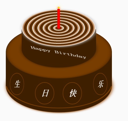
蛋糕分为三个部分,底部蛋糕,顶层蛋糕和蜡烛部分。HTML的布局结构也是按照这三部分布局的。另外就是使用CSS定位和CSS3的rotate,内外阴影等效果调整部分DOM元素样式。比较简单,相信码农都懂的。
不赘述其它有的没的了。
下面给出完整的的HTML代码和CSS代码
<!DOCTYPE html>
<html>
<head lang="en">
    <meta charset="UTF-8">
    <title></title>
    <style>
        .birthday .container{
            width:600px;
            height:600px;
            margin:0px auto;
            background: #fafafa;
            border-radius:5px;
            position: relative;
        }
        /**
       ** 顶层的
       **/
        .birthday .top-one{
            position: absolute;
            width:280px;
            height: 280px;
            bottom: 200px;
            left:160px;
        }
        .birthday .top-one .bottom{
            position: absolute;
            width:280px;
            height: 280px;
            bottom:-30px;
            border:1px solid #3e2001;
            border-radius: 140px;
            transform: rotateX(60deg);
            z-index: 4;
            background: #3e2001;
            box-shadow: 0px 0px 20px #3e2001;
        }
        .birthday .top-one .top{
            position: absolute;
            width:280px;
            height: 280px;
            top:-50px;
            border-radius: 140px;
            background: #FFFFFF;
            transform: rotateX(60deg);
            box-shadow: 2px 2px 20px #b7b7b7;
            z-index: 6;
            background: -webkit-repeating-radial-gradient(circle, #783d01, #3e2001 10px, #914909 10px,white 20px);
            background: -moz-repeating-radial-gradient(circle, #783d01, #3e2001 10px,#914909 10px,white 20px);
        }
        .birthday .top-one .side{
            position: absolute;
            top:95px;
            width:280px;
            height: 70px;
            border:1px solid #3e2001;
            border-top-width: 0px;
            border-bottom-width: 0px;
            background: #FFFFFF;
            z-index: 5;
            background: #3e2001;
        }
        /**
        ** 底层的
        **/
        .birthday .bottom-one{
            position: absolute;
            width:400px;
            height: 400px;
            bottom: 0px;
            left:100px;
        }
        .birthday .bottom-one .bottom{
            position: absolute;
            width:400px;
            height: 400px;
            bottom:-30px;
            border:1px solid #914909;
            border-radius: 200px;
            transform: rotateX(60deg);
            box-shadow: 2px 2px 20px #914909;
            z-index: 1;
            background: #3e2001;
            overflow: hidden;
        }
        .birthday .bottom-one .line{
            position: absolute;
            width:400px;
            height: 400px;
            border-radius: 200px;
            z-index: 1;
        }
        .birthday .bottom-one .line1{
            bottom: 30px;
            border:5px solid #783d01;
            left:-5px;
            z-index: 1;
        }
        .birthday .bottom-one .top{
            position: absolute;
            width:400px;
            height: 400px;
            top:-100px;
            border:1px solid #3e2001;
            border-radius: 200px;
            background: #FFFFFF;
            transform: rotateX(60deg);
            z-index: 3;
            background: #783d01;
            box-shadow: inset 0px 0px 20px #3e2001;
        }
        .birthday .bottom-one .side{
            position: absolute;
            top:100px;
            width:400px;
            height: 130px;
            border:1px solid #3e2001;
            border-top-width: 0px;
            border-bottom-width: 0px;
            background: #3e2001;
            z-index: 2;
        }
        /**
        ** 底层的文字
        **/
        .birthday .flower{
            position: relative;
            text-align: justify;
            z-index: 9;
            top:200px;
            font-size: 32px;
            font-family: "Helvetica Neue", "Noto Sans CJK SC", "Source Han Sans CN";
            color:#FFFFFF;
            font-weight: bold;
        }
        .birthday .flower:after{
            content:"";
            display:inline-block;
            position: relative;
            width:100%;
        }
        .birthday .flower i{
            position: relative;
            width:80px;
            line-height: 80px;
            display: inline-block;
            border-radius: 50%;
            border:2px solid #783d01;
            text-align: center;
        }
        /**
        ** 顶层的文字
        **/
        .birthday .top-one .text{
            width:100%;
            text-align: center;
            position: absolute;
            top:165px;
            z-index: 9;
            margin:0px auto;
            font-size: 30px;
            color:#FFFFFF;
            transform: rotateX(60deg) skew(10deg,20deg);
        }
        /**
         ** 蜡烛
        **/
        .birthday .candle{
            width:10px;
            height:80px;
            margin:0px auto;
            position: absolute;
            left:295px;
            top:130px;
            z-index: 9;
        }
        .birthday .candle .body{
            width:10px;
            height:70px;
            margin:0px auto;
            background: red;
            border-bottom-width: 0px;
        }
        .birthday .candle .top{
            width:10px;
            height: 10px;
            border-radius: 5px;
            transform: rotateX(60deg);
            position: relative;
            top:5px;
            background: red;
        }
        .birthday .candle .bottom{
            width:10px;
            height: 10px;
            border-radius: 5px;
            transform: rotateX(60deg);
            position: relative;
            bottom:5px;
            background: red;
            box-shadow: 1px 1px 10px red;
        }
        .birthday .candle .fire{
            position: absolute;
            width:6px;
            height: 6px;
            left:2px;
            transform: rotate(45deg);
            background: #ffd507;
            box-shadow: 0px 0px 20px #ffff00, 2px 2px 10px red;
        }
    </style>
</head>
<body>
    <p class="birthday">
        <p class="container">
            <p class="candle">
                <p class="fire"></p>
                <p class="top"></p>
                <p class="body"></p>
                <p class="bottom"></p>
            </p>
            <p class="top-one">
                <p class="top"></p>
                <p class="side"></p>
                <p class="bottom"></p>
                <p class="text">
                    Happy Birthday
                </p>
            </p>
            <p class="bottom-one">
                <p class="top"></p>
                <p class="side"></p>
                <p class="bottom">
                    <p class="line line1"></p>
                </p>
                <p class="flower">
                    <i style="top:-20px;transform: rotateY(50deg)">生</i>
                    <i style="top:15px;transform: rotateY(30deg)">日</i>
                    <i style="top:15px;transform: rotateY(30deg)">快</i>
                    <i style="top:-20px;transform: rotateY(50deg)">乐</i>
                </p>
            </p>
        </p>
    </p>
</body>
</html>
以上就是纯HTML5+CSS3制作生日蛋糕(代码易懂) 的内容,更多相关内容请关注PHP中文网(www.php.cn)!

 H5和HTML5之间的连接:相似性和差异Apr 24, 2025 am 12:01 AM
H5和HTML5是不同的概念:HTML5是HTML的一个版本,包含新元素和API;H5是基于HTML5的移动应用开发框架。HTML5通过浏览器解析和渲染代码,H5应用则需要容器运行并通过JavaScript与原生代码交互。
 H5代码的基础:密钥元素及其目的Apr 23, 2025 am 12:09 AM
HTML5的关键元素包括、、、、、等,用于构建现代网页。1.定义头部内容,2.用于导航链接,3.表示独立文章内容,4.组织页面内容,5.展示侧边栏内容,6.定义页脚,这些元素增强了网页的结构和功能性。
 HTML5和H5:了解常见用法Apr 22, 2025 am 12:01 AM
HTML5和H5没有区别,H5是HTML5的简称。1.HTML5是HTML的第五个版本,增强了网页的多媒体和交互功能。2.H5常用于指代基于HTML5的移动网页或应用,适用于各种移动设备。
 HTML5:现代网络的基础(H5)Apr 21, 2025 am 12:05 AM
HTML5是超文本标记语言的最新版本,由W3C标准化。HTML5引入了新的语义化标签、多媒体支持和表单增强,提升了网页结构、用户体验和SEO效果。HTML5引入了新的语义化标签,如、、、等,使网页结构更清晰,SEO效果更好。HTML5支持多媒体元素和,无需第三方插件,提升了用户体验和加载速度。HTML5增强了表单功能,引入了新的输入类型如、等,提高了用户体验和表单验证效率。
 H5代码:编写清洁有效的HTML5Apr 20, 2025 am 12:06 AM
如何写出干净高效的HTML5代码?答案是通过语义化标签、结构化代码、性能优化和避免常见错误。1.使用语义化标签如、等,提升代码可读性和SEO效果。2.保持代码结构化和可读性,使用适当缩进和注释。3.优化性能,通过减少不必要的标签、使用CDN和压缩代码。4.避免常见错误,如标签未闭合,确保代码有效性。
 H5:如何增强网络上的用户体验Apr 19, 2025 am 12:08 AM
H5通过多媒体支持、离线存储和性能优化提升网页用户体验。1)多媒体支持:H5的和元素简化开发,提升用户体验。2)离线存储:WebStorage和IndexedDB允许离线使用,提升体验。3)性能优化:WebWorkers和元素优化性能,减少带宽消耗。
 解构H5代码:标签,元素和属性Apr 18, 2025 am 12:06 AM
HTML5代码由标签、元素和属性组成:1.标签定义内容类型,用尖括号包围,如。2.元素由开始标签、内容和结束标签组成,如内容。3.属性在开始标签中定义键值对,增强功能,如。这些是构建网页结构的基本单位。
 了解H5代码:HTML5的基本原理Apr 17, 2025 am 12:08 AM
HTML5是构建现代网页的关键技术,提供了许多新元素和功能。1.HTML5引入了语义化元素如、、等,增强了网页结构和SEO。2.支持多媒体元素和,无需插件即可嵌入媒体。3.表单增强了新输入类型和验证属性,简化了验证过程。4.提供了离线和本地存储功能,提升了网页性能和用户体验。


热AI工具

Undresser.AI Undress
人工智能驱动的应用程序,用于创建逼真的裸体照片

AI Clothes Remover
用于从照片中去除衣服的在线人工智能工具。

Undress AI Tool
免费脱衣服图片

Clothoff.io
AI脱衣机

Video Face Swap
使用我们完全免费的人工智能换脸工具轻松在任何视频中换脸!

热门文章
热工具

SublimeText3 英文版
推荐:为Win版本,支持代码提示!

记事本++7.3.1
好用且免费的代码编辑器

SublimeText3汉化版
中文版,非常好用

mPDF
mPDF是一个PHP库,可以从UTF-8编码的HTML生成PDF文件。原作者Ian Back编写mPDF以从他的网站上“即时”输出PDF文件,并处理不同的语言。与原始脚本如HTML2FPDF相比,它的速度较慢,并且在使用Unicode字体时生成的文件较大,但支持CSS样式等,并进行了大量增强。支持几乎所有语言,包括RTL(阿拉伯语和希伯来语)和CJK(中日韩)。支持嵌套的块级元素(如P、DIV),

禅工作室 13.0.1
功能强大的PHP集成开发环境

