


在web开发中,不可避免遇到要计算元素大小以及位置的问题,解决这类问题的方法是利用DOM提供的一些API结合兼容性处理来,所有内容大概分3篇左右的文章的来说明。本文作为第一篇,介绍DOM提供的与尺寸大小相关的DOM属性,提供一些兼容性处理的方法,并结合常见的场景说明如何正确运用这些属性。
1. 正确理解offsetWidth、clientWidth、scrollWidth及相应的height属性
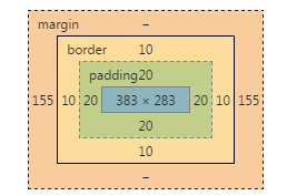
假设某一个元素的横纵向滚动条都拖动到最末端,则offsetWidth、clientWidth、scrollWidth等属性相应的范围如下图所示:

1)offsetWidth ,offsetHeight对应的是盒模型的宽度和高度,这两个值跟我们使用chrome审查元素时看到的尺寸一致:

2)scrollWidth,与scrollHeight对应的是滚动区域的宽度和高度 , 但是不包含滚动条的宽度!滚动区域由padding和content组成。
3)clientWidth,clientHeight对应的是盒模型除去边框后的那部分区域的宽度和高度,不包含滚动条的宽度。
4)任何一个DOM元素,都可以通过以下api快速得到offsetWidth,clientWidth,scrollWidh及相关的height属性:
//domE为一个DOM Html Element对象
domE.scrollWidth
domE.scrollHeight
domE.clientWidth
domE.clientHeight
domE.offsetWidth
domE.offsetHeight
//domE为一个DOM Html Element对象
domE.scrollWidth
domE.scrollHeight
domE.clientWidth
domE.clientHeight
domE.offsetWidth
domE.offsetHeight
5) 这些属性在现代浏览器包括pc和mobile上几乎没有兼容性问题,可以放心使用 。如果你想了解详细的兼容性规则,可以参考下面的2篇文章:
W3C DOM Compatibility – CSS Object Model View
cssom视图模式cssom-view-module相关整理与介绍
下面针对普通html元素,html根元素和body元素的以上相关属性一一测试,以便验证前面的结论,总结一些可在实际编码过程中直接使用的经验技巧。之所以要区分普通html元素,html根元素和body元素,是因为前面的理论,在html根元素和body元素会有一些怪异之处,需要小心处理。
注:
1、为了减少篇幅,测试贴出的代码不是完整的代码,但不影响学习参考,另外文中给出的测试结果都是在chrome(版本:45.0)下运行得出的,在测试结果有差异的情况下,还会给出IE9,IE10,IE11,firefox(版本:42.0),opera(版本:34.0)的测试结果,没有差异的会在测试结果中说明,不考虑IE8及以下。
2、safari因为设备限制暂不测试,另外它跟chrome内核相同,对标准支持的可靠性差不到哪去。
3、老版本的chrome,firefox,opera也因为设备的限制无法测试,不过从浏览器对标准的支持程度考虑,这三个浏览器在很早的版本开始对W3C的标准都是比较规矩的,加之这些浏览器更新换代的速度较快,现在市面上这些浏览器主流的版本也都是较新的。
4、由于不考虑IE8及以下,同时html现在都用html5,所以document.compatMode = ‘BackCompat' 的情况不考虑。不过尽管BackCompat模式是IE6类的浏览器引出的,但是对于chrome,firefox等也存在document.compatMode = ‘BackCompat' 的情况,比如下面的这个网页,你用chrome打开,并且在console中打印document.compatMode,你会发现它的值也是BackCompat(原因跟该页面用的是html4.0的dtd有关,如果换成html4.01的dtd就不会在chrome和firefox里出现该情况了):
http://samples.msdn.microsoft.com/workshop/samples/author/dhtml/refs/compatModeCompat.htm
更多关于compatMode的知识,你可以通过下面的几个资源学习:
https://developer.mozilla.org/zh-CN/docs/Web/API/Document/compatMode
https://msdn.microsoft.com/en-us/library/ms533687(VS.85).aspx
http://www.cnblogs.com/uedt/archive/2010/09/21/1832402.html
测试一、验证普通html元素(非body及html根元素)的offsetWidth、clientWidth、scrollWidth及相关height属性:
<style type="text/css">
  html,
  body {
    margin: 0;
  }
  body {
    padding: 100px;
  }
  .box {
    overflow: scroll;
    width: 400px;
    height: 300px;
    padding: 20px;
    border: 10px solid #000;
    margin: 0 auto;
    box-sizing: content-box;
  }
  .box-2 {
    border: 1px solid #000;
  }
</style>
<body>
  <div class="box">
    <div class="box-2">...</div>
  </div>
</body>
<script type="text/javascript">
var boxE = document.querySelectorAll('.box')[0];
console.log('scrollWidth:' + boxE.scrollWidth);
console.log('scrollHeight:' + boxE.scrollHeight);
console.log('clientWidth:' + boxE.clientWidth);
console.log('clientHeight:' + boxE.clientHeight);
console.log('offsetWidth :' + boxE.offsetWidth);
console.log('offsetHeight:' + boxE.offsetHeight);
</script>
<styletype="text/css">
  html,
  body{
    margin: 0;
  }
  body{
    padding: 100px;
  }
  .box{
    overflow: scroll;
    width: 400px;
    height: 300px;
    padding: 20px;
    border: 10px solid #000;
    margin: 0 auto;
    box-sizing: content-box;
  }
  .box-2{
    border: 1px solid #000;
  }
</style>
<body>
  <divclass="box">
    <divclass="box-2">...</div>
  </div>
</body>
<scripttype="text/javascript">
var boxE = document.querySelectorAll('.box')[0];
console.log('scrollWidth:' + boxE.scrollWidth);
console.log('scrollHeight:' + boxE.scrollHeight);
console.log('clientWidth:' + boxE.clientWidth);
console.log('clientHeight:' + boxE.clientHeight);
console.log('offsetWidth :' + boxE.offsetWidth);
console.log('offsetHeight:' + boxE.offsetHeight);
</script>
在这个例子中,box元素有400*300的宽高,20px的padding和10px的border,chrome下对应的盒模型:

js执行结果:

从盒模型与js执行结果可知:
1)offsetWidth与offsetHeight与chrome审查元素看到的尺寸完全一致;
2)clientWidth与clientHeight分别等于offsetWidth与offsetHeight减掉相应边框(上下共20px,左右共20px)和滚动条宽度后的值(chrome下滚动条宽度为17px);
3)对于scrollWidth由于没有发生横向的溢出,同时由于overflow: scroll的原因,scrollWidth 跟clientWidth相同,但是没有包含滚动条的宽度,这也验证了前面提出的结论;
4)对于scrollHeight,在这个例子中,它其实等于上下padding(共40px) div.box-2的offsetHeight(1370px),div.box-2:

5)以上测试还有一个css值得注意,就是box-sizing,以上代码中box-sizing设置为了content-box,如果把它改成border-box,结果也是类似的,因为offsetWidth,clientWidth还有scrollWidth对应的区域不会发生改变。
6)其它浏览器运行结果与1-5的结论一致。
测试二、验证html根元素和body元素的相关offset client scroll宽高属性:
<style type="text/css">
  html,
  body {
    margin: 0;
  }
  body {
    border: 10px solid #D4D2D2;
  }
  .box {
    overflow: scroll;
    width: 400px;
    height: 300px;
    padding: 20px;
    border: 10px solid #000;
    margin: 0 auto;
    box-sizing: content-box;
  }
  .box-2 {
    border: 1px solid #000;
  }
</style>
<body>
  <div class="box">
    <div class="box-2">...</div>
  </div>
  <div class="box">
    <div class="box-2">...</div>
  </div>
  <div class="box">
    <div class="box-2">...</div>
  </div>
  <div class="box">
    <div class="box-2">...</div>
  </div>
</body>
<script>
console.log('docE.scrollWidth:' + document.documentElement.scrollWidth);
console.log('scrollHeight:' + document.documentElement.scrollHeight);
console.log('docE.clientWidth:' + document.documentElement.clientWidth);
console.log('docE.clientHeight:' + document.documentElement.clientHeight);
console.log('docE.offsetWidth :' + document.documentElement.offsetWidth);
console.log('docE.offsetHeight:' + document.documentElement.offsetHeight);
console.log('');
console.log('body.scrollWidth:' + document.body.scrollWidth);
console.log('body.scrollHeight:' + document.body.scrollHeight);
console.log('body.clientWidth:' + document.body.clientWidth);
console.log('body.clientHeight:' + document.body.clientHeight);
console.log('body.offsetWidth :' + document.body.offsetWidth);
console.log('body.offsetHeight:' + document.body.offsetHeight);
</script>
<styletype="text/css">
  html,
  body{
    margin: 0;
  }
  body{
    border: 10px solid #D4D2D2;
  }
  .box{
    overflow: scroll;
    width: 400px;
    height: 300px;
    padding: 20px;
    border: 10px solid #000;
    margin: 0 auto;
    box-sizing: content-box;
  }
  .box-2{
    border: 1px solid #000;
  }
</style>
<body>
  <divclass="box">
    <divclass="box-2">...</div>
  </div>
  <divclass="box">
    <divclass="box-2">...</div>
  </div>
  <divclass="box">
    <divclass="box-2">...</div>
  </div>
  <divclass="box">
    <divclass="box-2">...</div>
  </div>
</body>
<script>
console.log('docE.scrollWidth:' + document.documentElement.scrollWidth);
console.log('scrollHeight:' + document.documentElement.scrollHeight);
console.log('docE.clientWidth:' + document.documentElement.clientWidth);
console.log('docE.clientHeight:' + document.documentElement.clientHeight);
console.log('docE.offsetWidth :' + document.documentElement.offsetWidth);
console.log('docE.offsetHeight:' + document.documentElement.offsetHeight);
console.log('');
console.log('body.scrollWidth:' + document.body.scrollWidth);
console.log('body.scrollHeight:' + document.body.scrollHeight);
console.log('body.clientWidth:' + document.body.clientWidth);
console.log('body.clientHeight:' + document.body.clientHeight);
console.log('body.offsetWidth :' + document.body.offsetWidth);
console.log('body.offsetHeight:' + document.body.offsetHeight);
</script>
In this example, there are 4 box elements under the body (total height is 360 * 4 = 1440px). The width of the body is adaptive, and the body also has a 10px border. The running results are as follows:


As you can see from this result:
1) Due to the 10px border of the body element, the clientWidth is 20px less than the offsetWidth. This is consistent with the theory mentioned above, but what is incredible is that the scrollWidth/scrollHeight of the body is actually equal to its offsetWidth/offsetHeight, scrollWidth /scrollHeight is the width and height of the scroll area of the element. According to the range diagram given above, the scrollWidth/scrollHeight of the body should be smaller than its offsetWidth/offsetHeight;
2) The scrollWidth and scrollHeight of docE should be equal to the offsetWidth and offsetHeight of the body element. Judging from the running results, this is consistent, but the clientWidth of docE is actually equal to its offsetWidth. According to the range diagram, the clientWidth of docE should be It is equal to offsetWidth minus the width of the scroll bar.
The running results of other browsers are also quite different from chrome:
IE11:

1) The body element under IE11 does not have the problem of the body element under chrome
2) The html root element under IE11 also has a similar problem to chrome
IE10, IE9:

1) The body element under IE10 and 9 does not have the problem of the body element under chrome
2) The html root element under IE10 and 9 does not have similar problems as chrome
firefox: The running results are consistent with IE11.
opera: The running result is consistent with that of chrome. It may be because my version of opera uses the same webkit kernel as chrome.
It seems that IE9 and IE10 are the most normal. It is a bit difficult to understand. I searched online for a long time and found no relevant information to explain these differences. In the end, I could only make bold assumptions and guess a few explanations. Reasons for these problems:
1) First of all, the scrolling of the entire web page is different from the scrolling of ordinary html elements. Ordinary html elements themselves are the scroll objects, but for web pages, the scroll objects are not necessarily the html root element or body element. Because when the body content is empty, the height of the body is 0, and the height of the html root element is also 0. If you add overflow: scroll css to the html or body at this time, you will see that the scroll bar still appears on the right side of the browser window. The bottom edge, so for the overall scrolling of the web page, in theory, the scrolling object should be the window, not the html element or body element! But this is not the case, as far as the browsers tested:
For IE10 and IE9, its scrolling object is the html root element, so the offset of their html root element will include the width of the scroll bar;
For other browsers, the scroll object is window, so the offset of their html root element does not include the width of the scroll bar.
2) Second, when a normal element scrolls, the scrolling content = its content area + its padding area. When the web page scrolls as a whole, the scrolling content should be the html root element! But this is not actually the case, as far as the browsers tested:
For IE9, IE10, IE11, and Firefox, their scrolling area is the html root element, so the scrollWidth and scrollHeight of their documentElement always represent the overall scrolling area size of the web page!
For chrome and opera, their scrolling object is the body element, so their body's scrollWidth and scrollHeight always represent the overall scrolling area size of the web page!
3) Third, the browser always describes documentElement.clientWidth and documentElement.clientHeight as the size of the visible area of the webpage excluding the scroll bar, which has nothing to do with the content of the webpage!
The above inferences are not unreasonable. Take the scrolling object and scrolling area as an example: If you want to use js to scroll the page to a certain position in chrome, you must use window.scrollTo without using it. document.body.scrollTop = xxx to process, and setting document.documentElement.scrollTop is invalid, indicating that the overall scrolling area of chrome is determined by the scrolling area of the body; and if you want to use js to scroll the page to a certain position under IE11 and Firefox, Without using window.scrollTo, document.documentElement.scrollTop = xxx must be used. Setting document.body.scrollTop is invalid, indicating that the overall scrolling area of IE11 and Firefox is determined by the scrolling area of the HTML root element.
2. Use JS to accurately obtain the size of the DOM object
Common scenarios include:
1) Get the size of the visible area of the entire web page, excluding scroll bars
2) Get the size of the entire web page, including invisible scrolling area
3) Get the size of an ordinary html element
4) Determine whether scroll bars appear on elements or web pages
5) Calculate the width of the scroll bar
下面针对这5个场景一一说明,以下代码均 不考虑IE8及以下,不考虑html4 ,另外请注意viewport的设置,要保证在移动设备上visual viewport与layout viewport重合。
1)如何获取整个网页的可视区域的大小,不包括滚动条
document.documentElement.clientWidth;
document.documentElement.clientHeight;
document.documentElement.clientWidth;
document.documentElement.clientHeight;
2)如何获取整个网页的大小,包括不可见的滚动区域
function pageWidth() {
  var doc = document.documentElement,
    body = document.body;
  if (doc.clientWidth == window.innerWidth) {
    return doc["clientWidth"];
  }
  return Math.max(
    body["scrollWidth"], doc["scrollWidth"],
    body["offsetWidth"], doc["clientWidth"]
  );
}
function pageHeight() {
  var doc = document.documentElement,
    body = document.body;
  if (doc.clientHeight == window.innerHeight) {
    return doc["clientHeight"];
  }
  return Math.max(
    body["scrollHeight"], doc["scrollHeight"],
    body["offsetHeight"], doc["clientHeight"]
  );
}
以上出现的window.innerWidth和window.innerHeight分别用来获取网页包括滚动条的可视区域的宽高,这也是一个兼容性不错的方法,不过从实际开发情况来看,我们需要不包括滚动条的可视区域更多一些,所以在前面没有单独介绍。另外在之前给出的PPK的博客中也有关于这两个属性的兼容性测试,可以去了解。
3)如何获取一个普通html元素的大小
简单方法:
docE.offsetWidth;
docE.offsetHeight;
docE.offsetWidth;
docE.offsetHeight;
利用getBoundingClientRect:
var obj = docE.getBoundingClientRect(),
  elemWidth,
  elemHeight;
if(obj) {
  if(obj.width) {
    elemWidth = obj.width;
    elemHeight = obj.height;
  } else {
    elemWidth = obj.right - obj.left;
    elemHeight = obj.bottom - obj.top;
  }
} else {
  elemWidth = docE.offsetWidth;
  elemHeight = docE.offsetHeight;
}
getBoundingClientRect将在下篇文章中跟其它与位置有关的DOM属性一起再详细介绍。
4 )判断元素或网页有无出现滚动条
function scrollbarState(elem) {
  var docE = document.documentElement,
    body = document.body;
  if (!elem || elem === document || elem === docE || elem === body) {
    return {
      scrollbarX: docE.clientHeight window.innerHeight,
      scrollbarY: docE.clientWidth window.innerWidth
    }
  }
  if (typeof(Element) == 'function' & !(elem instanceof(Element) || !body.contains(elem))) {
    return {
      scrollbarX: false,
      scrollbarY: false
    };
  }
  var elemStyle = elem.style,
    overflowStyle = {
      hidden: elemStyle.overflow == 'hidden',
      hiddenX: elemStyle.overflowX == 'hidden',
      hiddenY: elemStyle.overflowY == 'hidden',
      scroll: elemStyle.overflow == 'scroll',
      scrollX: elemStyle.overflowX == 'scroll',
      scrollY: elemStyle.overflowY == 'scroll'
    };
  return {
    scrollbarX: overflowStyle.scroll || overflowStyle.scrollX || (!overflowStyle.hidden & !overflowStyle.hiddenX && elem.clientWidth elem.scrollWidth),
    scrollbarY: overflowStyle.scroll || overflowStyle.scrollY || (!overflowStyle.hidden && !overflowStyle.hiddenY && elem.clientHeight elem.scrollHeight)
  };
}
function scrollbarState(elem) {
  var docE = document.documentElement,
    body = document.body;
  if (!elem || elem === document || elem === docE || elem === body) {
    return {
      scrollbarX: docE.clientHeight window.innerHeight,
      scrollbarY: docE.clientWidth window.innerWidth
    }
  }
  if (typeof(Element) == 'function' & !(eleminstanceof(Element) || !body.contains(elem))) {
    return {
      scrollbarX: false,
      scrollbarY: false
    };
  }
  var elemStyle = elem.style,
    overflowStyle = {
      hidden: elemStyle.overflow == 'hidden',
      hiddenX: elemStyle.overflowX == 'hidden',
      hiddenY: elemStyle.overflowY == 'hidden',
      scroll: elemStyle.overflow == 'scroll',
      scrollX: elemStyle.overflowX == 'scroll',
      scrollY: elemStyle.overflowY == 'scroll'
    };
  return {
    scrollbarX: overflowStyle.scroll || overflowStyle.scrollX || (!overflowStyle.hidden & !overflowStyle.hiddenX && elem.clientWidth elem.scrollWidth),
    scrollbarY: overflowStyle.scroll || overflowStyle.scrollY || (!overflowStyle.hidden && !overflowStyle.hiddenY && elem.clientHeight elem.scrollHeight)
  };
}
当x或y方向的overflow为scroll的时候,该方向的scrollbarX为true,表示出现滚动条。
5)计算滚动条的宽度
function scrollbarWidth() {
  var docE = document.documentElement,
    body = document.body,
    e = document.createElement('div');

  e.style.cssText = 'position: absolute; top: -9999px; width: 50px; height: 50px; overflow: scroll;';

  body.appendChild(e);
  var _scrollbarWidth = e.offsetWidth - e.clientWidth
  body.removeChild(e);
  return _scrollbarWidth;
}
以上就是本文的全部内容,希望能对您有所帮助:)另外本文第二部分提供的代码,是根据个人思考和经验总结出的一些方法,在兼容性方面可能还有未考虑到的地方, 如果您有遇到其它不兼容的情况或者有更好的代码,还请不吝赐教 ,欢迎您的指导。

 JavaScript在行动中:现实世界中的示例和项目Apr 19, 2025 am 12:13 AM
JavaScript在现实世界中的应用包括前端和后端开发。1)通过构建TODO列表应用展示前端应用,涉及DOM操作和事件处理。2)通过Node.js和Express构建RESTfulAPI展示后端应用。
 JavaScript和Web:核心功能和用例Apr 18, 2025 am 12:19 AM
JavaScript在Web开发中的主要用途包括客户端交互、表单验证和异步通信。1)通过DOM操作实现动态内容更新和用户交互;2)在用户提交数据前进行客户端验证,提高用户体验;3)通过AJAX技术实现与服务器的无刷新通信。
 了解JavaScript引擎:实施详细信息Apr 17, 2025 am 12:05 AM
理解JavaScript引擎内部工作原理对开发者重要,因为它能帮助编写更高效的代码并理解性能瓶颈和优化策略。1)引擎的工作流程包括解析、编译和执行三个阶段;2)执行过程中,引擎会进行动态优化,如内联缓存和隐藏类;3)最佳实践包括避免全局变量、优化循环、使用const和let,以及避免过度使用闭包。
 Python vs. JavaScript:学习曲线和易用性Apr 16, 2025 am 12:12 AM
Python更适合初学者,学习曲线平缓,语法简洁;JavaScript适合前端开发,学习曲线较陡,语法灵活。1.Python语法直观,适用于数据科学和后端开发。2.JavaScript灵活,广泛用于前端和服务器端编程。
 Python vs. JavaScript:社区,图书馆和资源Apr 15, 2025 am 12:16 AM
Python和JavaScript在社区、库和资源方面的对比各有优劣。1)Python社区友好,适合初学者,但前端开发资源不如JavaScript丰富。2)Python在数据科学和机器学习库方面强大,JavaScript则在前端开发库和框架上更胜一筹。3)两者的学习资源都丰富,但Python适合从官方文档开始,JavaScript则以MDNWebDocs为佳。选择应基于项目需求和个人兴趣。
 从C/C到JavaScript:所有工作方式Apr 14, 2025 am 12:05 AM
从C/C 转向JavaScript需要适应动态类型、垃圾回收和异步编程等特点。1)C/C 是静态类型语言,需手动管理内存,而JavaScript是动态类型,垃圾回收自动处理。2)C/C 需编译成机器码,JavaScript则为解释型语言。3)JavaScript引入闭包、原型链和Promise等概念,增强了灵活性和异步编程能力。
 JavaScript引擎:比较实施Apr 13, 2025 am 12:05 AM
不同JavaScript引擎在解析和执行JavaScript代码时,效果会有所不同,因为每个引擎的实现原理和优化策略各有差异。1.词法分析:将源码转换为词法单元。2.语法分析:生成抽象语法树。3.优化和编译:通过JIT编译器生成机器码。4.执行:运行机器码。V8引擎通过即时编译和隐藏类优化,SpiderMonkey使用类型推断系统,导致在相同代码上的性能表现不同。
 超越浏览器:现实世界中的JavaScriptApr 12, 2025 am 12:06 AM
JavaScript在现实世界中的应用包括服务器端编程、移动应用开发和物联网控制:1.通过Node.js实现服务器端编程,适用于高并发请求处理。2.通过ReactNative进行移动应用开发,支持跨平台部署。3.通过Johnny-Five库用于物联网设备控制,适用于硬件交互。


热AI工具

Undresser.AI Undress
人工智能驱动的应用程序,用于创建逼真的裸体照片

AI Clothes Remover
用于从照片中去除衣服的在线人工智能工具。

Undress AI Tool
免费脱衣服图片

Clothoff.io
AI脱衣机

AI Hentai Generator
免费生成ai无尽的。

热门文章
热工具

PhpStorm Mac 版本
最新(2018.2.1 )专业的PHP集成开发工具

WebStorm Mac版
好用的JavaScript开发工具

SublimeText3 Mac版
神级代码编辑软件(SublimeText3)

SublimeText3 Linux新版
SublimeText3 Linux最新版

适用于 Eclipse 的 SAP NetWeaver 服务器适配器
将Eclipse与SAP NetWeaver应用服务器集成。

