TL;DR: This blog uses code examples to explore five of the best CSS styles and features for web development: container queries, subgrid, pseudo-classes, logical properties, and lab color space. They enhance responsiveness, simplify layouts, and improve design consistency.
Cascading Style Sheets (CSS) is a well-known styling language used to style webpages. With CSS, you can customize HTML elements by adding space; defining colors, font sizes, and font styles; and more. CSS has improved a lot within the past few years with new features to improve the developer experience.
So, this article will discuss five innovative CSS features you can use in your next project.
1. Container Queries
CSS container queries introduced a new approach to responsiveness. Previously, we used media queries to create UIs that adapted to different screen sizes. But it wasn’t as easy as it sounds. There were issues in maintenance, performance, flexibility, and style overlapping.
Container queries resolve these issues by allowing developers to customize elements depending on their parent container size. Since this method doesn’t depend on the viewport size, it makes the HTML components fully modular and self-contained.
Following is a simple example of how container queries work.
.wrapper {
  display: grid;
  grid-template-columns: 2fr 1fr;
  gap: 20px;
}
@container (min-width: 500px) {
  .profile-card {
    grid-template-columns: 150px 1fr;
    grid-template-rows: auto 1fr;
    align-items: start;
    gap: 20px;
  }

  .profile-card header,
  .profile-card .bio {
    grid-column: 2;
  }

  .profile-card .profile-image {
    grid-row: 1 / 3;
    grid-column: 1;
  }
}
This container query adjusts the layout of the profile-card when its width reaches 500px or more. It changes the card from a stacked layout (with the image on top) to a two-column layout where the image appears on the left and the text content aligns on the right.
Refer to the following images.


Container queries are very useful in design systems where components need to adapt based on their immediate environment rather than the entire viewport. However, container queries still lack full browser support. If your users are using any unsupported browsers or older versions, they might face styling issues.

Note: Take a look at this working demo for CSS container queries.
2. Subgrid
Subgrid is an exciting addition to the CSS grid layout model that allows you to inherit the grid structure of the parent grid container in child grid items. In simple words, a subgrid allows you to align child elements according to the rows or columns of the parent grid. With this method, you can easily create complex nested grids without using nested grid overrides.
In the following code example, the layout uses a subgrid approach within a list.
.product-wrapper {
  display: grid;
  grid-template-columns: repeat(auto-fit, minmax(300px, 1fr));
}
.product-card {
  display: grid;
  grid-template-rows: subgrid; /* Allows the nested grid to align directly with the parent grid */
}
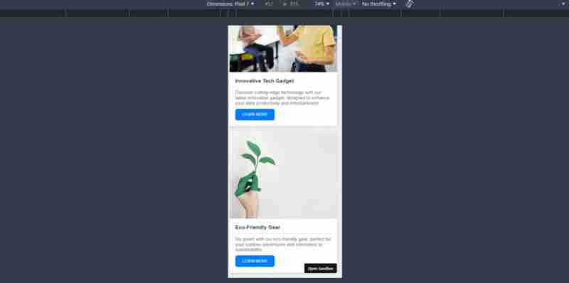
In the example, the product-wrapper creates a flexible grid layout to control the number of columns based on the container width. Then, each product-card aligns its rows directly with the grids defined by the product-wrapper.
Subgrid is particularly useful for e-commerce sites where product cards may contain varying amounts of content but must maintain a uniform appearance.
Refer to the following images.

Note: Check out the working demo for CSS subgrid.
3. Pseudo-Classes
Pseudo-classes such as :hover, :focus, and :first-child are options that select HTML elements based on their state rather than their hierarchy or sequence in the document. These selectors allow developers to create more interactive and responsive UIs without using JavaScript.
The following code example demonstrates several pseudo-classes in action.
// HTML
...
.hover-section:hover {
  background-color: rgb(82, 11, 145); /* Changes the background color on hover */
  color: white;
}
.input-section input[type="text"]:focus {
  border-color: orange; /* Highlights the input field when focused */
  background-color: lightyellow;
}
.list-section li:first-child {
  color: green; /* Styles the first item in a list */
}
.list-section li:last-child {
  color: red; /* Styles the last item in a list */
}
This CSS code example shows how to enhance user interaction by changing styles based on user actions, such as hovering or focusing on elements, and how to style specific children of a container.
These pseudo-classes are pretty useful when developing forms, navigation menus, and interactive content that requires visual cues to guide user interactions.
Refer to the following image.

Note: Check out this working demo for pseudo-classes.
4. Logical properties
CSS logical properties allow developers to manage layout and spacing in a direction-agnostic way. In other words, with CSS logical properties, you can use different writing modes, such as left-to-right (LTR) and right-to-left (RTL), without changing the structural code.
Here’s an example that uses logical properties for layout adjustments.
.lab-gradient-generator {
  margin-inline-start: 2rem; /* Responsive margin that adjusts based on text direction */
}
.lab-gradient-display {
  background: linear-gradient(
    to right,
    lab(var(--l-start) var(--a-start) var(--b-start)),
    lab(var(--l-end) var(--a-end) var(--b-end))
  ); /* Creates a gradient using LAB colors */
}
In this code example, margin-inline-start uses logical properties to ensure margins are always on the content starting side, adapting automatically to different writing systems. The background property with a LAB color gradient illustrates the use of logical properties in defining visually consistent color transitions.
Logical properties are particularly useful in global apps that require support for multiple languages, keeping the layouts the same regardless of directionality.
Refer to the following image.

Note: Refer to the working demo of how CSS logical properties can be used with internationalization.
5. Lab Color Space
Lab color space allows you to specify colors to align more closely with human vision. This method provides a broader and more precise range of colors, facilitating greater consistency across different displays.
Here’s a code example showcasing the usage of lab color space in CSS.
.color-strip:nth-child(1) {
  --l: 90%;
  --a: -80;
  --b: 80;
  background-color: lab(var(--l) var(--a) var(--b));
}
.color-strip:nth-child(2) {
  --l: 75%;
  --a: -40;
  --b: 40;
  background-color: lab(var(--l) var(--a) var(--b));
}
.color-strip:nth-child(3) {
  --l: 60%;
  --a: 0;
  --b: 0;
  background-color: lab(var(--l) var(--a) var(--b));
}
.color-strip:nth-child(4) {
  --l: 45%;
  --a: 40;
  --b: -40;
  background-color: lab(var(--l) var(--a) var(--b));
}
.color-strip:nth-child(5) {
  --l: 30%;
  --a: 80;
  --b: -80;
  background-color: lab(var(--l) var(--a) var(--b));
}
This code example sets up a series of divs (color-strip), each with a unique background color defined in the lab color space. It shows how lab colors produce a variety of hues and shades that are consistent across various displays.
Lab colors are invaluable in digital design, particularly in industries where color accuracy is critical, like digital art, online commerce, and brand design.
Refer to the following image.

Note: For more details, refer to the lab color space demo.
Conclusion
Thanks for reading! These CSS features offer unique advantages and new possibilities to improve the functionality and the user experience of your app. They also improve the developer experience, since these features simplify complex tasks for them.
So, make sure to try these examples yourself and implement them in your next web app to make it a modern one.
Related blogs
- React Styling: Essential Tips and Tricks for Designers
- Top 7 Ways to Write CSS in Your React or Next.js App
- Responsive Web Design Evolved: Introducing CSS Container Queries
- CSS Flex: What Every Developer Should Know
以上是odern CSS Styles You Should Know In 4的详细内容。更多信息请关注PHP中文网其他相关文章!
 @KeyFrames vs CSS过渡:有什么区别?May 14, 2025 am 12:01 AM
@keyframesandCSSTransitionsdifferincomplexity:@keyframesallowsfordetailedanimationsequences,whileCSSTransitionshandlesimplestatechanges.UseCSSTransitionsforhovereffectslikebuttoncolorchanges,and@keyframesforintricateanimationslikerotatingspinners.
 使用页面CMS进行静态站点内容管理May 13, 2025 am 09:24 AM
我知道,我知道:有大量的内容管理系统选项可用,而我进行了几个测试,但实际上没有一个是一个,y'知道吗?怪异的定价模型,艰难的自定义,有些甚至最终成为整个&
 链接HTML中CSS文件的最终指南May 13, 2025 am 12:02 AM
链接CSS文件到HTML可以通过在HTML的部分使用元素实现。1)使用标签链接本地CSS文件。2)多个CSS文件可通过添加多个标签实现。3)外部CSS文件使用绝对URL链接,如。4)确保正确使用文件路径和CSS文件加载顺序,优化性能可使用CSS预处理器合并文件。
 CSS Flexbox与网格:全面评论May 12, 2025 am 12:01 AM
选择Flexbox还是Grid取决于布局需求:1)Flexbox适用于一维布局,如导航栏;2)Grid适合二维布局,如杂志式布局。两者在项目中可结合使用,提升布局效果。
 如何包括CSS文件:方法和最佳实践May 11, 2025 am 12:02 AM
包含CSS文件的最佳方法是使用标签在HTML的部分引入外部CSS文件。1.使用标签引入外部CSS文件,如。2.对于小型调整,可以使用内联CSS,但应谨慎使用。3.大型项目可使用CSS预处理器如Sass或Less,通过@import导入其他CSS文件。4.为了性能,应合并CSS文件并使用CDN,同时使用工具如CSSNano进行压缩。
 Flexbox vs Grid:我应该学习两者吗?May 10, 2025 am 12:01 AM
是的,youshouldlearnbothflexboxandgrid.1)flexboxisidealforone-demensional,flexiblelayoutslikenavigationmenus.2)gridexcelstcelsintwo-dimensional,confffferDesignssignssuchasmagagazineLayouts.3)blosebothenHancesSunHanceSlineHancesLayOutflexibilitibilitibilitibilitibilityAnderibilitibilityAndresponScormentilial anderingStruction
 轨道力学(或我如何优化CSS KeyFrames动画)May 09, 2025 am 09:57 AM
重构自己的代码看起来是什么样的?约翰·瑞亚(John Rhea)挑选了他写的一个旧的CSS动画,并介绍了优化它的思维过程。


热AI工具

Undresser.AI Undress
人工智能驱动的应用程序,用于创建逼真的裸体照片

AI Clothes Remover
用于从照片中去除衣服的在线人工智能工具。

Undress AI Tool
免费脱衣服图片

Clothoff.io
AI脱衣机

Video Face Swap
使用我们完全免费的人工智能换脸工具轻松在任何视频中换脸!

热门文章

热工具

适用于 Eclipse 的 SAP NetWeaver 服务器适配器
将Eclipse与SAP NetWeaver应用服务器集成。

SublimeText3 英文版
推荐:为Win版本,支持代码提示!

SecLists
SecLists是最终安全测试人员的伙伴。它是一个包含各种类型列表的集合,这些列表在安全评估过程中经常使用,都在一个地方。SecLists通过方便地提供安全测试人员可能需要的所有列表,帮助提高安全测试的效率和生产力。列表类型包括用户名、密码、URL、模糊测试有效载荷、敏感数据模式、Web shell等等。测试人员只需将此存储库拉到新的测试机上,他就可以访问到所需的每种类型的列表。

SublimeText3 Mac版
神级代码编辑软件(SublimeText3)

安全考试浏览器
Safe Exam Browser是一个安全的浏览器环境,用于安全地进行在线考试。该软件将任何计算机变成一个安全的工作站。它控制对任何实用工具的访问,并防止学生使用未经授权的资源。


