


下面透過圖文並茂的方式給大家展示下css3製作變形與動畫效果
css3製作動畫的幾個屬性:變形(transform),過渡(transition)和動畫(animation)。
下面介紹:過渡transition。
一、例
先透過一個例子感性認識transition的動畫效果。
滑鼠放上去,div寬度從100px增加到200px。
<style type="text/css">
div{
width: 100px;
height: 100px;
background-color: red;
}
div:hover{
width: 200px;
}</style><div></div>
這效果其實也算是動畫,但是非常變化非常快,不平滑。
如果想讓滑鼠放上去後div寬度在5s內平滑過渡到200px。只需要加一行程式碼;
div:hover{
width: 200px;
transition:width 5s ease-in;}
這效果其實也算是動畫,但是非常變化非常快,不平滑。
如果想讓滑鼠放上去後div寬度在5s內平滑過渡到200px。只需要加一行程式碼;
div:hover{
width: 200px;
transition:width 5s ease-in;}
這裡用到的就是transition屬性,它就是用來實現屬性值平滑過渡,視覺上產生動畫效果。
上面用的transition是縮寫,包含四個屬性:transition-property,transition-duration,transition-timing-function,transition-delay,下面會一一介紹。
二、transition
css3新增transition屬性,可以在事件觸發元素的樣式變化時,讓效果更細膩平滑。
transition用來描述如何讓css屬性值在一段時間內平滑的從一個值過渡到另一個值。這種過渡效果可以在滑鼠點擊、獲得焦點、被點擊或對元素任何改變中觸發。
文法:
transition :
[<'transition-property'> || <'transition-duration'> || <'transition-timing-function'> ||
<'transition-delay'> [, [<'transition-property'> || <'transition-duration'> ||
<'transition-timing-function'> || <'transition-delay'>]]*
transition有四個屬性值:
transition-property:執行過渡的屬性。
transition-duration:指定完成過渡所需的時間。
transition-timing-function,在延續時間段,過渡變換的速率變化,簡單理解就是指定過渡函數。
transition-delay:過渡延遲時間。
1、transition-property
transition-property用來指定哪個屬性使用過渡動畫效果。
文法:
transition-property : none | all | [
none:所有屬性都不應用過渡效果。
all:預設值。當值為all時,元素產生任何屬性值變化時都會執行transition效果。
ident:元素屬性名。透過ident指定具體哪些屬性。如果指定的多個屬性中有某個屬性不能套用過渡效果,其他屬性還是生效的。
過渡屬性只有具備一個中點值的屬性(需要產生動畫的屬性)才能有過渡效果。在w3c中列出了所有可以實現transition效果的css屬性值以及值的類型
Property Name
Typebackground-color
as colorbackground-position
as repeatable list of simple list of length, percentage, or calcborder-bottom-color
as colorborder-bottom-width
as lengthborder-left-color
as colorborder-left-width
as lengthborder-right-color
as colorborder-right-width
as lengthborder-spacing
as simple list of lengthborder-top-color
as colorborder-top-width
as lengthbottom
as length, percentage, or calcclip
as rectanglecolor
as colorfont-size
as lengthfont-weight
as font weightheight
as length, percentage, or calcleft
as length, percentage, or calcletter-spacing
as lengthline-height
as either number or lengthmargin-bottom
as lengthmargin-left
as lengthmargin-right
as lengthmargin-top
as lengthmax-height
as length, percentage, or calcmax-width
as length, percentage, or calcmin-height
as length, percentage, or calcmin-width
as length, percentage, or calcopacity
as numberoutline-color
as coloroutline-width
as lengthpadding-bottom
as lengthpadding-left
as lengthpadding-right
as lengthpadding-top
as lengthright
as length, percentage, or calctext-indent
as length, percentage, or calctext-shadow
as shadow listtop
as length, percentage, or calcvertical-align
as lengthvisibility
as visibilitywidth
as length, percentage, or calcword-spacing
as lengthz-index
as integer
Note:並不是什麼屬性改變都會觸發transiton動畫效果,例如頁面的自適應寬度,當瀏覽器改變寬度時,並不會觸發transition的效果。但上述表格所示的屬性類型改變都會觸發一個transition動作效果。
舉例:可以同時為幾個屬性設定動畫效果,例如給height和line-height同時設定動畫效果,實現div變高文字仍然垂直居中。
<!DOCTYPE html><html><head>
<meta charset="utf-8">
<title>变形与动画</title>
<style type="text/css">div {
width: 300px;
height: 200px;
line-height: 200px;
text-align: center;
background-color: orange;
margin: 20px auto;
-webkit-transition-property: height line-height;
transition-property: height line-height;
-webkit-transition-duration: 1s;
transition-duration: 1s;
-webkit-transition-timing-function: ease-out;
transition-timing-function: ease-out;
-webkit-transition-delay: .2s;
transition-delay: .2s;}div:hover {
height: 100px;
line-height: 100px;}</style></head><body>
<div>文字垂直居中</div></body></html>

2、transition-duration
transition-duration用來設定從舊屬性過渡到新屬性所需的時間,即持續時間。
3、transition-timing-function
文法:
transition-timing-function属性指的是过渡的“缓动函数”。通过这个函数会建立一条加速度曲线,因此在整个transition变化过程中,变化速度可以不断改变。主要包括以下几种函数。
ease:默认值,元素样式从初始状态过渡到终止状态速度由快到慢,逐渐变慢。linear:意思是线性过渡,即过渡过程恒速。ease-in:速度越来越快,呈现加速状态,通常称为“渐显效果”。ease-out:速度越来越慢,呈现减速状态,通常称为“渐隐效果”。ease-in-out速度先加速后减速,称为“渐显渐隐效果”。
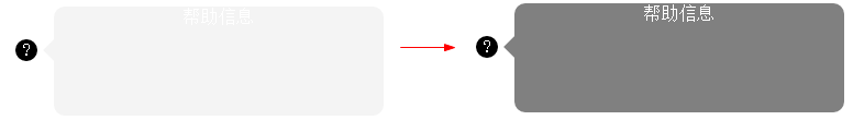
举例:鼠标经过问号,帮助信息渐显渐隐。
<!doctype html><html><head>
<meta charset="utf-8">
<title>transition-demo by starof</title>
<style>#help{
width:20px;
height:20px;
border-radius:10px;
color:#fff;
background:#000;
text-align:center;
position:relative;
margin:50px 20px;
cursor:pointer;}#help .tips{
position:absolute;
width:300px;
height:100px;
background:#000;
top:-30px;
left:35px;
border-radius:10px;
opacity:0;
/*渐隐效果*/
transition: opacity .8s ease-in-out;
-moz-transition: opacity .8s ease-in-out;
-webkit-transition: opacity .8s ease-in-out;}.tips:before{
content:"";
border-width:10px;
border-style:solid;
border-color:transparent #000 transparent transparent;
position:absolute;
left:-20px;
top:30px;}#help:hover .tips{
opacity:0.5;
/*渐显效果*/
transition: opacity .8s ease-in-out;
-moz-transition: opacity .8s ease-in-out;
-webkit-transition: opacity .8s ease-in-out;}</style></head><body>
<div id="help">
?
<div >帮助信息</div>
</div></body></html>
4、transition-delay
transition-delay设置改变属性值后多长时间开始执行动画。
5、属性简写
在改变多个css属性的transition效果时,把几个transition声明用逗号隔开,然后每个属性就都有各自的过渡时间和效果。
Note:第一个时间是时长,第二个是延时。
a{
transition: background 0.8s ease-in 0.3,
color 0.6s ease-out 0.3;}
三、贝塞尔曲线和transition
transition的数学模型就是贝塞尔曲线,下面介绍。
曲线其实就是两点之间插值的效果,贝塞尔曲线是一种插值算法,比线性插值复杂一点。
贝塞尔曲线:起始点,终止点(也称锚点),控制点。通过调整控制点,贝塞尔曲线的形状发生变化。
k阶贝塞尔插值算法需要k+1个控制点。
一阶贝塞尔曲线(线段):意思就是从P0到P1的连续点,用来描述一段线段。一次贝塞尔插值就是线性插值。


二阶贝塞尔曲线(抛物线):P0-P1是曲线在P0处的切线。

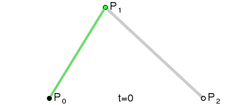
三阶贝塞尔曲线:

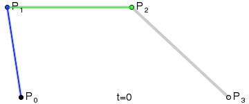
transition用到的就是三阶贝塞尔插值算法,如下图。
时间在0,1区间,待变换属性也认为是0,1区间。P0和P3的坐标一直是(0,0)和(1,1)。transition-timing-function属性用来确定P1和P2的坐标。
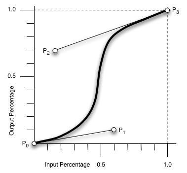
ease [0, 0] [0.25, 0.1] [0.25, 1.0] [1.0,1.0]
linear [0, 0] [0.0, 0.0] [1.0, 1.0] [1.0,1.0]
ease-in [0, 0] [0.42, 0] [1.0, 1.0] [1.0,1.0]
ease-out [0, 0] [0, 0] [0.58, 1.0] [1.0,1.0]
ease-in-out [0, 0] [0.42, 0] [0.58, 1.0] [1.0,1.0]
step-start steps(1,start)
step-end steps(1,end)
cubic-bezier(x1,y1,x2,y2) [0, 0] [x1, y1] [x2, y2] [1.0,1.0]
四、其他相关资料
canvas画贝塞尔曲线
<!DOCTYPE html PUBLIC "-//W3C//DTD XHTML 1.0 Transitional//EN" "http://www.w3.org/TR/xhtml1/DTD/xhtml1-transitional.dtd">
<html xmlns="http://www.w3.org/1999/xhtml">
<head>
<meta http-equiv="Content-Type" content="text/html; charset=utf-8">
<title>bezier demo</title>
</head>
<body>
<div style="width:800px;height:600px;background-color:#fac0c0;">
<canvas id="cvs" width="800" height="600">骚瑞,您的浏览器不支持canvas</canvas>
</div>
<script type="text/javascript">var cvs=document.getElementById("cvs"),
context=cvs.getContext("2d"),points=[];function getXY(node){var x=0,y=0;if (node.offsetParent)
{while (node.offsetParent)
{x += node.offsetLeft;y += node.offsetTop;node = node.offsetParent;}}
else {node.x && (x += node.x);node.y && (y += node.y);}return [x,y];}
function drawPoint(x,y,c,b) {!b && (b=2);context.fillStyle=c || "red";
context.fillRect(x,y,b,b);}function bezier(points,t){var i,n=points.length-1,x=0,y=0;function fn(p,n,i,t){return arrangement(n,i)*p*Math.pow(1-t,n-i)*Math.pow(t,i);}for(i=0;i<n+1;i++){x+=fn(points[i][0],n,i,t);
y+=fn(points[i][1],n,i,t);}return [x,y];}function factorial(n){if(isNaN(n) || n<=0 || Math.floor(n)!==n){return 1;}var s=1;
while(n){s*=n--;}return s;}function arrangement(n,r){return factorial(n)/(factorial(r)*factorial(n-r));}
cvs.addEventListener("click",function(event){var i,point=getXY(this),x=event.clientX-point[0]+(document.documentElement.scrollLeft || document.body.scrollLeft),y=event.clientY-point[1]+(document.documentElement.scrollTop || document.body.scrollTop);points.push([x,y]);context.clearRect(0,0,screen.width,screen.height);context.beginPath();
//pointsfor(i=0;i<points.length;i++){drawPoint(points[i][0],points[i][1],"blue",4);}//bezierfor (i = 0; i < 1; i += 0.001)
{drawPoint.apply(this, bezier(points,i));}//lineif(points.length==1){context.moveTo(points[0][0],points[0][1]);}else if (points.length>1){for(i=0;i<points.length;i++){context.lineTo(points[i][0],points[i][1]);}
context.lineWidth=0.2;context.stroke();context.closePath();}},true);</script>
</body>
</html>

希望这些内容可以帮助到大家,谢谢。

 在JavaScript中替換字符串字符Mar 11, 2025 am 12:07 AM
JavaScript字符串替換方法詳解及常見問題解答 本文將探討兩種在JavaScript中替換字符串字符的方法:在JavaScript代碼內部替換和在網頁HTML內部替換。 在JavaScript代碼內部替換字符串 最直接的方法是使用replace()方法: str = str.replace("find","replace"); 該方法僅替換第一個匹配項。要替換所有匹配項,需使用正則表達式並添加全局標誌g: str = str.replace(/fi
 自定義Google搜索API設置教程Mar 04, 2025 am 01:06 AM
本教程向您展示瞭如何將自定義的Google搜索API集成到您的博客或網站中,提供了比標準WordPress主題搜索功能更精緻的搜索體驗。 令人驚訝的是簡單!您將能夠將搜索限制為Y
 構建您自己的Ajax Web應用程序Mar 09, 2025 am 12:11 AM
因此,在這裡,您準備好了解所有稱為Ajax的東西。但是,到底是什麼? AJAX一詞是指用於創建動態,交互式Web內容的一系列寬鬆的技術。 Ajax一詞,最初由Jesse J創造
 示例顏色json文件Mar 03, 2025 am 12:35 AM
本文系列在2017年中期進行了最新信息和新示例。 在此JSON示例中,我們將研究如何使用JSON格式將簡單值存儲在文件中。 使用鍵值對符號,我們可以存儲任何類型的
 10個jQuery語法熒光筆Mar 02, 2025 am 12:32 AM
增強您的代碼演示文稿:10個語法熒光筆針對開發人員在您的網站或博客上共享代碼段的開發人員是開發人員的常見實踐。 選擇合適的語法熒光筆可以顯著提高可讀性和視覺吸引力。 t
 8令人驚嘆的jQuery頁面佈局插件Mar 06, 2025 am 12:48 AM
利用輕鬆的網頁佈局:8 ESTISSEL插件jQuery大大簡化了網頁佈局。 本文重點介紹了簡化該過程的八個功能強大的JQuery插件,對於手動網站創建特別有用
 10 JavaScript和JQuery MVC教程Mar 02, 2025 am 01:16 AM
本文介紹了關於JavaScript和JQuery模型視圖控制器(MVC)框架的10多個教程的精選選擇,非常適合在新的一年中提高您的網絡開發技能。 這些教程涵蓋了來自Foundatio的一系列主題
 什麼是這個&#x27;在JavaScript?Mar 04, 2025 am 01:15 AM
核心要點 JavaScript 中的 this 通常指代“擁有”該方法的對象,但具體取決於函數的調用方式。 沒有當前對象時,this 指代全局對象。在 Web 瀏覽器中,它由 window 表示。 調用函數時,this 保持全局對象;但調用對象構造函數或其任何方法時,this 指代對象的實例。 可以使用 call()、apply() 和 bind() 等方法更改 this 的上下文。這些方法使用給定的 this 值和參數調用函數。 JavaScript 是一門優秀的編程語言。幾年前,這句話可


熱AI工具

Undresser.AI Undress
人工智慧驅動的應用程序,用於創建逼真的裸體照片

AI Clothes Remover
用於從照片中去除衣服的線上人工智慧工具。

Undress AI Tool
免費脫衣圖片

Clothoff.io
AI脫衣器

AI Hentai Generator
免費產生 AI 無盡。

熱門文章
熱工具

禪工作室 13.0.1
強大的PHP整合開發環境

記事本++7.3.1
好用且免費的程式碼編輯器

SecLists
SecLists是最終安全測試人員的伙伴。它是一個包含各種類型清單的集合,這些清單在安全評估過程中經常使用,而且都在一個地方。 SecLists透過方便地提供安全測試人員可能需要的所有列表,幫助提高安全測試的效率和生產力。清單類型包括使用者名稱、密碼、URL、模糊測試有效載荷、敏感資料模式、Web shell等等。測試人員只需將此儲存庫拉到新的測試機上,他就可以存取所需的每種類型的清單。

ZendStudio 13.5.1 Mac
強大的PHP整合開發環境

EditPlus 中文破解版
體積小,語法高亮,不支援程式碼提示功能

