


異常資料4種剔除方法分別是:1、“isolation forest”,孤立森林;2、DBSCAN;3、OneClassSVM;4、“Local Outlier Factor”,計算一個數值score來反映一個樣本的異常程度。

本教學操作環境:windows7系統、Dell G3電腦。
outlier detection異常點識別方法
1. isolation forest 孤立森林
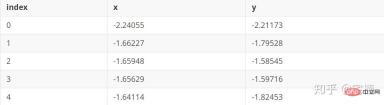
1.1 測試樣本範例
檔案test.pkl
1.2 孤立森林demo
孤立森林原理
#透過對特徵進行隨機劃分,建立隨機森林,將經過較少次數進行劃分就可以劃分出來的點認為時異常點。
# 参考https://blog.csdn.net/ye1215172385/article/details/79762317
# 官方例子https://scikit-learn.org/stable/auto_examples/ensemble/plot_isolation_forest.html#sphx-glr-auto-examples-ensemble-plot-isolation-forest-py
import numpy as np
import matplotlib.pyplot as plt
from sklearn.ensemble import IsolationForest

rng = np.random.RandomState(42)

# 构造训练样本
n_samples = 200  #样本总数
outliers_fraction = 0.25  #异常样本比例
n_inliers = int((1. - outliers_fraction) * n_samples)
n_outliers = int(outliers_fraction * n_samples)

X = 0.3 * rng.randn(n_inliers // 2, 2)
X_train = np.r_[X + 2, X - 2]   #正常样本
X_train = np.r_[X_train, np.random.uniform(low=-6, high=6, size=(n_outliers, 2))]  #正常样本加上异常样本

# 构造模型并拟合
clf = IsolationForest(max_samples=n_samples, random_state=rng, contamination=outliers_fraction)
clf.fit(X_train)
# 计算得分并设置阈值
scores_pred = clf.decision_function(X_train)
threshold = np.percentile(scores_pred, 100 * outliers_fraction)  #根据训练样本中异常样本比例,得到阈值,用于绘图

# plot the line, the samples, and the nearest vectors to the plane
xx, yy = np.meshgrid(np.linspace(-7, 7, 50), np.linspace(-7, 7, 50))
Z = clf.decision_function(np.c_[xx.ravel(), yy.ravel()])
Z = Z.reshape(xx.shape)

plt.title("IsolationForest")
# plt.contourf(xx, yy, Z, cmap=plt.cm.Blues_r)
plt.contourf(xx, yy, Z, levels=np.linspace(Z.min(), threshold, 7), cmap=plt.cm.Blues_r)  #绘制异常点区域,值从最小的到阈值的那部分
a = plt.contour(xx, yy, Z, levels=[threshold], linewidths=2, colors='red')  #绘制异常点区域和正常点区域的边界
plt.contourf(xx, yy, Z, levels=[threshold, Z.max()], colors='palevioletred')  #绘制正常点区域,值从阈值到最大的那部分

b = plt.scatter(X_train[:-n_outliers, 0], X_train[:-n_outliers, 1], c='white',
                    s=20, edgecolor='k')
c = plt.scatter(X_train[-n_outliers:, 0], X_train[-n_outliers:, 1], c='black',
                    s=20, edgecolor='k')
plt.axis('tight')
plt.xlim((-7, 7))
plt.ylim((-7, 7))
plt.legend([a.collections[0], b, c],
           ['learned decision function', 'true inliers', 'true outliers'],
           loc="upper left")
plt.show()
1.3 自己修改的,X_train能夠改成自己需要的數據
此處沒有進行標準化,可以先進行標準化再在標準化的基礎上去除異常點, from sklearn.preprocessing import StandardScaler
import numpy as np
import matplotlib.pyplot as plt
from sklearn.ensemble import IsolationForest
from scipy import stats

rng = np.random.RandomState(42)


X_train =  X_train_demo.values
outliers_fraction = 0.1
n_samples = 500
# 构造模型并拟合
clf = IsolationForest(max_samples=n_samples, random_state=rng, contamination=outliers_fraction)
clf.fit(X_train)
# 计算得分并设置阈值
scores_pred = clf.decision_function(X_train)
threshold = stats.scoreatpercentile(scores_pred, 100 * outliers_fraction)  #根据训练样本中异常样本比例,得到阈值,用于绘图

# plot the line, the samples, and the nearest vectors to the plane
range_max_min0 = (X_train[:,0].max()-X_train[:,0].min())*0.2
range_max_min1 = (X_train[:,1].max()-X_train[:,1].min())*0.2
xx, yy = np.meshgrid(np.linspace(X_train[:,0].min()-range_max_min0, X_train[:,0].max()+range_max_min0, 500),
                     np.linspace(X_train[:,1].min()-range_max_min1, X_train[:,1].max()+range_max_min1, 500))
Z = clf.decision_function(np.c_[xx.ravel(), yy.ravel()])
Z = Z.reshape(xx.shape)

plt.title("IsolationForest")
# plt.contourf(xx, yy, Z, cmap=plt.cm.Blues_r)
plt.contourf(xx, yy, Z, levels=np.linspace(Z.min(), threshold, 7), cmap=plt.cm.Blues_r)  #绘制异常点区域,值从最小的到阈值的那部分
a = plt.contour(xx, yy, Z, levels=[threshold], linewidths=2, colors='red')  #绘制异常点区域和正常点区域的边界
plt.contourf(xx, yy, Z, levels=[threshold, Z.max()], colors='palevioletred')  #绘制正常点区域,值从阈值到最大的那部分


is_in = clf.predict(X_train)>0
b = plt.scatter(X_train[is_in, 0], X_train[is_in, 1], c='white',
                    s=20, edgecolor='k')
c = plt.scatter(X_train[~is_in, 0], X_train[~is_in, 1], c='black',
                    s=20, edgecolor='k')
plt.axis('tight')
plt.xlim((X_train[:,0].min()-range_max_min0, X_train[:,0].max()+range_max_min0,))
plt.ylim((X_train[:,1].min()-range_max_min1, X_train[:,1].max()+range_max_min1,))
plt.legend([a.collections[0], b, c],
           ['learned decision function', 'inliers', 'outliers'],
           loc="upper left")
plt.show()
1.4 核心程式碼
1.4.1 範例樣本
import numpy as np
# 构造训练样本
n_samples = 200  #样本总数
outliers_fraction = 0.25  #异常样本比例
n_inliers = int((1. - outliers_fraction) * n_samples)
n_outliers = int(outliers_fraction * n_samples)

X = 0.3 * rng.randn(n_inliers // 2, 2)
X_train = np.r_[X + 2, X - 2]   #正常样本
X_train = np.r_[X_train, np.random.uniform(low=-6, high=6, size=(n_outliers, 2))]  #正常样本加上异常样本
1.4.2 核心程式碼實作
clf = IsolationForest(max_samples=0.8, contamination=0.25)
from sklearn.ensemble import IsolationForest
# fit the model
# max_samples 构造一棵树使用的样本数,输入大于1的整数则使用该数字作为构造的最大样本数目,
# 如果数字属于(0,1]则使用该比例的数字作为构造iforest
# outliers_fraction 多少比例的样本可以作为异常值
clf = IsolationForest(max_samples=0.8, contamination=0.25)
clf.fit(X_train)
# y_pred_train = clf.predict(X_train)
scores_pred = clf.decision_function(X_train)
threshold = np.percentile(scores_pred, 100 * outliers_fraction)  #根据训练样本中异常样本比例,得到阈值,用于绘图

## 以下两种方法的筛选结果,完全相同
X_train_predict1 = X_train[clf.predict(X_train)==1]
X_train_predict2 = X_train[scores_pred>=threshold,:]
# 其中,1的表示非异常点,-1的表示为异常点
clf.predict(X_train)
array([ 1,  1,  1,  1,  1,  1,  1,  1,  1,  1,  1,  1,  1,  1,  1,  1,  1,
        1,  1,  1,  1,  1,  1,  1,  1,  1,  1,  1,  1,  1,  1,  1,  1,  1,
        1,  1,  1,  1,  1,  1,  1,  1,  1,  1,  1,  1,  1,  1,  1,  1,  1,
        1,  1,  1,  1,  1,  1,  1,  1,  1,  1,  1,  1,  1,  1,  1,  1, -1,
        1,  1,  1,  1,  1,  1,  1,  1,  1,  1,  1,  1,  1,  1,  1,  1,  1,
        1,  1,  1,  1,  1,  1,  1,  1,  1,  1,  1,  1,  1,  1,  1,  1,  1,
        1,  1,  1,  1,  1,  1,  1,  1,  1,  1,  1,  1,  1,  1,  1,  1,  1,
        1,  1,  1,  1,  1,  1,  1,  1,  1,  1,  1,  1,  1,  1,  1,  1,  1,
        1,  1,  1,  1,  1,  1,  1,  1,  1,  1,  1,  1,  1,  1, -1, -1, -1,
       -1, -1, -1, -1, -1, -1, -1,  1, -1, -1, -1, -1, -1, -1, -1, -1, -1,
       -1, -1, -1, -1, -1, -1, -1, -1, -1, -1, -1, -1, -1, -1, -1, -1, -1,
       -1, -1, -1, -1, -1, -1, -1, -1, -1, -1, -1, -1, -1])
2. DBSCAN
DBSCAN(Density-Based Spatial Clustering of Applications with Noise) 原理
以每個點為中心,設定鄰域及鄰域內需要有多少個點,如果樣本點大於指定要求,則認為該點與鄰域內的點屬於同一類,如果小於指定值,若該點位於其它點的鄰域內,則屬於邊界點。
2.1 DBSCAN demo
# 参考https://blog.csdn.net/hb707934728/article/details/71515160
#
# 官方示例 https://scikit-learn.org/stable/auto_examples/cluster/plot_dbscan.html#sphx-glr-auto-examples-cluster-plot-dbscan-py

import numpy as np

import matplotlib.pyplot as plt
import matplotlib.colors

import sklearn.datasets as ds
from sklearn.cluster import DBSCAN
from sklearn.preprocessing import StandardScaler


def expand(a, b):
    d = (b - a) * 0.1
    return a-d, b+d


if __name__ == "__main__":
    N = 1000
    centers = [[1, 2], [-1, -1], [1, -1], [-1, 1]]
    #scikit中的make_blobs方法常被用来生成聚类算法的测试数据,直观地说,make_blobs会根据用户指定的特征数量、
    # 中心点数量、范围等来生成几类数据,这些数据可用于测试聚类算法的效果。
    #函数原型:sklearn.datasets.make_blobs(n_samples=100, n_features=2,
    # centers=3, cluster_std=1.0, center_box=(-10.0, 10.0), shuffle=True, random_state=None)[source]
    #参数解析:
    # n_samples是待生成的样本的总数。
    #
    # n_features是每个样本的特征数。
    #
    # centers表示类别数。
    #
    # cluster_std表示每个类别的方差,例如我们希望生成2类数据,其中一类比另一类具有更大的方差,可以将cluster_std设置为[1.0, 3.0]。
    data, y = ds.make_blobs(N, n_features=2, centers=centers, cluster_std=[0.5, 0.25, 0.7, 0.5], random_state=0)
    data = StandardScaler().fit_transform(data)
    # 数据1的参数:(epsilon, min_sample)
    params = ((0.2, 5), (0.2, 10), (0.2, 15), (0.3, 5), (0.3, 10), (0.3, 15))

    plt.figure(figsize=(12, 8), facecolor='w')
    plt.suptitle(u'DBSCAN clustering', fontsize=20)

    for i in range(6):
        eps, min_samples = params[i]
        #参数含义:
        #eps:半径,表示以给定点P为中心的圆形邻域的范围
        #min_samples:以点P为中心的邻域内最少点的数量
        #如果满足,以点P为中心,半径为EPS的邻域内点的个数不少于MinPts,则称点P为核心点
        model = DBSCAN(eps=eps, min_samples=min_samples)
        model.fit(data)
        y_hat = model.labels_

        core_indices = np.zeros_like(y_hat, dtype=bool)  # 生成数据类型和数据shape和指定array一致的变量
        core_indices[model.core_sample_indices_] = True  # model.core_sample_indices_ border point位于y_hat中的下标

        # 统计总共有积累,其中为-1的为未分类样本
        y_unique = np.unique(y_hat)
        n_clusters = y_unique.size - (1 if -1 in y_hat else 0)
        print (y_unique, '聚类簇的个数为:', n_clusters)

        plt.subplot(2, 3, i+1) # 对第几个图绘制,2行3列,绘制第i+1个图
        # plt.cm.spectral https://blog.csdn.net/robin_Xu_shuai/article/details/79178857
        clrs = plt.cm.Spectral(np.linspace(0, 0.8, y_unique.size)) #用于给画图灰色
        for k, clr in zip(y_unique, clrs):
            cur = (y_hat == k)
            if k == -1:
                # 用于绘制未分类样本
                plt.scatter(data[cur, 0], data[cur, 1], s=20, c='k')
                continue
            # 绘制正常节点
            plt.scatter(data[cur, 0], data[cur, 1], s=30, c=clr, edgecolors='k')
            # 绘制边缘点
            plt.scatter(data[cur & core_indices][:, 0], data[cur & core_indices][:, 1], s=60, c=clr, marker='o', edgecolors='k')
        x1_min, x2_min = np.min(data, axis=0)
        x1_max, x2_max = np.max(data, axis=0)
        x1_min, x1_max = expand(x1_min, x1_max)
        x2_min, x2_max = expand(x2_min, x2_max)
        plt.xlim((x1_min, x1_max))
        plt.ylim((x2_min, x2_max))
        plt.grid(True)
        plt.title(u'$epsilon$ = %.1f m = %d clustering num %d'%(eps, min_samples, n_clusters), fontsize=16)
    plt.tight_layout()
    plt.subplots_adjust(top=0.9)
    plt.show()
[-1  0  1  2  3] 聚类簇的个数为: 4
[-1  0  1  2  3] 聚类簇的个数为: 4
[-1  0  1  2  3  4] 聚类簇的个数为: 5
[-1  0] 聚类簇的个数为: 1
[-1  0  1] 聚类簇的个数为: 2
[-1  0  1  2  3] 聚类簇的个数为: 4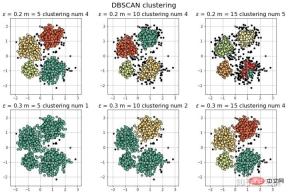
#2.2 使用自訂測試範例
#
# 参考https://blog.csdn.net/hb707934728/article/details/71515160
#
# 官方示例 https://scikit-learn.org/stable/auto_examples/cluster/plot_dbscan.html#sphx-glr-auto-examples-cluster-plot-dbscan-py
import numpy as np
import matplotlib.pyplot as plt
import matplotlib.colors
import sklearn.datasets as ds
from sklearn.cluster import DBSCAN
from sklearn.preprocessing import StandardScaler
def expand(a, b):
d = (b - a) * 0.1
return a-d, b+d
if __name__ == "__main__":
N = 1000
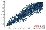
data = X_train_demo.values
# 数据1的参数:(epsilon, min_sample)
params = ((0.2, 5), (0.2, 10), (0.2, 15), (0.2, 20), (0.2, 25), (0.2, 30))
plt.figure(figsize=(12, 8), facecolor='w')
plt.suptitle(u'DBSCAN clustering', fontsize=20)
for i in range(6):
eps, min_samples = params[i]
#参数含义:
#eps:半径,表示以给定点P为中心的圆形邻域的范围
#min_samples:以点P为中心的邻域内最少点的数量
#如果满足,以点P为中心,半径为EPS的邻域内点的个数不少于MinPts,则称点P为核心点
model = DBSCAN(eps=eps, min_samples=min_samples)
model.fit(data)
y_hat = model.labels_
core_indices = np.zeros_like(y_hat, dtype=bool) # 生成数据类型和数据shape和指定array一致的变量
core_indices[model.core_sample_indices_] = True # model.core_sample_indices_ border point位于y_hat中的下标
# 统计总共有积累,其中为-1的为未分类样本
y_unique = np.unique(y_hat)
n_clusters = y_unique.size - (1 if -1 in y_hat else 0)
print (y_unique, '聚类簇的个数为:', n_clusters)
plt.subplot(2, 3, i+1) # 对第几个图绘制,2行3列,绘制第i+1个图
# plt.cm.spectral https://blog.csdn.net/robin_Xu_shuai/article/details/79178857
clrs = plt.cm.Spectral(np.linspace(0, 0.8, y_unique.size)) #用于给画图灰色
for k, clr in zip(y_unique, clrs):
cur = (y_hat == k)
if k == -1:
# 用于绘制未分类样本
plt.scatter(data[cur, 0], data[cur, 1], s=20, c='k')
continue
# 绘制正常节点
plt.scatter(data[cur, 0], data[cur, 1], s=30, c=clr, edgecolors='k')
# 绘制边缘点
plt.scatter(data[cur & core_indices][:, 0], data[cur & core_indices][:, 1], s=60, c=clr, marker='o', edgecolors='k')
x1_min, x2_min = np.min(data, axis=0)
x1_max, x2_max = np.max(data, axis=0)
x1_min, x1_max = expand(x1_min, x1_max)
x2_min, x2_max = expand(x2_min, x2_max)
plt.xlim((x1_min, x1_max))
plt.ylim((x2_min, x2_max))
plt.grid(True)
plt.title(u'$epsilon$ = %.1f m = %d clustering num %d'%(eps, min_samples, n_clusters), fontsize=14)
plt.tight_layout()
plt.subplots_adjust(top=0.9)
plt.show()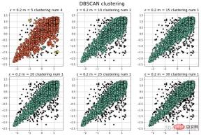
注意:可以看到在測試樣例的兩端,相較於與孤立森林,DBSCAN能夠很好地對「尖端」處的樣本的分類。
2.3 核心程式碼
model = DBSCAN(eps=eps, min_samples=min_samples) # 建構分類器
from sklearn.cluster import DBSCAN
from sklearn import metrics
data = X_train_demo.values
eps, min_samples = 0.2, 10
# eps为领域的大小,min_samples为领域内最小点的个数
model = DBSCAN(eps=eps, min_samples=min_samples) # 构造分类器
model.fit(data) # 拟合
labels = model.labels_ # 获取类别标签,-1表示未分类
# 获取其中的core points
core_indices = np.zeros_like(labels, dtype=bool)  # 生成数据类型和数据shape和指定array一致的变量
core_indices[model.core_sample_indices_] = True  # model.core_sample_indices_ border point位于labels中的下标
core_point = data[core_indices]
# 获取非异常点
normal_point = data[labels>=0]
# 绘制剔除了异常值后的图
plt.scatter(normal_point[:,0],normal_point[:,1],edgecolors='k')
plt.show()
2.4 建構過濾函數
此函數先進行了標準化,方便使用固定的參數進行分析
2.4.1 濾波函數
def filter_data(data0, params):
    from sklearn.cluster import DBSCAN
    from sklearn import metrics
    scaler = StandardScaler()
    scaler.fit(data0)
    data = scaler.transform(data0)

    eps, min_samples = params
    # eps为领域的大小,min_samples为领域内最小点的个数
    model = DBSCAN(eps=eps, min_samples=min_samples) # 构造分类器
    model.fit(data) # 拟合
    labels = model.labels_ # 获取类别标签,-1表示未分类
    # 获取其中的core points
    core_indices = np.zeros_like(labels, dtype=bool)  # 生成数据类型和数据shape和指定array一致的变量
    core_indices[model.core_sample_indices_] = True  # model.core_sample_indices_ border point位于labels中的下标
    core_point = data[core_indices]
    # 获取非异常点
    normal_point = data0[labels>=0]
    return normal_point
2.4.2 衡量分類結果
(markdown格式懶得轉,直接截圖了::>_<::>

# 轮廓系数
metrics.silhouette_score(data, labels, metric='euclidean')
[out]0.13250260550638607
# Calinski-Harabaz Index 系数
metrics.calinski_harabaz_score(data, labels,)
[out]16.414158842632794
3. OneClassSVM
# reference:https://scikit-learn.org/stable/auto_examples/svm/plot_oneclass.html#sphx-glr-auto-examples-svm-plot-oneclass-py

import numpy as np
import matplotlib.pyplot as plt
import matplotlib.font_manager
from sklearn import svm

xx, yy = np.meshgrid(np.linspace(-5, 5, 500), np.linspace(-5, 5, 500))
# Generate train data
X = 0.3 * np.random.randn(100, 2)
X_train = np.r_[X + 2, X - 2]
# Generate some regular novel observations
X = 0.3 * np.random.randn(20, 2)
X_test = np.r_[X + 2, X - 2]
# Generate some abnormal novel observations
X_outliers = np.random.uniform(low=-4, high=4, size=(20, 2))

# fit the model
clf = svm.OneClassSVM(nu=0.1, kernel="rbf", gamma=0.1)
clf.fit(X_train)
y_pred_train = clf.predict(X_train)
y_pred_test = clf.predict(X_test)
y_pred_outliers = clf.predict(X_outliers)
n_error_train = y_pred_train[y_pred_train == -1].size
n_error_test = y_pred_test[y_pred_test == -1].size
n_error_outliers = y_pred_outliers[y_pred_outliers == 1].size

# plot the line, the points, and the nearest vectors to the plane
Z = clf.decision_function(np.c_[xx.ravel(), yy.ravel()])
Z = Z.reshape(xx.shape)

plt.title("Novelty Detection")
plt.contourf(xx, yy, Z, levels=np.linspace(Z.min(), 0, 7), cmap=plt.cm.PuBu)
a = plt.contour(xx, yy, Z, levels=[0], linewidths=2, colors='darkred')
plt.contourf(xx, yy, Z, levels=[0, Z.max()], colors='palevioletred')

s = 40
b1 = plt.scatter(X_train[:, 0], X_train[:, 1], c='white', s=s, edgecolors='k')
b2 = plt.scatter(X_test[:, 0], X_test[:, 1], c='blueviolet', s=s,
                 edgecolors='k')
c = plt.scatter(X_outliers[:, 0], X_outliers[:, 1], c='gold', s=s,
                edgecolors='k')
plt.axis('tight')
plt.xlim((-5, 5))
plt.ylim((-5, 5))
plt.legend([a.collections[0], b1, b2, c],
           ["learned frontier", "training observations",
            "new regular observations", "new abnormal observations"],
           loc="upper left",
           prop=matplotlib.font_manager.FontProperties(size=11))
plt.xlabel(
    "error train: %d/200 ; errors novel regular: %d/40 ; "
    "errors novel abnormal: %d/40"
    % (n_error_train, n_error_test, n_error_outliers))
plt.show()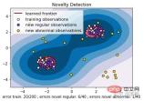
#3.2 核心程式碼
from sklearn import svm
X_train = X_train_demo.values
# 构造分类器
clf = svm.OneClassSVM(nu=0.2, kernel="rbf", gamma=0.2)
clf.fit(X_train)
# 预测,结果为-1或者1
labels = clf.predict(X_train)
# 分类分数
score = clf.decision_function(X_train) # 获取置信度
# 获取正常点
X_train_normal = X_train[labels>0]
進行剔除異常點之前
剔除異常點之後
plt.scatter(X_train_normal[:,0],X_train_normal[:,1])
plt.show()

#4. Local Outlier Factor(LOF)
LOF透過計算一個數值score來反映一個樣本的異常程度。這個數值的大致意思是:
一個樣本點周圍的樣本點所處位置的平均密度比上該樣本點所在位置的密度。比值越大於1,則該點所在位置的密度越小於其周圍樣本所在位置的密度。
#
# 参考https://blog.csdn.net/hb707934728/article/details/71515160
#
# 官方示例 https://scikit-learn.org/stable/auto_examples/cluster/plot_dbscan.html#sphx-glr-auto-examples-cluster-plot-dbscan-py

import numpy as np

import matplotlib.pyplot as plt
import matplotlib.colors

from sklearn.neighbors import LocalOutlierFactor

def expand(a, b):
    d = (b - a) * 0.1
    return a-d, b+d


if __name__ == "__main__":
    N = 1000
    data = X_train_demo.values
    # 数据1的参数:(epsilon, min_sample)
    params = ((0.01, 5), (0.05, 10), (0.1, 15), (0.15, 20), (0.2, 25), (0.25, 30))

    plt.figure(figsize=(12, 8), facecolor='w')
    plt.suptitle(u'DBSCAN clustering', fontsize=20)

    for i in range(6):
        outliers_fraction, min_samples = params[i]
        #参数含义:
        #eps:半径,表示以给定点P为中心的圆形邻域的范围
        #min_samples:以点P为中心的邻域内最少点的数量
        #如果满足,以点P为中心,半径为EPS的邻域内点的个数不少于MinPts,则称点P为核心点

        model = LocalOutlierFactor(n_neighbors=min_samples, contamination=outliers_fraction)
        y_hat = model.fit_predict(X_train)

        # 统计总共有积累,其中为-1的为未分类样本
        y_unique = np.unique(y_hat)

        # clrs = []
        # for c in np.linspace(16711680, 255, y_unique.size):
        #     clrs.append('#%06x' % c)
        plt.subplot(2, 3, i+1) # 对第几个图绘制,2行3列,绘制第i+1个图
        # plt.cm.spectral https://blog.csdn.net/robin_Xu_shuai/article/details/79178857
        clrs = plt.cm.Spectral(np.linspace(0, 0.8, y_unique.size)) #用于给画图灰色
        for k, clr in zip(y_unique, clrs):
            cur = (y_hat == k)
            if k == -1:
                # 用于绘制未分类样本
                plt.scatter(data[cur, 0], data[cur, 1], s=20, c='k')
                continue
            # 绘制正常节点
            plt.scatter(data[cur, 0], data[cur, 1], s=30, c=clr, edgecolors='k')
        x1_max, x2_max = np.max(data, axis=0)
        x1_min, x2_min = np.min(data, axis=0)
        x1_min, x1_max = expand(x1_min, x1_max)
        x2_min, x2_max = expand(x2_min, x2_max)
        plt.xlim((x1_min, x1_max))
        plt.ylim((x2_min, x2_max))
        plt.grid(True)
        plt.title(u'outliers_fraction = %.1f min_samples = %d'%(outliers_fraction, min_samples), fontsize=12)
    plt.tight_layout()
    plt.subplots_adjust(top=0.9)
    plt.show()
4.1 核心程式碼
from sklearn.neighbors import LocalOutlierFactor
X_train = X_train_demo.values
# 构造分类器
## 25个样本点为一组,异常值点比例为0.2
clf = LocalOutlierFactor(n_neighbors=25, contamination=0.2)
# 预测,结果为-1或者1
labels = clf.fit_predict(X_train)
# 获取正常点
X_train_normal = X_train[labels>0]
進行剔除異常點之前
plt.scatter(X_train[:,0],X_train[:,1])
plt.show()
plt.scatter(X_train_normal[:,0],X_train_normal[:,1])
plt.show()

常見問題欄位!
以上是異常資料4種剔除方法分別是什麼的詳細內容。更多資訊請關注PHP中文網其他相關文章!

熱AI工具

Undresser.AI Undress
人工智慧驅動的應用程序,用於創建逼真的裸體照片

AI Clothes Remover
用於從照片中去除衣服的線上人工智慧工具。

Undress AI Tool
免費脫衣圖片

Clothoff.io
AI脫衣器

AI Hentai Generator
免費產生 AI 無盡。

熱門文章
熱工具

Atom編輯器mac版下載
最受歡迎的的開源編輯器

SAP NetWeaver Server Adapter for Eclipse
將Eclipse與SAP NetWeaver應用伺服器整合。

PhpStorm Mac 版本
最新(2018.2.1 )專業的PHP整合開發工具

Dreamweaver CS6
視覺化網頁開發工具

mPDF
mPDF是一個PHP庫,可以從UTF-8編碼的HTML產生PDF檔案。原作者Ian Back編寫mPDF以從他的網站上「即時」輸出PDF文件,並處理不同的語言。與原始腳本如HTML2FPDF相比,它的速度較慢,並且在使用Unicode字體時產生的檔案較大,但支援CSS樣式等,並進行了大量增強。支援幾乎所有語言,包括RTL(阿拉伯語和希伯來語)和CJK(中日韓)。支援嵌套的區塊級元素(如P、DIV),

