
在微信小程式中如何使用switch元件
- 亚连原創
- 2018-06-08 17:33:483996瀏覽
這篇文章主要為大家詳細介紹了微信小程式switch元件的實作方法,具有一定的參考價值,有興趣的夥伴們可以參考一下
本文實例為大家分享了微信小程式switch元件的實作程式碼,供大家參考,具體內容如下
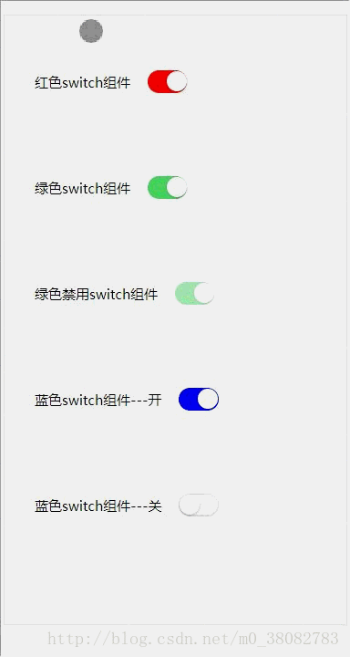
效果圖
#HTML
<p class="switch-list">
 <span class="fui-fr">红色switch组件</span>
 <input class="fui-switch" style="color:rgb(255, 0, 0);" type="checkbox" checked>
</p>
<p class="switch-list">
 <span class="fui-fr">绿色switch组件</span>
 <input class="fui-switch" style="color:rgb(76, 216, 100);" type="checkbox" checked>
</p>
<p class="switch-list">
 <span class="fui-fr">绿色禁用switch组件</span>
 <input class="fui-switch" style="color:rgb(76, 216, 100);" type="checkbox" checked disabled>
</p>
<p class="switch-list">
 <span class="fui-fr">蓝色switch组件---开</span>
 <input class="fui-switch" style="color:blue" type="checkbox" checked>
</p>
<p class="switch-list">
 <span class="fui-fr">蓝色switch组件---关</span>
 <input class="fui-switch" style="color:blue" type="checkbox">
</p>
CSS
.switch-list{
 padding: .5rem;
}
.fui-switch{
 position: relative;
 width: .87rem;
 height: .5rem;
 z-index: 10;
 display: inline-block;
 outline: medium;
 border: 1px solid #dfdfdf;
 border-radius: .25rem;
 background-color: #dfdfdf;
 -webkit-appearance: none;
 -moz-appearance: none;
 vertical-align: middle;
}
.fui-switch:checked{
 border-color: currentColor;
 background-color: currentColor;
}
.fui-switch::after,.fui-switch::before{
 content: "";
 position: absolute;
 height: .44rem;
 top: 0;
 left: 0;
 border-radius: .25rem;
 -webkit-transition: -webkit-transform .3s;
 transition: -webkit-transform .3s;
 transition: transform .3s;
 transition: transform .3s,-webkit-transform .3s;
}
.fui-switch:before {
 width: .84rem;
 background-color: #fdfdfd;
}
.fui-switch:checked:before {
 -webkit-transform: scale(0);
 transform: scale(0);
}
.fui-switch:after {
 width: .44rem;
 background-color: #fff;
 box-shadow: 0 1px 3px rgba(0,0,0,.4);
}
.fui-switch:checked:after {
 -webkit-transform: translateX(.4rem);
 transform: translateX(.4rem);
}
.fui-switch[disabled] {
 opacity: .5;
}
.fui-fr{font-size: .3rem;vertical-align: middle;}
實作rem的JS
(function(win,factory){
 factory(win);
 window.addEventListener('resize',function(){factory(win)},false);
}(window,function(win){
 var width = document.documentElement.clientWidth;
 width = width > 750 ? 750 : width;
 document.documentElement.style.fontSize = width / 7.5 + 'px';
}));
注意
此處1rem 在750 的psd 設計圖代表100px ;
switch 的切換動畫是透過CSS3 的transition 屬性實現;
主要是控制switch 的after 的移動,以及before 的放大縮小動畫。
上面是我整理給大家的,希望今後對大家有幫助。
相關文章:
以上是在微信小程式中如何使用switch元件的詳細內容。更多資訊請關注PHP中文網其他相關文章!
陳述:
本文內容由網友自願投稿,版權歸原作者所有。本站不承擔相應的法律責任。如發現涉嫌抄襲或侵權的內容,請聯絡admin@php.cn