

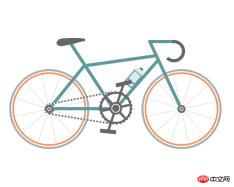
這次帶給大家css3實現動畫自行車效果,css3實現動畫自行車效果的注意事項有哪些,下面就是實戰案例,一起來看一下。
首先來看看實作的效果圖(靜態):
#實例原始碼:
#nbsp;html>
<meta>
<title>自行车</title>
<style>
* {
margin: 0;
padding: 0
}
ol,
ul {
list-style: none/*去掉圆点或数字*/
}
.cycle-outer {
width: 534px;
height: 260px;
position: absolute;
/*绝对定位*/
top: 50%;
/*距离顶部*/
margin: -160px 0 0 -267px;
/*距离外边距*/
left: 50%;
}
.cycle-wrapper {
width: 534px;
height: 260px;
margin: 0 auto;
position: relative;
/*相对定位*/
}
.cycle-wheel-front {
/*前轮*/
margin: 100px 0 0 330px;
}
.cycle-wheel-back {
/*后轮*/
margin: 100px 0 0 0px;
}
.cycle-wheel-outer {
background: transparent;
border: 5px solid #aaa;
border-radius: 50%;
/*画外轮圆圈*/
width: 190px;
height: 190px;
position: absolute;
margin-top: 5px;
animation: wheel-rotate 2s linear infinite;
/*定义动画*/
}
/*轮胎开始旋转*/
@keyframes wheel-rotate {
from {
transform: rotate(0deg);
}
to {
transform: rotate(360deg);
}
}
.cycle-wheel-outer:after {
/*插入内轮胎圆圈*/
background: transparent;
border: 4px solid #EF9058;
border-radius: 50%;
width: 176px;
height: 176px;
position: absolute;
margin: 3px;
content: "";
}
.spoke {
/*开始画车轮线条*/
position: absolute;
width: 1px;
height: 200px;
background: #ccc;
margin: -5px 0 0 95px;
z-index: 0;
}
.spoke:after {
/*在后面插入两条*/
content: "";
position: absolute;
width: 1px;
height: 200px;
background: #ccc;
transform: rotate(120deg);
}
.spoke:before {
/*在前面插入两条*/
content: "";
position: absolute;
width: 1px;
height: 200px;
background: #ccc;
transform: rotate(240deg);
}
/*轮胎线条完成*/
.spoke-container li:nth-child(2) {
/*中心点旋转*/
transform: rotate(30deg);
}
.inner-disc {
/*画中心轴圆点*/
background: #666;
width: 20px;
height: 20px;
border-radius: 50%;
position: absolute;
left: 50%;
margin: -10px 0 0 -10px;
top: 50%;
}
/*.cycle-wheel-back .inner-disc:after {
content: "";
background: #666;
width: 20px;
height: 20px;
border-radius: 50%;
position: absolute;
left: 50%;
margin: -10px 0 0 -10px;
top: 50%;
}*/
.inner-disc-2 {
/*画轮胎中心轴的圆圈*/
background: transparent;
width: 6px;
height: 6px;
border: 2px solid #FFF;
border-radius: 50%;
position: absolute;
left: 50%;
margin: -5px 0 0 -5px;
top: 50%;
}
.cycle-wheel-back .inner-disc-2:after {
/*插入后轮轴心齿轮*/
content: "";
background: transparent;
width: 18px;
height: 18px;
border-radius: 50%;
position: absolute;
left: 50%;
margin: -13px 0 0 -13px;
top: 50%;
border: 4px dotted #666;
}
.cycle-body {
margin-left: 125px;
}
.front-wheel-frame {/*前叉*/
background: #5E999B;
width: 8px;
height: 180px;
position: absolute;
z-index: 2;
transform: rotate(-25deg);
margin: -72px 0 0 260px;
}
.top-frame {/*上管*/
background: #5E999B;
width: 180px;
height: 8px;
position: absolute;
z-index: 2;
margin: -20px 0 0 62px;
transform: rotate(-8deg);
}
.front-frame {/*下管*/
background: #5E999B;
width: 8px;
height: 160px;
position: absolute;
z-index: 2;
transform: rotate(41deg);
margin: -36px 0 0 189px;
}
.center-frame { /*坐杆*/
background: #5E999B;
width: 8px;
height: 205px;
position: absolute;
z-index: 2;
transform: rotate(-33deg);
margin: -84px 0 0 75px;
}
.back-frame {/*后管*/
background: #5E999B;
width: 8px;
height: 136px;
position: absolute;
z-index: 2;
transform: rotate(39deg);
margin: -23px 0 0 19px;
}
.bottom-frame {/*后叉or平管*/
background: #5E999B;
width: 159px;
height: 8px;
position: absolute;
z-index: 2;
margin: 100px 0 0 -16px;
}
.handlebar-front {/*车把*/
width: 60px;
height: 8px;
background: #5E999B;
z-index: 2;
position: absolute;
margin: -68px 0 0 222px;
border-top-left-radius: 3px;
border-bottom-left-radius: 3px;
}
.handlebar-curve {/*车把手*/
width: 40px;
height: 40px;
border: 8px solid #666;
border-top-right-radius: 100%;
border-bottom-right-radius: 100%;
border-bottom-left-radius: 100%;
background: transparent;
position: absolute;
margin: -68px 0 0 258px;
border-left: 8px solid transparent;
border-top: 8px solid #666;
border-bottom: 8px solid #666;
}
/*座垫*/
.seat {
width: 50px;
height: 10px;
background: #666;
border-radius: 44%;
position: absolute;
margin: -73px 0 0 15px;
}
.seat:after {
width: 0px;
height: 0px;
border-style: solid;
border-width: 0 40px 16px 40px;
border-color: transparent transparent #666 transparent;
content: "";
position: absolute;
z-index: 3;
transform: rotate(-12deg);
position: absolute;
border-radius: 100%;
margin: 0 0 0 -26px;
}
.seat:before {
width: 0px;
height: 0px;
border-style: solid;
border-width: 0 40px 16px 40px;
border-color: transparent transparent #666 transparent;
content: "";
position: absolute;
z-index: 3;
transform: rotate(179deg);
position: absolute;
border-radius: 100%;
margin: 0 0 0 -26px;
}
.seat span {
width: 32px;
height: 19px;
background: #666;
border-radius: 100%;
position: absolute;
margin: 1px 0 0 -22px;
transform: rotate(-11deg);
}
/*去掉中心轴的*/
.chain-rotation {
position: absolute;
z-index: 16;
}
/*中心轴*/
.chain-disc-inner {
background: #666;
width: 18px;
height: 18px;
border-radius: 50%;
position: absolute;
margin: 2px;
z-index: 4;
}
.chain-disc-outer {
background: #FFF;
width: 22px;
height: 22px;
border: 5px solid #666;
border-radius: 50%;
position: absolute;
margin: 87px 0 0 250px;
z-index: 3;
content: "";
}
/*牙盘*/
.chain-rods {
height: 70px;
width: 6px;
background: #666;
position: absolute;
margin: 67px 0 0 263px;
z-index: 15;
animation: wheel-rotate 2s linear infinite;
}
.chain-rods:before {
content: "";
height: 70px;
width: 6px;
background: #666;
position: absolute;
transform: rotate(120deg);
}
.chain-rods:after {
content: "";
height: 70px;
width: 6px;
background: #666;
position: absolute;
transform: rotate(240deg);
-webkit-transform: rotate(240deg);
-moz-transform: rotate(240deg);
}
.outer-axle {
height: 70px;
width: 70px;
border-radius: 50%;
background: transparent;
border: 5px solid #666;
position: absolute;
margin: 62px 0 0 226px;
z-index: 3;
}
.outer-axle:after {
content: "";
height: 74px;
width: 74px;
border-radius: 50%;
background: transparent;
border: 5px dotted #666;
margin: -7px;
position: absolute;
z-index: 3;
animation: wheel-rotate 2s linear infinite;
}
/*车链子*/
.chain-up {
background-color: transparent;
background-size: 8px 2px;
background-position: 0 0, 30px 30px;
width: 155px;
height: 4px;
position: absolute;
z-index: 9;
background: #EEE;
transform: rotate(-11deg);
margin: 76px 0 0 98px;
}
.chain-up:before {
content: "";
background-color: transparent;
background-image: linear-gradient(90deg, #666 25%, transparent 25%, transparent 75%, #666 75%, #666);
background-size: 8px 2px;
background-position: 0 0, 30px 30px;
width: 155px;
height: 4px;
animation: chainUp 2s linear infinite;
position: absolute;
z-index: 10;
}
.chain-bottom {
background-color: transparent;
background-size: 8px 2px;
background-position: 0 0, 30px 30px;
width: 155px;
height: 4px;
position: absolute;
z-index: 9;
background: #EEE;
-webkit-transform: rotate(9deg);
-moz-transform: rotate(9deg);
transform: rotate(9deg);
margin: 127px 0 0 98px;
}
.chain-bottom:before {
content: "";
background-color: transparent;
background-image: linear-gradient(90deg, #666 25%, transparent 25%, transparent 75%, #666 75%, #666);
background-size: 8px 2px;
background-position: 0 0, 30px 30px;
width: 155px;
height: 4px;
animation: chainDown 2s linear infinite;
position: absolute;
z-index: 10;
}
/*脚踏*/
.pedal-rod {
height: 120px;
width: 6px;
background: #666;
position: absolute;
margin: -25px 0 0 0px;
}
.pedal-rod:before {
width: 40px;
height: 10px;
background: #666;
position: absolute;
margin: 10px;
content: "";
margin: -7px -17px;
animation: pedal1 2s linear infinite;
}
.pedal-rod:after {
width: 40px;
height: 10px;
background: #666;
position: absolute;
margin: 10px;
content: "";
margin: 119px -17px;
animation: pedal2 2s linear infinite;
}
/*水壶架*/
.bottle-holder {
width: 20px;
height: 36px;
background: #daeded;
border: 3px solid #5E999B;
position: absolute;
margin: 54px 0 0 -25px;
}
.bottle-holder:after {
width: 20px;
height: 3px;
content: "";
background: #5E999B;
position: absolute;
margin: 24px 0 0 0px;
}
/*水壶*/
.bottle-holder:before {
background-color: #daeded;
width: 18px;
height: 10px;
border-radius: 30% / 100%;
border-bottom-left-radius: 0;
border-bottom-right-radius: 0;
content: "";
position: absolute;
margin-top: -13px;
border: 1px solid #98baba;
border-bottom: 0;
}
.bottle-holder span {
position: absolute;
width: 9px;
height: 4px;
background: #666;
margin: -17px 0 0 5px;
}
/*车链子动画*/
@keyframes chainUp {
0% {
background-position: 0 25%;
}
100% {
background-position: 100% 0;
}
}
@keyframes chainDown {
0% {
background-position: 100% 0;
}
100% {
background-position: 0 25%;
}
}
/*脚踏动画*/
@keyframes pedal1 {
0% {
transform: rotate(00deg);
}
25% {
transform: rotate(-140deg);
}
50% {
transform: rotate(-180deg);
}
75% {
transform: rotate(-240deg);
}
100% {
transform: rotate(-360deg);
}
}
@keyframes pedal2 {
0% {
transform: rotate(00deg);
}
25% {
transform: rotate(-60deg);
}
50% {
transform: rotate(-180deg);
}
75% {
transform: rotate(-340deg);
}
100% {
transform: rotate(-360deg);
}
}
</style>
<p>
</p><p>
<!--
描述:车架
-->
</p><p>
</p><p>
<span></span>
</p>
<p></p>
<p></p>
<p>
</p><p>
<span></span>
</p>
<p></p>
<p></p>
<p></p>
<p></p>
<p></p>
<!--
描述:后轮
-->
<p>
</p><p>
</p><p>
</p><p>
</p>
相信看了本文案例你已經掌握了方法,更多精彩請關注php中文網其它相關文章!
推薦閱讀:
css的background-attachment進階使用方法
以上是css3實現動畫自行車效果的詳細內容。更多資訊請關注PHP中文網其他相關文章!
陳述
本文內容由網友自願投稿,版權歸原作者所有。本站不承擔相應的法律責任。如發現涉嫌抄襲或侵權的內容,請聯絡admin@php.cn


 如何使用HTML,CSS和JavaScript創建動畫倒計時計時器Apr 11, 2025 am 11:29 AM
您是否曾經在項目上需要一個倒計時計時器?對於這樣的東西,可以自然訪問插件,但實際上更多


熱AI工具

Undresser.AI Undress
人工智慧驅動的應用程序,用於創建逼真的裸體照片

AI Clothes Remover
用於從照片中去除衣服的線上人工智慧工具。

Undress AI Tool
免費脫衣圖片

Clothoff.io
AI脫衣器

AI Hentai Generator
免費產生 AI 無盡。

熱門文章
R.E.P.O.能量晶體解釋及其做什麼(黃色晶體)
3 週前By尊渡假赌尊渡假赌尊渡假赌
R.E.P.O.最佳圖形設置
3 週前By尊渡假赌尊渡假赌尊渡假赌
刺客信條陰影:貝殼謎語解決方案
2 週前ByDDD
R.E.P.O.如果您聽不到任何人,如何修復音頻
3 週前By尊渡假赌尊渡假赌尊渡假赌
WWE 2K25:如何解鎖Myrise中的所有內容
3 週前By尊渡假赌尊渡假赌尊渡假赌
熱工具

Atom編輯器mac版下載
最受歡迎的的開源編輯器

mPDF
mPDF是一個PHP庫,可以從UTF-8編碼的HTML產生PDF檔案。原作者Ian Back編寫mPDF以從他的網站上「即時」輸出PDF文件,並處理不同的語言。與原始腳本如HTML2FPDF相比,它的速度較慢,並且在使用Unicode字體時產生的檔案較大,但支援CSS樣式等,並進行了大量增強。支援幾乎所有語言,包括RTL(阿拉伯語和希伯來語)和CJK(中日韓)。支援嵌套的區塊級元素(如P、DIV),

MantisBT
Mantis是一個易於部署的基於Web的缺陷追蹤工具,用於幫助產品缺陷追蹤。它需要PHP、MySQL和一個Web伺服器。請查看我們的演示和託管服務。

Dreamweaver Mac版
視覺化網頁開發工具

記事本++7.3.1
好用且免費的程式碼編輯器

