


使用vue開發項目,用到elementUI,根據官網的寫法,我們可以自訂主題來適應我們的專案要求,下面來介紹一下兩種方法實現的具體步驟,(可以參考官方文件自訂主題官方文件),先說專案中沒有使用scss編寫,用主題工具的方法(使用的較多)
第一種方法:使用命令列主題工具
#使用vue -cli安裝完專案並引入element-ui(具體可參考第二種方法中的介紹)
一、安裝工具
1,安裝主題工具
npm i element-theme -g
2,安裝chalk主題,可以從npm 安裝或從GitHub 拉取最新程式碼
# 从 npm
npm i element-theme-chalk -D
# 从 GitHub
npm i https://github.com/ElementUI/theme-chalk -D
二、初始化變數檔
et -i [可以自定义变量文件,默认为element-variables.scss]
> ✔ Generator variables file
這時根目錄下會產生element-variables.scss(或自訂的檔案),大致如下:
$--color-primary: #409EFF !default;
$--color-primary-light-1: mix($--color-white, $--color-primary, 10%) !default; /* 53a8ff */
$--color-primary-light-2: mix($--color-white, $--color-primary, 20%) !default; /* 66b1ff */
$--color-primary-light-3: mix($--color-white, $--color-primary, 30%) !default; /* 79bbff */
$--color-primary-light-4: mix($--color-white, $--color-primary, 40%) !default; /* 8cc5ff */
$--color-primary-light-5: mix($--color-white, $--color-primary, 50%) !default; /* a0cfff */
$--color-primary-light-6: mix($--color-white, $--color-primary, 60%) !default; /* b3d8ff */
$--color-primary-light-7: mix($--color-white, $--color-primary, 70%) !default; /* c6e2ff */
$--color-primary-light-8: mix($--color-white, $--color-primary, 80%) !default; /* d9ecff */
$--color-primary-light-9: mix($--color-white, $--color-primary, 90%) !default; /* ecf5ff */
$--color-success: #67c23a !default;
$--color-warning: #eb9e05 !default;
$--color-danger: #fa5555 !default;
$--color-info: #878d99 !default;
...
三、修改變數
直接編輯element-variables.scss 文件,例如修改主題色為自己所需的顏色(如: 紫色( purple))
$--color-primary: purple;
四、編譯主題
修改完變數後,要編譯主題(如果編譯後,再修改了變數,需要重新編譯)
et
> ✔ build theme font
> ✔ build element theme
五、引入自訂主題
最後一步,將編譯好的主題文件引入專案(編譯的文件預設在根目錄下的theme檔下,也可以透過-o 參數指定打包目錄),在入口文件main.js中引入
import '../theme/index.css'
import ElementUI from 'element-ui'
import Vue from 'vue'
Vue.use(ElementUI)
在專案中寫些樣式,看下主題色是否改變:(主題色變為紫色)
<p>
  <el-button>默认按钮</el-button>
  <el-button>主要按钮</el-button>
  <el-button>成功按钮</el-button>
  <el-button>信息按钮</el-button>
  <el-button>警告按钮</el-button>
  <el-button>危险按钮</el-button>
 </p>
第二種方法: 直接修改element樣式變數
在專案中直接修改element的樣式變量,(前提是你的文件也是使用scss寫)
一、先用vue-cli安裝一個新項目:
1,安裝vue:
npm i -g vue
2,在專案目錄下安裝vue-cli:
npm i -g vue-cli
3,基於webpack建立新專案( vue-project)
vue init webpack vue-project
4,依序輸入以下命令列,執行vue-project
cd vue-project
npm i
npm run dev
二、安裝elementUI以及sass-loader,node-sass(專案中使用scss編寫需要依賴的插件)
1,安裝element-ui
npm i element-ui -S
2,安裝sass-loader,node-sass
npm i sass-loader node-sass -D
在這裡說一下,不需要設定webpack.base.conf.js檔案,vue-loader會根據不同類型檔案來設定對應loader來打包我們的樣式檔案(感興趣的可看下vue-loader的核心程式碼)
三、改變element樣式變數
1.在src下建立element-variables.scss檔(名字可以自訂),寫入如下程式碼:
/* 改变主题色变量 */
$--color-primary: teal;
/* 改变 icon 字体路径变量,必需 */
$--font-path: '../node_modules/element-ui/lib/theme-chalk/fonts';
@import "../node_modules/element-ui/packages/theme-chalk/src/index";
2.在入口檔main.js中引入上面的檔案即可
import Vue from 'vue'
import Element from 'element-ui'
import './element-variables.scss'
Vue.use(Element)
看下效果吧,在檔案裡引入些樣式看看,如button
<p>
  <el-button>默认按钮</el-button>
  <el-button>主要按钮</el-button>
  <el-button>成功按钮</el-button>
  <el-button>信息按钮</el-button>
  <el-button>警告按钮</el-button>
  <el-button>危险按钮</el-button>
 </p>
預設的顏色已經變成我們自訂的了,有其他的改變在element-variable.scss檔案中改變變數即可
相關推薦:
以上是Vue的elementUI實作自訂主題的詳細內容。更多資訊請關注PHP中文網其他相關文章!

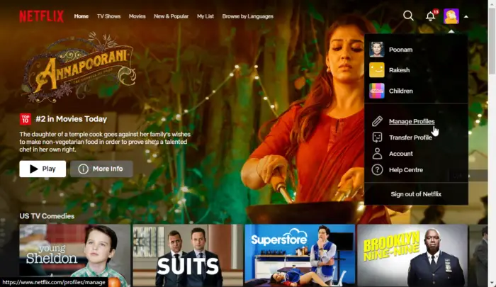 如何在Netflix中快速设置自定义头像Feb 19, 2024 pm 06:33 PM
Netflix上的头像是你流媒体身份的可视化代表。用户可以超越默认的头像来展示自己的个性。继续阅读这篇文章,了解如何在Netflix应用程序中设置自定义个人资料图片。如何在Netflix中快速设置自定义头像在Netflix中,没有内置功能来设置个人资料图片。不过,您可以通过在浏览器上安装Netflix扩展来实现此目的。首先,在浏览器上安装Netflix扩展的自定义个人资料图片。你可以在Chrome商店买到它。安装扩展后,在浏览器上打开Netflix并登录您的帐户。导航至右上角的个人资料,然后单击
 Win11如何自定义背景图片Jun 30, 2023 pm 08:45 PM
Win11如何自定义背景图片?在最新发布的win11系统中,里面有许多的自定义功能,但是很多小伙伴不知道应该如何使用这些功能。就有小伙伴觉得背景图片比较单调,想要自定义背景图,但是不知道如何操作自定义背景图,如果你不知道如何定义背景图片,小编下面整理了Win11自定义背景图片步骤,感兴趣的话一起往下看看把!Win11自定义背景图片步骤1、点击桌面win按钮,在弹出的菜单中点击设置,如图所示。2、进入设置菜单,点击个性化,如图所示。3、进入个性化,点击背景,如图所示。4、进入背景设置,点击浏览图片
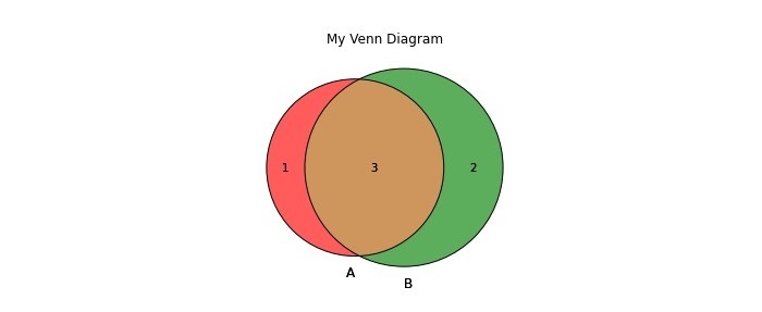 如何在Python中创建和自定义Venn图?Sep 14, 2023 pm 02:37 PM
维恩图是用来表示集合之间关系的图。要创建维恩图,我们将使用matplotlib。Matplotlib是一个在Python中常用的数据可视化库,用于创建交互式的图表和图形。它也用于制作交互式的图像和图表。Matplotlib提供了许多函数来自定义图表和图形。在本教程中,我们将举例说明三个示例来自定义Venn图。Example的中文翻译为:示例这是一个创建两个维恩图交集的简单示例;首先,我们导入了必要的库并导入了venns。然后我们将数据集创建为Python集,之后,我们使用“venn2()”函数创
 如何在CakePHP中创建自定义分页?Jun 04, 2023 am 08:32 AM
CakePHP是一个强大的PHP框架,为开发人员提供了很多有用的工具和功能。其中之一是分页,它可以帮助我们将大量数据分成几页,从而简化浏览和操作。默认情况下,CakePHP提供了一些基本的分页方法,但有时你可能需要创建一些自定义的分页方法。这篇文章将向您展示如何在CakePHP中创建自定义分页。步骤1:创建自定义分页类首先,我们需要创建一个自定义分页类。这个
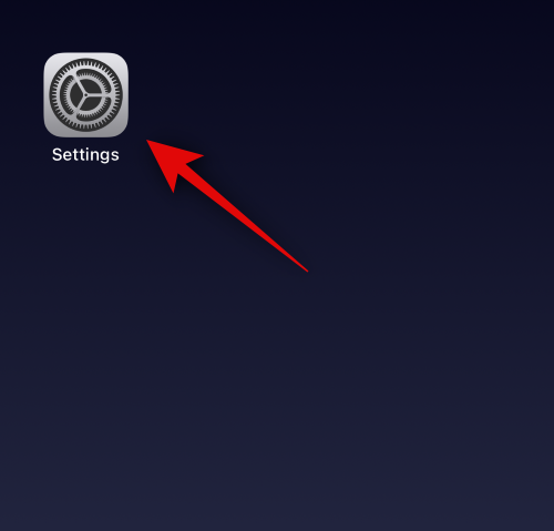 如何在装有 iOS 17 的 iPhone 上的 Apple Music 中启用和自定义交叉淡入淡出Jun 28, 2023 pm 12:14 PM
适用于iPhone的iOS17更新为AppleMusic带来了一些重大变化。这包括在播放列表中与其他用户协作,在使用CarPlay时从不同设备启动音乐播放等。这些新功能之一是能够在AppleMusic中使用交叉淡入淡出。这将允许您在曲目之间无缝过渡,这在收听多个曲目时是一个很棒的功能。交叉淡入淡出有助于改善整体聆听体验,确保您在音轨更改时不会受到惊吓或退出体验。因此,如果您想充分利用这项新功能,以下是在iPhone上使用它的方法。如何為AppleMusic啟用和自定Crossfade您需要最新的
 如何在CodeIgniter中实现自定义中间件Jul 29, 2023 am 10:53 AM
如何在CodeIgniter中实现自定义中间件引言:在现代的Web开发中,中间件在应用程序中起着至关重要的作用。它们可以用来执行在请求到达控制器之前或之后执行一些共享的处理逻辑。CodeIgniter作为一个流行的PHP框架,也支持中间件的使用。本文将介绍如何在CodeIgniter中实现自定义中间件,并提供一个简单的代码示例。中间件概述:中间件是一种在请求
 Eclipse中自定义快捷键设置的方法Jan 28, 2024 am 10:01 AM
如何在Eclipse中自定义快捷键设置?作为一名开发人员,在使用Eclipse进行编码时,熟练掌握快捷键是提高效率的关键之一。Eclipse作为一款强大的集成开发环境,不仅提供了许多默认的快捷键,还允许用户根据自己的偏好进行个性化的定制。本文将介绍如何在Eclipse中自定义快捷键设置,并给出具体的代码示例。打开Eclipse首先,打开Eclipse,并进入
 Vue3中的render函数:自定义渲染函数Jun 18, 2023 pm 06:43 PM
Vue是一款流行的JavaScript框架,它提供了许多方便的功能和API以帮助开发者构建交互式的前端应用程序。随着Vue3的发布,render函数成为了一个重要的更新。本文将介绍Vue3中render函数的概念、用途和如何使用它自定义渲染函数。什么是render函数在Vue中,template是最常用的渲染方式,但是在Vue3中,可以使用另外一种方式:r


熱AI工具

Undresser.AI Undress
人工智慧驅動的應用程序,用於創建逼真的裸體照片

AI Clothes Remover
用於從照片中去除衣服的線上人工智慧工具。

Undress AI Tool
免費脫衣圖片

Clothoff.io
AI脫衣器

AI Hentai Generator
免費產生 AI 無盡。

熱門文章
熱工具

VSCode Windows 64位元 下載
微軟推出的免費、功能強大的一款IDE編輯器

SublimeText3 Linux新版
SublimeText3 Linux最新版

記事本++7.3.1
好用且免費的程式碼編輯器

EditPlus 中文破解版
體積小,語法高亮,不支援程式碼提示功能

禪工作室 13.0.1
強大的PHP整合開發環境

