
React根據寬度自適應高度實例分享

- 小云云原創
- 2018-01-25 11:40:492766瀏覽
有時對於響應式佈局,我們需要根據元件的寬度自適應高度。 CSS無法實現這種動態變化,傳統是用jQuery實現。本文主要介紹了React根據寬度自適應高度的範例程式碼,小編覺得挺不錯的,現在分享給大家,也給大家做個參考。一起跟著小編過來看看吧,希望能幫助大家。
而在React中無需依賴JQuery,實作相對比較簡單,只要在DidMount後更改width即可。
Try on Codepen
要注意的是在resize時候也要同步變更,需要註冊個監聽器
class Card extends React.Component {
constructor(props) {
super(props);
this.state = {
width: props.width || -1,
height: props.height || -1,
}
}
componentDidMount() {
this.updateSize();
window.addEventListener('resize', () => this.updateSize());
}
componentWillUnmount() {
window.removeEventListener('resize', () => this.updateSize());
}
updateSize() {
try {
const parentDom = ReactDOM.findDOMNode(this).parentNode;
let { width, height } = this.props;
//如果props没有指定height和width就自适应
if (!width) {
width = parentDom.offsetWidth;
}
if (!height) {
height = width * 0.38;
}
this.setState({ width, height });
} catch (ignore) {
}
}
render() {
return (
<p className="test" style={ { width: this.state.width, height: this.state.height } }>
{`${this.state.width} x ${this.state.height}`}
</p>
);
}
}
ReactDOM.render(
<Card/>,
document.getElementById('root')
);參考資料
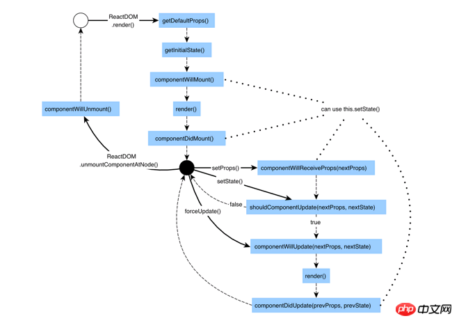
React生命週期
JavaScript 處理Iframe自適應高度(同或不同網域下)
#
以上是React根據寬度自適應高度實例分享的詳細內容。更多資訊請關注PHP中文網其他相關文章!
陳述:
本文內容由網友自願投稿,版權歸原作者所有。本站不承擔相應的法律責任。如發現涉嫌抄襲或侵權的內容,請聯絡admin@php.cn