


我相信每個人的童年都有一個哆啦a夢,一個小小的肚皮裡裝滿了不可思議的哆啦a夢,一個在你無助傷心的時候陪在你身邊的哆啦a夢,一個陪你胡思亂想陪你吃銅鑼燒的哆啦a夢~今天我們就來畫一個我們心中的哆啦a夢吧~

定義哆啦a夢的容器
-
千篇一律先定義一個畫哆啦a夢的大容器,確定它的大小和位置。
<!-- 哆啦A梦大容器 -->
<p class="doa"></p>
/*哆啦A梦*/
 .doa{position: relative;top: 100px;}
畫哆啦a夢的頭部(包括臉,臉部包括眼睛和鼻子)
頭部包含好幾塊部分:哆啦a夢的臉部和鼻子,臉部又包括兩隻眼睛,兩隻眼睛裡面還有眼珠和眼白部分,所以會有好幾層的dom嵌套,當然基本圖形都是由p+border -radius拼湊而成。
將畫好的各個部位品拼湊到對應的位置上即可。
-
看我前面畫的幾個圖畫就知道border-radius是一個非常常用的屬性,幾乎p的每一次變形都離不開它,其實border-radius的真面目應該是border-radius: 300px 300px 300px 300px/300px 300px 300px 300px;醬紫的,我們一般不寫斜線後面的內容,斜線切面是水平長度,斜線後面是垂直高度,前槓後面是垂直高度寫水平和垂直大小是一樣的。我知道我這樣說不夠詳細,可以參考我鑫神的博客秋月何時了,CSS3 border-radius知多少? ,保證你分分鐘在老司機的帶領下徹底弄清楚border-radius,還不快上車?
<!-- 头 --> <p class="head"> <!-- 存放脸部的容器 --> <p class="face"> <!-- 左眼大圈儿 --> <p> <!-- 左眼眼珠(黑色部分) --> <p> <!-- 左眼眼白,黑色里面的白色部分 --> <p></p> </p> </p> <!-- 右眼大圈儿 --> <p> <!--右眼眼珠(黑色部分) --> <p> <!-- 右眼眼白,黑色里面的白色部分 --> <p></p> </p> </p> </p> <!-- 红鼻子部分 --> <p class="nose"> <!-- 红鼻子里面的白圈儿 --> <p></p> </p> <!-- 红鼻子下面的那根黑线,也属于鼻子部分 --> <p class="nose1"></p> </p> .head{ margin: 0 auto; /*头部定义大小并居中显示*/ width: 400px; height: 350px; background: #008ee3; /*头部定义背景颜色*/ position: relative; border-radius: 50% 50% 25% 25% / 55% 55% 45% 45%; /*头部定义四个方向圆角大小*/ } .face{ width: 310px; /*脸部定义大小*/ height: 260px; background: snow; /*脸部定义背景颜色*/ border-radius: 50% 50% 25% 25% / 55% 55% 45% 45%; /*脸部定义四个方向的圆角大小*/ position: relative; /*脸部定义位置,是相对于head的位置*/ top: 90px; left: 45px; } /*左眼眶*/ .face>p:first-child{ width: 80px; /*左眼框定义大小*/ height: 100px; border-radius: 50%; /*左眼框定义与圆角大小*/ border:2px #000 solid; /*定义外边框*/ background: snow; float: left; /*为了使左右两个眼睛能在一排显示*/ position: relative; /*位置是相对于face的位置*/ top:-40px; left: 71px; z-index: 50; } /*右眼眶,画法跟左眼一样*/ .face>p:last-child{ width: 80px; height: 100px; border-radius: 50%; border:2px #000 solid; background: snow; float: left; position: relative; top:-40px; left: 71px; z-index: 50; } /*左眼珠1*/ .face>p:first-child p{ width: 20px; /*定义眼珠的大小*/ height: 25px; background: #000; border-radius: 50%; position: absolute; /*定义眼珠的位置,相对于眼眶的位置*/ top: 45px; left: 60px; } /*左瞳孔*/ .face>p:first-child p p{ width: 10px; /*定义黑色瞳孔的大小*/ height: 10px; background: #ffffff; border-radius: 50%; position: absolute; /*定义黑色瞳孔的位置,相对于眼珠的位置*/ top: 7px; left: 10px; } /*右眼珠和左眼珠画法一样*/ .face>p:last-child p{ width: 20px; height: 25px; background: #000; border-radius: 50%; position: absolute; top: 45px; } /*右瞳孔和左瞳孔的画法一样*/ .face>p:last-child p p{ width: 10px; height: 10px; background: #ffffff; border-radius: 50%; position: absolute; top: 7px; } .nose{ width: 30px; /*定义红鼻子的大小*/ height: 30px; border-radius: 50%; background: #c70000; position: absolute; top: 130px; left: 50%; margin-left: -15px; z-index: 10; } .nose p{ width: 10px; /*定义红鼻子里面白色圈圈的大小*/ height: 10px; border-radius: 50%; position: absolute; background: #ffffff; top: 10px; margin-left: 20px; z-index: 10; } .nose1{ width: 2px; /*定义红鼻子下面的那一条黑线*/ height: 130px; background: #000; position: absolute; top: 160px; left: 50%; margin-left: -1px; z-index: 10; } -

哆啦a夢的頭部.png
畫哆啦a夢的嘴巴部分
-
嘴巴應該是很簡單的了吧,看一眼就知道是用邊框+border-radius實現的。
<p class="mouth"></p>
.mouth{
 width: 250px; /*定义嘴巴的大小*/
 height: 200px;
 border-radius: 50%;
 background: snow;
 border-bottom: 2px #000 solid;
 margin: -230px auto;
 position: relative; /*定义嘴巴的位置*/
 }
哆啦a夢的嘴巴.png
畫哆啦a夢的鬍鬚部分
-
鬍鬚部分其實在上一篇文章畫html打造動畫【連載3】- 小貓笑臉動畫裡面畫鬍鬚的時候就已經介紹了畫鬍鬚的方法,這裡就不贅述了,基本思路都是一樣的。
<!-- 胡须 -->
  <p class="beard">
 <!-- 左边胡须部分 -->
 <p class="left">
 <!-- 第一根胡须 -->
 <p></p>
 <!-- 第二根胡须 -->
 <p></p>
 <!-- 第三根胡须 -->
 <p></p>
 </p>
 <p class="right">
 <p></p>
 <p></p>
 <p></p>
 </p>
 <!-- 脖子部分的小白条部分 -->
 <span></span>
 </p>
/*胡须样式*/
.beard .left p:first-child{
 width: 120px;
 height: 40px;
 border-top: 2px #000 solid;
 border-radius: 10% 90% 10% 90% / 10% 90% 10% 90%;
 position: absolute;
 left: 50%;
 top: 140px;
 margin-left: -170px;
 z-index: 100;
 }
 .beard .left p:nth-child(2){
 width: 120px;
 height: 40px;
 border-top: 2px #000 solid;
 border-radius: 10% 90% 10% 90% / 30% 70% 40% 60%;
 position: absolute;
 left: 50%;
 top: 170px;
 margin-left: -170px;
 z-index: 100;
 }
 .beard .left p:last-child{
 width: 120px;
 height: 40px;
 border-top: 2px #000 solid;
 border-radius: 10% 90% 10% 90% / 40% 60% 10% 90%;
 position: absolute;
 left: 50%;
 top: 200px;
 margin-left: -170px;
 z-index: 100;
 }

 .beard .right p:first-child{
 width: 120px;
 height: 40px;
 border-top: 2px #000 solid;
 border-radius: 90% 10% 90% 10% / 90% 10% 90% 10%;
 position: absolute;
 left: 50%;
 top: 140px;
 margin-left: 50px;
 z-index: 100;
 }
 .beard .right p:nth-child(2){
 width: 120px;
 height: 40px;
 border-top: 2px #000 solid;
 border-radius: 90% 10% 90% 10% / 70% 30% 60% 40%;
 position: absolute;
 left: 50%;
 top: 170px;
 margin-left: 50px;
 z-index: 100;
 }
 .beard .right p:last-child{
 width: 120px;
 height: 40px;
 border-top: 2px #000 solid;
 border-radius: 90% 10% 90% 10% / 60% 40% 90% 10%;
 position: absolute;
 left: 50%;
 top: 200px;
 margin-left: 50px;
 z-index: 100;
 }
 .beard span{
 display: block;
 width: 60px;
 height: 3.5px;
 background: #ffffff;
 border-radius: 4px;
 position: absolute;
 top: 352px;
 left: 50%;
 margin-left: -105px;
 }
哆啦a夢的鬍鬚.png
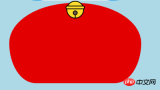
- ##畫哆啦a夢的脖子部分(脖子部分包括鈴鐺)
- 脖子就是基本p變形之後的圖形,多餘的部分隱藏到頭部下面就可以了。
- 鈴鐺部分是各個很簡單的基本圖形組成。
<!-- 脖 -->
  <p class="neck">
 <!-- 铃铛的圆形 -->
 <p></p>
 <!-- 铃铛的小圆角矩形 -->
 <p></p>
 <!-- 铃铛的小圆形 -->
 <p></p>
 <!-- 铃铛的小竖线 -->
 <p></p>
 </p>
.neck{
 width: 330px;
 height: 200px;
 border-radius: 50% 50% 20% 20% / 50% 50% 50% 50%;
 background: #e30000;
 margin: 80px auto;
 z-index: 100;
 }
 .neck p:first-child{
 border: 2px #000 solid;
 border-radius: 50%;
 width: 40px;
 height: 40px;
 background: #ffdd2e;
 position: absolute;
 top: 350px;
 left: 50%;
 margin-left: -22px;
 transition: all 1s;
 }
 .neck p:nth-child(2){
 border: 2px #000 solid;
 width: 44px;
 height: 5px;
 background: #ffdd2e;
 position: absolute;
 left: 50%;
 margin-left: -24px;
 top: 363px;
 border-radius: 5px;
 transition: all 1s;
 }
 .neck p:nth-child(3){
 width: 8px;
 height: 8px;
 border: 2px #000 solid;
 position: absolute;
 background: #6c5844;
 border-radius: 50%;
 left: 50%;
 margin-left: -6px;
 top: 375px;
 transition: all 1s;
 }
 .neck p:nth-child(4){
 width: 2px;
 height: 8px;
 background: #000;
 position: absolute;
 left: 50%;
 margin-left: -1px;
 top: 385px;
 transition: all 1s;
 }
哆啦a夢的脖子.png - 完成哆啦a夢的動態效果
- 動起來的哆啦a夢才比較萌對吧,那我們就讓它動起來吧(transition屬性)。
- 滑鼠移動到眼睛部位左眼珠移動到左邊。
- 滑鼠移動到嘴巴部位,臉部表情變化。
- 滑鼠移動到鈴鐺部分,鈴鐺變大。
/*眼睛动效*/
.head:hover .face>p:first-child p{
 left: 0px;
 transition: all 1s;
 }
 .head:hover .face>p:first-child p p{
 left: 0px;
 transition: all 1s;
 }
/*嘴巴动效,嘴巴的dom容器下面要加了个空的p容器*/
.mouth p:first-child{
 width: 82px;
 height: 2px;
 background: #000;
 position: absolute;
 z-index: 1000;
 top: -25px;
 left: 6px;
 display: none;
 }
 .mouth p:nth-child(2){
 width: 82px;
 height: 2px;
 background: #000;
 position: absolute;
 z-index: 1000;
 top: -25px;
 left: 90px;
 display: none;
 }
 .mouth:hover{
 border-radius: 0;
 width: 180px;
 height: 200px;
 }
 .mouth:hover p:first-child,.mouth:hover p:nth-child(2){
 display: block;
 }
/*铃铛动效*/
.neck:hover p:first-child{
 width: 60px;
 height: 60px;
 left: 50%;
 margin-left: -30px;
 }
 .neck:hover p:nth-child(2){
 width: 66px;
 height: 7.5px;
 left: 50%;
 margin-left: -33px;
 }
 .neck:hover p:nth-child(3){
 width: 12px;
 height: 12px;
 left: 50%;
 margin-left: -6px;
 top: 385px;
 }
 .neck:hover p:nth-child(4){
 width: 2px;
 height: 12px;
 left: 50%;
 margin-left: 1px;
 top: 400px;
 }
#


以上是分享html打造動畫哆啦A夢的範例程式碼的詳細內容。更多資訊請關注PHP中文網其他相關文章!

 HTML的角色:構建Web內容Apr 11, 2025 am 12:12 AM
HTML的作用是通過標籤和屬性定義網頁的結構和內容。 1.HTML通過到、等標籤組織內容,使其易於閱讀和理解。 2.使用語義化標籤如、等增強可訪問性和SEO。 3.優化HTML代碼可以提高網頁加載速度和用戶體驗。
 HTML和代碼:仔細觀察術語Apr 10, 2025 am 09:28 AM
htmlisaspecifictypefodyfocusedonstructuringwebcontent,而“代碼” badlyLyCludEslanguagesLikeLikejavascriptandPytyPythonForFunctionality.1)htmldefineswebpagertuctureduseTags.2)“代碼”代碼“ code” code code code codeSpassSesseseseseseseseAwiderRangeLangeLangeforLageforLogageforLogicIctInterract
 HTML,CSS和JavaScript:Web開發人員的基本工具Apr 09, 2025 am 12:12 AM
HTML、CSS和JavaScript是Web開發的三大支柱。 1.HTML定義網頁結構,使用標籤如、等。 2.CSS控製網頁樣式,使用選擇器和屬性如color、font-size等。 3.JavaScript實現動態效果和交互,通過事件監聽和DOM操作。
 HTML,CSS和JavaScript的角色:核心職責Apr 08, 2025 pm 07:05 PM
HTML定義網頁結構,CSS負責樣式和佈局,JavaScript賦予動態交互。三者在網頁開發中各司其職,共同構建豐富多彩的網站。
 HTML容易為初學者學習嗎?Apr 07, 2025 am 12:11 AM
HTML適合初學者學習,因為它簡單易學且能快速看到成果。 1)HTML的學習曲線平緩,易於上手。 2)只需掌握基本標籤即可開始創建網頁。 3)靈活性高,可與CSS和JavaScript結合使用。 4)豐富的學習資源和現代工具支持學習過程。
 HTML中起始標籤的示例是什麼?Apr 06, 2025 am 12:04 AM
AnexampleOfAstartingTaginHtmlis,beginSaparagraph.startingTagSareEssentialInhtmlastheyInitiateEllements,defiteTheeTheErtypes,andarecrucialforsstructuringwebpages wepages webpages andConstructingthedom。
 如何利用CSS的Flexbox佈局實現菜單中虛線分割效果的居中對齊?Apr 05, 2025 pm 01:24 PM
如何設計菜單中的虛線分割效果?在設計菜單時,菜名和價格的左右對齊通常不難實現,但中間的虛線或點如何...
 在線代碼編輯器究竟用什麼HTML元素實現代碼輸入?Apr 05, 2025 pm 01:21 PM
網頁代碼編輯器中的HTML元素分析許多在線代碼編輯器允許用戶輸入HTML、CSS和JavaScript代碼。最近,有人提出了一...


熱AI工具

Undresser.AI Undress
人工智慧驅動的應用程序,用於創建逼真的裸體照片

AI Clothes Remover
用於從照片中去除衣服的線上人工智慧工具。

Undress AI Tool
免費脫衣圖片

Clothoff.io
AI脫衣器

AI Hentai Generator
免費產生 AI 無盡。

熱門文章
熱工具

ZendStudio 13.5.1 Mac
強大的PHP整合開發環境

Atom編輯器mac版下載
最受歡迎的的開源編輯器

Safe Exam Browser
Safe Exam Browser是一個安全的瀏覽器環境,安全地進行線上考試。該軟體將任何電腦變成一個安全的工作站。它控制對任何實用工具的訪問,並防止學生使用未經授權的資源。

SublimeText3 Linux新版
SublimeText3 Linux最新版

SublimeText3漢化版
中文版,非常好用

