
詳細介紹一個利用html+css實作叮噹貓的實例代碼

- 零下一度原創
- 2017-05-18 17:04:484245瀏覽
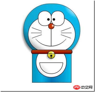
用html畫出來確實是第一次接觸,所以很樂意去嘗試一下,對於我這種菜鳥,確實是幫助不少,至少懂得如何去畫一個簡單的人物形像出來,再加上一些動畫效果,就活了,那就更好玩了! OK,開始之前,先把效果圖曬一下:
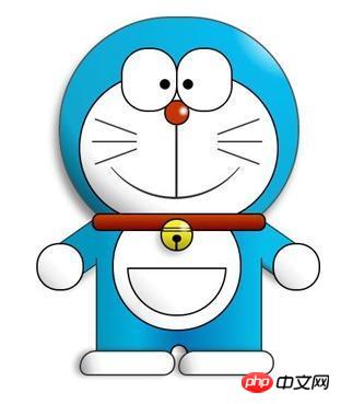
最終效果圖
PS:說實話,我覺得挺可愛的,小時候常常看多啦A夢,突然覺得很親切,很童真,瞬間年輕了很多,哈哈!
首先,先把HTML結構搭建好:
<p class="wrapper">
    <!--叮当猫整体-->
    <p class="doraemon">
        <!--头部-->
        <p class="head">
            <!--眼睛-->
            <p class="eyes">
                <p class="eye left">
                    <!--眼珠-->
                    <p class="black bleft"></p>
                </p>
                <p class="eye right">
                    <p class="black bright"></p>
                </p>
            </p>
            <!--脸部-->
            <p class="face">
                <!--白色脸底-->
                <p class="white"></p>
                <!--鼻子-->
                <p class="nose">
                    <!--鼻子高光部分-->
                    <p class="light"></p>
                </p>
                <!--鼻子的竖线-->
                <p class="nose_line"></p>
                <!--嘴巴-->
                <p class="mouth"></p>
                <!--胡须-->
                <p class="whiskers">
                    <p class="whisker rTop r160"></p>
                    <p class="whisker rMiddle"></p>
                    <p class="whisker rBottom r20"></p>
                    <p class="whisker lTop r20"></p>
                    <p class="whisker lMiddle"></p>
                    <p class="whisker lBottom r160"></p>
                </p>
            </p>
        </p>
        <!--脖子和铃铛-->
        <p class="choker">
            <!--铃铛-->
            <p class="bell">
                <p class="bell_line"></p>
                <p class="bell_circle"></p>
                <p class="bell_under"></p>
                <p class="bell_light"></p>
            </p>
        </p>
        <!--身体-->
        <p class="bodys">
            <!--肚子-->
            <p class="body"></p>
            <!--肚兜-->
            <p class="wraps"></p>
            <!--口袋-->
            <p class="pocket"></p>
            <!--遮住一半口袋,使其呈现半圆-->
            <p class="pocket_mask"></p>
        </p>
        <!--右手-->
        <p class="hand_right">
            <!--手臂-->
            <p class="arm"></p>
            <!--手掌-->
            <p class="circle"></p>
            <!--遮住手臂和身子交接处的线-->
            <p class="arm_rewrite"></p>
        </p>
        <!--左手-->
        <p class="hand_left">
            <p class="arm"></p>
            <p class="circle"></p>
            <p class="arm_rewrite"></p>
        </p>
        <!--脚-->
        <p class="foot">
            <p class="left"></p>
            <p class="right"></p>
             <!--双脚之间的缝隙-->
            <p class="foot_rewrite"></p>
        </p>
    </p>
</p>
最好先把叮噹貓的整體結構仔細研究一下,這對以後想要自己動手畫別的人物形像很有幫助,想法會比較明朗。
接下來,我們依照頭部,脖子,身體,腳部別進行示範。首先將容器wrapper和叮噹貓整體做一些基本的樣式,叮噹貓整體doraemon 設定position為relative,主要是為了方便 子元素/後代元素進行定位。
.wrapper{
    margin: 50px 0 0 500px;
}
.doraemon{
    position: relative;
}
頭部head的樣式,因為叮噹貓的頭部不是正圓,所以寬高有一點偏差,然後使用border-radius將頭部從矩形變成橢圓形,然後再使用徑向漸層從右上角給背景來個放射性漸變,然後在加個陰影,使其更有立體感,background:#07bbee;是為了兼容低版本瀏覽器:
.doraemon .head {
            position:relative;
            width: 320px;
            height: 300px;
            border-radius: 150px;
            background: #07bbee;
            background: -webkit-radial-gradient(right top,#fff 10%,#07bbee 20%,#10a6ce 75%,#000);
            background: -moz-radial-gradient(right top,#fff 10%,#07bbee 20%,#10a6ce 75%,#000);
            background: -ms-radial-gradient(right top,#fff 10%,#07bbee 20%,#10a6ce 75%,#000);
            border:2px solid #555;
            box-shadow:-5px 10px 15px rgba(0,0,0,0.45);
}
看看效果到底怎麼樣:
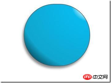
什麼鬼,這麼醜,別急,慢慢讓它活過來:
/*脸部*/
         .doraemon .face {
             position: relative; /*让所有脸部元素可自由定位*/
             z-index: 2;    /*脸在头部背景上面*/
         }
        /*白色脸底*/
        .doraemon .face .white {
            width: 265px;       /*设置宽高*/
            height: 195px;
            border-radius: 150px;
            position: absolute; /*进行绝对定位*/
            top: 75px;
            left: 25px;
            background: #fff;
            /*此放射渐变也是使脸的左下角暗一些,看上去更真实*/
            background: -webkit-radial-gradient(right top,#fff 75%,#eee 80%,#999 90%,#444);
            background: -moz-radial-gradient(right top,#fff 75%,#eee 80%,#999 90%,#444);
            background: –ms-radial-gradient(right top,#fff 75%,#eee 80%,#999 90%,#444);
         }
        /*鼻子*/
         .doraemon .face .nose{
             width:30px;
             height:30px;
             border-radius:15px;
             background:#c93300;
             border:2px solid #000;
             position:absolute;
             top:110px;
             left:140px;
             z-index:3;   /*鼻子在白色脸底下面*/
         }
        /*鼻子上的高光*/
        .doraemon .face .nose .light {
            width:10px;
            height:10px;
            border-radius: 5px;
            box-shadow: 19px 8px 5px #fff;  /*通过阴影实现高光*/
        }
         /*鼻子下的线*/
         .doraemon .face .nose_line{
             width:3px;
             height:100px;
             background:#333;
             position:absolute;
             top:143px;
             left:155px;
             z-index:3;
         }
         /*嘴巴*/
         .doraemon .face .mouth{
             width:220px;
             height:400px;
             /*通过底边框加上圆角模拟微笑嘴巴*/
             border-bottom:3px solid #333;
             border-radius:120px;
             position:absolute;
             top:-160px;
             left:45px;
         }
         /*眼睛*/
        .doraemon .eyes {
            position: relative;
            z-index: 3; /*眼睛在白色脸底下面*/
        }
        /*眼睛共同的样式*/
        .doraemon .eyes .eye{
            width:72px;
            height:82px;
            background:#fff;
            border:2px solid #000;
            border-radius:35px 35px;
            position:absolute;
            top:40px;
        }
        /*眼珠*/
        .doraemon .eyes .eye .black{
            width:14px;
            height:14px;
            background:#000;
            border-radius:7px;
            position:absolute;
            top:40px;
        }
        .doraemon .eyes .left{
            left:82px;
        }
        .doraemon .eyes .right {
            left: 156px;
        }
        .doraemon .eyes .eye .bleft {
            left: 50px;
        }

        .doraemon .eyes .eye .bright {
            left: 7px;
        }
寫了這麼多樣式,結果是怎麼樣的呢:
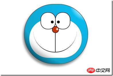
#怎麼看都覺得彆扭,喔!還差鬍鬚和白色臉底的邊框呢,咱給補上:
/*胡须背景,主要用于挡住嘴巴的一部分,不要显得太长*/
        .doraemon .whiskers{
            width:220px;
            height:80px;
            background:#fff;
            border-radius:15px;
            position:absolute;
            top:120px;
            left:45px;
            z-index:2;   /*在鼻子和眼睛下面*/
        }
        /*所有胡子的公用样式*/
        .doraemon .whiskers .whisker {
            width: 60px;
            height: 2px;
            background: #333;
            position: absolute;
            z-index: 2;
        }
        /*右上胡子*/
        .doraemon .whiskers .rTop {
            left: 165px;
            top: 25px;
        }
        /*右中胡子*/
        .doraemon .whiskers .rMiddle {
            left: 167px;
            top: 45px;
        }
        /*右下胡子*/
        .doraemon .whiskers .rBottom {
            left: 165px;
            top: 65px;
        }
        /*左上胡子*/
        .doraemon .whiskers .lTop {
            left: 0;
            top: 25px;
        }
        /*左中胡子*/
        .doraemon .whiskers .lMiddle {
            left: -2px;
            top: 45px;
        }
        /*左下胡子*/
        .doraemon .whiskers .lBottom {
            left: 0;
            top: 65px;
        }
        /*胡子旋转角度*/
        .doraemon .whiskers .r160 {
            -webkit-transform: rotate(160deg);
            -moz-transform: rotate(160deg);
            -ms-transform: rotate(160deg);
            -o-transform: rotate(160deg);
            transform: rotate(160deg);
        }
        .doraemon .whiskers .r20 {
            -webkit-transform: rotate(200deg);
            -moz-transform: rotate(200deg);
            -ms-transform: rotate(200deg);
            -o-transform: rotate(200deg);
            transform: rotate(200deg);
        }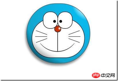
這樣就對了,看著多舒服!趁熱打鐵,做脖子和身體:
/*围脖*/
        .doraemon .choker {
            width: 230px;
            height: 20px;
            background: #c40;
            /*线性渐变 让围巾看上去更自然*/
            background: -webkit-gradient(linear,left top,left bottom,from(#c40),to(#800400));
            background: -moz-linear-gradient(center top,#c40,#800400);
            background: -ms-linear-gradient(center top,#c40,#800400);
            border: 2px solid #000;
            border-radius: 10px;
            position: relative;
            top: -40px;
            left: 45px;
            z-index: 4;
        }
        /*铃铛*/
        .doraemon .choker .bell {
            width: 40px;
            height: 40px;
            _overflow: hidden; /*IE6 hack*/
            border: 2px solid #000;
            border-radius: 50px;
            background: #f9f12a;
            background: -webkit-gradient(linear, left top, left bottom, from(#f9f12a),color-stop(0.5, #e9e11a), to(#a9a100));
            background: -moz-linear-gradient(top, #f9f12a, #e9e11a 75%,#a9a100);
            background: -ms-linear-gradient(top, #f9f12a, #e9e11a 75%,#a9a100);
            box-shadow: -5px 5px 10px rgba(0,0,0,0.25);
            position: absolute;
            top: 5px;
            left: 90px;
        }
        /*双横线*/
        .doraemon .choker .bell_line {
            width: 36px;
            height: 2px;
            background: #f9f12a;
            border: 2px solid #333;
            border-radius: 3px 3px 0 0;
            position: absolute;
            top: 10px;
        }
        /*黑点*/
        .doraemon .choker .bell_circle{
            width:12px;
            height:10px;
            background:#000;
            border-radius:5px;
            position:absolute;
            top:20px;
            left:14px;
        }
        /*黑点下的线*/
        .doraemon .choker .bell_under{
            width: 3px;
            height:15px;
            background:#000;
            position:absolute;
            left: 18px;
            top:27px;
        }
        /*铃铛高光*/
        .doraemon .choker .bell_light{
            width:12px;
            height:12px;
            border-radius:10px;
            box-shadow:19px 8px 5px #fff;
            position:absolute;
            top:-5px;
            left:5px;
            opacity:0.7;
        }
        /*身子*/
        .doraemon .bodys {
            position: relative;
            top: -310px;
        }
        /*肚子*/
        .doraemon .bodys .body {
            width: 220px;
            height: 165px;
            background: #07beea;
            background: -webkit-gradient(linear,right top,left top,from(#07beea),color-stop(0.5, #0073b3),color-stop(0.75,#00b0e0), to(#0096be));
            background: -moz-linear-gradient(right center,#07beea,#0073b3 50%,#00b0e0 75%,#0096be 100%);
            background: -ms-linear-gradient(right center,#07beea,#0073b3 50%,#00b0e0 75%,#0096be 100%);
            border:2px solid #333;
            position:absolute;
            top:265px;
            left:50px;
        }
        /*白色肚兜*/
            .doraemon .bodys .wraps {
                width: 170px;
                height: 170px;
                background: #fff;
                background: -webkit-gradient(linear, right top, left bottom, from(#fff),color-stop(0.75,#fff),color-stop(0.83,#eee),color-stop(0.90,#999),color-stop(0.95,#444), to(#000));
                background: -moz-linear-gradient(right top,#fff,#fff 75%,#eee 83%,#999 90%,#444 95%,#000);
                background: -ms-linear-gradient(right top,#fff,#fff 75%,#eee 83%,#999 90%,#444 95%,#000);
                border: 2px solid #000;
                border-radius: 85px;
                position: absolute;
                left: 72px;
                top: 230px;
            }
            /*口袋*/
            .doraemon .bodys .pocket {
                width: 130px;
                height: 130px;
                border-radius: 65px;
                background: #fff;
                background: -webkit-gradient(linear, right top, left bottom, from(#fff),color-stop(0.70,#fff),color-stop(0.75,#f8f8f8),color-stop(0.80,#eee),color-stop(0.88,#ddd), to(#fff));
                background: -moz-linear-gradient(right top, #fff, #fff 70%,#f8f8f8 75%,#eee 80%,#ddd 88%, #fff);
                background: -ms-linear-gradient(right top, #fff, #fff 70%,#f8f8f8 75%,#eee 80%,#ddd 88%, #fff);
                border: 2px solid #000;
                position:absolute;
                top: 250px;
                left: 92px;
            }
            /*挡住口袋一半*/
            .doraemon .bodys .pocket_mask {
                width: 134px;
                height: 60px;
                background:#fff;
                border-bottom: 2px solid #000;
                position:absolute;
                top: 259px;
                left: 92px;
           }
好吧,脖子和身體都有啦!上圖:
現在看起來有點像擺設品,不過笑容還是那麼單純,好了,趕緊把手腳做出來:
/*左右手*/
            .doraemon .hand_right, .doraemon .hand_left {
                height: 100px;
                width: 100px;
                position: absolute;
                top: 272px;
                left: 248px;
            }
            /*左手*/
            .doraemon .hand_left {
                left: -10px;
            }
            /*手臂公共部分*/
            .doraemon .arm {
                width:80px;
                height:50px;
                background: #07beea;
                background: -webkit-gradient(linear, left top, left bottom, from(#07beea),color-stop(0.85,#07beea), to(#555));
                background: -moz-linear-gradient(center top, #07BEEA, #07BEEA 85%, #555);
                background: -ms-linear-gradient(center top, #07BEEA, #07BEEA 85%, #555);
                border: 1px solid #000000;
                box-shadow: -10px 7px 10px rgba(0, 0, 0, 0.35);
                z-index: -1;
                position: relative;
            }
            /*右手手臂*/
            .doraemon .hand_right .arm {
                top: 17px;
                -webkit-transform: rotate(35deg);
                -moz-transform: rotate(35deg);
                -ms-transform: rotate(35deg);
                -o-transform: rotate(35deg);
                transform: rotate(35deg);
            }
            /*左手手臂*/
            .doraemon .hand_left .arm {
                top: 17px;
                background: #0096be;   /*背光一面使用纯色,使其有立体感*/
                box-shadow: 5px -7px 10px rgba(0, 0, 0, 0.25);
                -webkit-transform: rotate(145deg);
                -moz-transform: rotate(145deg);
                -ms-transform: rotate(145deg);
                -o-transform: rotate(145deg);
                transform: rotate(145deg);
            }
            /*圆形手掌公共部分*/
            .doraemon .circle {
                width: 60px;
                height: 60px;
                border-radius: 30px;
                border: 2px solid #000;
                background: #fff;
                background: -webkit-gradient(linear, right top, left bottom, from(#fff),color-stop(0.5,#fff),color-stop(0.70,#eee),color-stop(0.8,#ddd), to(#999));
                background: -moz-linear-gradient(right top, #fff, #fff 50%, #eee 70%, #ddd 80%,#999);
                background: -ms-linear-gradient(right top, #fff, #fff 50%, #eee 70%, #ddd 80%,#999);
                position: absolute;
            }
            /*右手手掌*/
            .doraemon .hand_right .circle {
                left: 40px;
                top: 32px;
            }
            /*左手手掌*/
            .doraemon .hand_left .circle {
                left: -20px;
                top: 32px;
            }
            /*手臂和身体结合处,使用背景遮住边框*/
            .doraemon .arm_rewrite {
                height: 45px;
                width: 5px;
                background: #07beea;
                position: relative;
            }
            /*右手结合处*/
            .doraemon .hand_right .arm_rewrite {
                top: -45px;
                left: 22px;
            }
            /*左手结合处*/
            .doraemon .hand_left .arm_rewrite {
                top: -45px;
                left: 60px;
                background: #0096be; /*同理,背光一面使用纯色,使其有立体感*/
            }
            /*脚部*/
            .doraemon .foot {
                width: 280px;
                height: 40px;
                position: relative;
                top: 55px;
                left: 20px;
            }
            /*左右脚共同样式*/
            .doraemon .foot .left, .doraemon .foot .right {
                width: 125px;
                height: 30px;
                background: #fff;
                background: -webkit-gradient(linear, right top, left bottom, from(#fff),color-stop(0.75,#fff),color-stop(0.85,#eee), to(#999));
                background: -moz-linear-gradient(right top, #fff, #fff 75%, #eee 85%, #999);
                background: -ms-linear-gradient(right top, #fff, #fff 75%, #eee 85%, #999);
                border: 2px solid #333;
                border-radius: 80px 60px 60px 40px;
                box-shadow: -6px 0 10px rgba(0, 0, 0, 0.35);
                position: relative;
            }
            .doraemon .foot .left {
                left: 8px;
                top: 65px;
            }

            .doraemon .foot .right {
                top: 31px;
                left: 141px;
            }
            /*双脚之间的缝隙,加阴影使用立体感*/
            .doraemon .foot .foot_rewrite {
                width: 20px;
                height: 10px;
                background: #fff;
                background: -webkit-gradient(linear, right top, left bottom, from(#666),color-stop(0.83,#fff), to(#fff));
                background: -moz-linear-gradient(right top, #666, #fff 83%, #fff);
                background: -ms-linear-gradient(right top, #666, #fff 83%, #fff);
                /*制作半圆效果*/
                border: 2px solid #000;
                border-bottom: none;
                border-radius: 40px 40px 0 0;
                position: relative;
                top: -11px;
                left: 130px;
                _left: 127px;
            }
好了,最後完整結果:
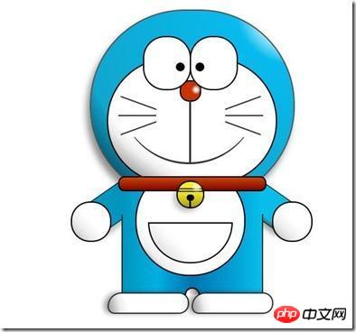
#看一下,效果是不是和一開始的一樣呢,雖然做好了,但是還是可以讓它動起來的,比如眼睛,我們可以給它加個動畫效果,讓眼睛轉動起來:
/*眼珠*/
        .doraemon .eyes .eye .black {
            width: 14px;
            height: 14px;
            background: #000;
            border-radius: 7px;
            position: absolute;
            top: 40px;
            -webkit-animation: eyemove 3s linear infinite;
            -moz-animation: eyemove 3s linear infinite;
            -ms-animation: eyemove 3s linear infinite;
            -o-animation: eyemove 3s linear infinite;
            animation: eyemove 3s linear infinite;
        }

        /*让眼睛动起来*/
        @-webkit-keyframes eyemove {
            70%{
                margin:0 0 0 0;
            }
            80% {
                margin: -22px 0 0 0;
            }

            85% {
                margin: -22px 0 0 5px;
            }

            90% {
                margin: -22px 10px 0 0;
            }

            93% {
                margin: -22px 0 0 0;
            }

            96% {
                margin: 0 0 0 0;
            }
        }

        @-moz-keyframes eyemove {
            70% {
                margin: 0 0 0 0;
            }

            80% {
                margin: -22px 0 0 0;
            }

            85% {
                margin: -22px 0 0 5px;
            }

            90% {
                margin: -22px 10px 0 0;
            }

            93% {
                margin: -22px 0 0 0;
            }

            96% {
                margin: 0 0 0 0;
            }
        }

        @-o-keyframes eyemove {
            70% {
                margin: 0 0 0 0;
            }

            80% {
                margin: -22px 0 0 0;
            }

            85% {
                margin: -22px 0 0 5px;
            }

            90% {
                margin: -22px 10px 0 0;
            }

            93% {
                margin: -22px 0 0 0;
            }

            96% {
                margin: 0 0 0 0;
            }
        }
        @keyframes eyemove {
            70% {
                margin: 0 0 0 0;
            }

            80% {
                margin: -22px 0 0 0;
            }

            85% {
                margin: -22px 0 0 5px;
            }

            90% {
                margin: -22px 10px 0 0;
            }

            93% {
                margin: -22px 0 0 0;
            }

            96% {
                margin: 0 0 0 0;
            }
        }
OK,這樣,眼睛就會動了,有興趣的可以試試一下,這裡就無法展示了。但如果你有什麼更好的動畫效果也可以嘗試,那麼這個案例就結束了。
【相關推薦】
1. 特別推薦:「php程式設計師工具箱」V0.1版本下載
2. 免費html線上影片教學
以上是詳細介紹一個利用html+css實作叮噹貓的實例代碼的詳細內容。更多資訊請關注PHP中文網其他相關文章!