
介紹兩種利用CSS實現背景圖片透明而文字不透明的特效代碼

- 零下一度原創
- 2017-04-28 10:45:072302瀏覽
這篇文章主要介紹了CSS實現背景圖片透明而文字不透明效果的兩種方法,需要的朋友可以參考下
摘要:
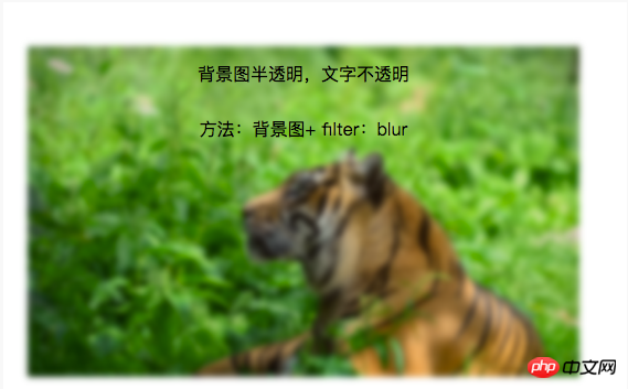
#方法一(毛玻璃效果):背景圖+ 偽類+ flite:blur(3px)
方法二(半透明效果):背景圖+ 定位+ background:rgba(255,255,255,0.3 )
CSS實現背景圖片透明,文字不透明效果的兩種方法
專案中常會用到背景圖上放一些文字介紹,這裡介紹兩種技術來實現背景圖片透明,文字不透明效果,記錄一下,方便日後學習。
1.毛玻璃效果:
背景圖+ 偽類別+ flite:blur(3px)
.demo1{
    width: 500px;
    height: 300px;
    line-height: 50px;
    text-align: center;
}
.demo1:before{
    background: url(http://csssecrets.io/images/tiger.jpg) no-repeat;
    background-size: cover;
    width: 500px;
    height: 300px;
    content: "";
    position: absolute;
    top: 0;
    left: 0;
    z-index: -1;/*-1 可以当背景*/
    -webkit-filter: blur(3px);
    filter: blur(3px);
}
<p class="demo1">背景图半透明,文字不透明<br />方法:背景图+ filter:blur</p>
#2.半透明效果:
背景圖+ 定位+ background:rgba(255,255,255,0.3)
.demo2-bg{
    background: url(http://csssecrets.io/images/tiger.jpg) no-repeat;
    background-size: cover;
    width: 500px;
    height: 300px;
    position: relative;
}
.demo2{
    position: absolute;
    left: 0;
    right: 0;
    top: 0;
    bottom: 0;
    width: 500px;
    height: 300px;
    line-height: 50px;
    text-align: center;
    background:rgba(255,255,255,0.3);
}
<p class="demo2-bg">
    <p class="demo2">背景图半透明,文字不透明<br />方法:定位+ background:rgba(255,255,255,0.3)</p>
</p>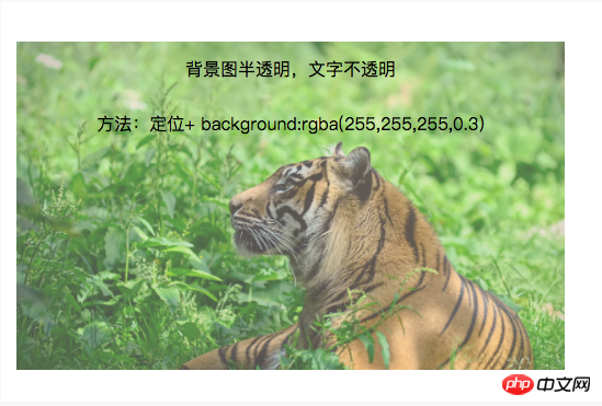
以上是介紹兩種利用CSS實現背景圖片透明而文字不透明的特效代碼的詳細內容。更多資訊請關注PHP中文網其他相關文章!
陳述:
本文內容由網友自願投稿,版權歸原作者所有。本站不承擔相應的法律責任。如發現涉嫌抄襲或侵權的內容,請聯絡admin@php.cn
相關文章
看更多- 以下是幾本符合文章內容的英文問答類標題: 1. **Why Doesn\'t `margin: auto` Work on Inline-Block Elements?** 2. **How to Center Inline-Block Elements Without `margin: auto`?** 3. **Why Does Margin: Auto Fail for Inline-Bl
- 為什麼我的選擇元素背景圖像在 Chrome 中失敗?
- 如何讓 SASS 變數可以跨多個檔案存取?
- GitHub 如何實現無需頁面重新載入的無縫導覽?
- 如何在 Vue.js 中頁面背景上的滑鼠遊標周圍新增徑向漸變