


Bootstrap uses some HTML5 elements and CSS properties, so it needs to use the HTML5 document type.
<!DOCTYPE html>
<html lang="zh-CN">
 ...
</html>
In order to make the website developed by Bootstrap mobile-friendly and ensure proper drawing and touch screen scaling, you need to add the viewport meta tag to the head of the web page, as shown below:
<meta name="viewport" content="width=device-width, //视口宽度为设备宽度
          initial-scale=1.0, //缩放程度
          maximum-scale=1.0, //最大缩放级别(可选)
          user-scalable=no">//禁止页面缩放(可选)
Bootstrap uses Normalize to establish cross-browser consistency. Normalize.css is a small CSS file that provides better cross-browser consistency in the default styling of HTML elements.
About layout
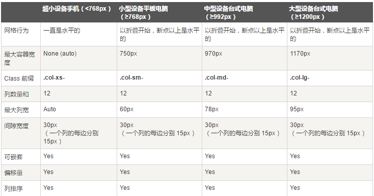
Bootstrap provides a responsive, mobile-first fluid grid system that is automatically divided into up to 12 columns as the screen or viewport size increases.
img-responsive is used for img elements
container element used to wrap content on the page
-
The
- row needs to be placed in the container and is used to create horizontal groups of columns.
- Predefined grid classes, such as .row and .col-xs-4, can be used to quickly create grid layouts.
- Rows and columns can be nested into each other, and the adaptation after nesting is based on the parent element, not the device width
-
To create three equal columns, use three col-xs-4, or 12 col-xs-1 for 12 columns.
<div class="container">
 <div class="row">
  <div class="col-xs-6 col-md-2 col-md-offset-1"></div>
  <div class="col-xs-6 col-md-3"></div>
  <div class="col-xs-6 col-md-3"></div>
  <div class="col-xs-6 col-md-3"></div>
 </div>
 <div class="row">...</div>
</div>
<div class="container">....
<!--以上代码在手机上就是两行两列,在电脑上是一行四列,其中第一列前面有空白,比其它列宽度小三分之一-->
//可使用.col-md-push-* 和 .col-md-pull-* 这种类设定显示,col-md-push-6按照我个人的理解,是在左面浮动了6列,然后再插入元素,col-md-pull-3则是在右边浮动了3列,然后从右往左插入元素
- Media queries are very fancy "conditional CSS rules". It only works with some CSS based on certain specified conditions. If those conditions are met, the corresponding style is applied.
@media (min-width: @screen-sm-min) and (max-width: @screen-sm-max) { ... }
//For all devices with min-width: @screen-sm-min, if the width of the screen is smaller than @screen-sm-max, some processing will be done.
About typesetting
-
About text
<small>本行内容是在标签内</small><br>
<strong>本行内容是在标签内</strong><br>
<em>本行内容是在标签内,并呈现为斜体</em><br>
<p class="text-left">向左对齐文本</p>
<p class="text-center">居中对齐文本</p>
<p class="text-right">向右对齐文本</p>
<p class="text-muted">本行内容是减弱的</p>灰
<p class="text-primary">本行内容带有一个 primary class</p>蓝
<p class="text-success">本行内容带有一个 success class</p>绿
<p class="text-info">本行内容带有一个 info class</p>深蓝
<p class="text-warning">本行内容带有一个 warning class</p>黄
<p class="text-danger">本行内容带有一个 danger class</p>红
Bootstrap defines the style of the element as a dashed border that appears at the bottom of the text, with the full text appearing when the mouse is hovered over it (as long as you add text for the title attribute). To get a smaller font size for text, add .initialism to .
<abbr title="World Wide Web">WWW</abbr><br>
<abbr title="Real Simple Syndication" class="initialism">RSS</abbr>
- Using the tag, you can display contact information on your web page.
- Use the
tag as a quote
<blockquote>这是一个带有源标题的引用。<small>Someone famous in Source Title</small></blockquote>
- list-unstyled is used for unstyled list ul, list-inline is used for horizontal list ul
- pre-scrollable makes pre scrollable
-
displays code inline, <pre class="brush:php;toolbar:false"> displays multiple lines of code</pre>
About the form


By wrapping any .table in a .table-responsive class, you can make the table scroll horizontally to fit on small devices (less than 768px). You won't see any difference when viewing on large devices larger than 768px wide.
<div class="table-responsive">
 <table class="table">
  <caption>响应式表格布局</caption>
  <thead>
   <tr>
   <th>产品</th>
   <th>付款日期</th>
   <th>状态</th>
   </tr>
  </thead>
  <tbody>
   <tr>
   <td>产品1</td>
   <td>23/11/2013</td>
   <td>待发货</td>
   </tr>
  </tbody>
 </table>
</div>
About the form
- Add the attribute role="form" to the form and the basic form structure of Bootstrap will be applied. At this time, the default is a vertical form
- Put the labels and controls in a with class .form-group. This is necessary to obtain optimal spacing.
- Add class .form-control to all text elements ,
<input type="text" class="form-control" placeholder="文本输入"/>
<textarea class="form-control" rows="3"></textarea>
<label for="name">可多选的选择列表</label>
  <select multiple class="form-control">
   <option>1</option>
   <option>2</option>
   <option>3</option>
   <option>4</option>
   <option>5</option>
  </select>
- 在form加上类calss=form-inline,那么表单元素就会变成内联的
- 在form加上类class=form-horizontal,那么表单元素就会变成水平的
1)设置表单控件padding和margin值
2)改变“form-group”的表现形式,类似于网格系统的“row”。
3)向标签添加 class .control-label。
- 复选框和单选框
1)对一系列复选框和单选框使用 .checkbox-inline 或 .radio-inline class,控制它们显示在同一行上。
- 当您需要在一个水平表单内的表单标签后放置纯文本时,请在
上使用 class .form-control-static。
- 禁用的输入框 input,如果您想要禁用一个输入框 input,只需要简单地添加 disabled 属性
- 对
- Bootstrap 包含了错误、警告和成功消息的验证样式。只需要对父元素简单地添加适当的 class(.has-warning、 .has-error 或 .has-success)即可使用验证状态。
- .input-lg 和.input-sm可以改变输入框的高度样式
-
help-block Bootstrap 表单控件可以在输入框 input 上有一个块级帮助文本。为了添加一个占用整个宽度的内容块,请在 后使用 .help-block。
<input class="form-control" type="text" placeholder="">
 <span class="help-block">一个较长的帮助文本块,超过一行,
 需要扩展到下一行。本实例中的帮助文本总共有两行。</span>
关于按钮
 <button type="button" class="btn btn-default">默认按钮</button>

<!-- 提供额外的视觉效果,标识一组按钮中的原始动作 -->
<button type="button" class="btn btn-primary">原始按钮</button>

<!-- 表示一个成功的或积极的动作 -->
<button type="button" class="btn btn-success">成功按钮</button>

<!-- 信息警告消息的上下文按钮 -->
<button type="button" class="btn btn-info">信息按钮</button>

<!-- 表示应谨慎采取的动作 -->
<button type="button" class="btn btn-warning">警告按钮</button>

<!-- 表示一个危险的或潜在的负面动作 -->
<button type="button" class="btn btn-danger">危险按钮</button>

<!-- 并不强调是一个按钮,看起来像一个链接,但同时保持按钮的行为 -->
<button type="button" class="btn btn-link">链接按钮</button>
按钮的大小
<p>
 <button type="button" class="btn btn-primary btn-lg">
  大的原始按钮
 </button>
</p>
<p>
 <button type="button" class="btn btn-primary">
  默认大小的原始按钮
 </button>
</p>
<p>
 <button type="button" class="btn btn-primary btn-sm">
  小的原始按钮
 </button>
</p>
<p>
 <button type="button" class="btn btn-primary btn-xs">
  特别小的原始按钮
 </button>
</p>
<p>
 <button type="button" class="btn btn-primary btn-lg btn-block">
  块级的原始按钮
 </button>
</p>
- class为active表示激活按钮
- class为disabled表示禁用按钮
在a和input上使用按钮class也能弄成按钮的样子,但是考虑到跨浏览器的问题还是在button上比较好。
关于图片
关于图片的样式除了之前提到的img-responsive用于图片的自适应之外还有以下三个样式:
- .img-rounded 圆角图片
- .img-circle 圆形图片
- .img-thumbnail 缩略图功能
关于其它样式类
- .pull-left左浮动
- .pull-right右浮动
- center-block内容居中
- .clearfix清除浮动
- .caret显示下拉式
-
.close关闭图标
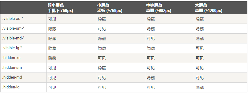
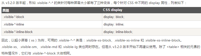
关于不同设备

以上就是Bootstarp中CSS的使用方法,希望大家会喜欢。
- Add class .form-control to all text elements ,

 Python vs. JavaScript:開發人員的比較分析May 09, 2025 am 12:22 AM
Python和JavaScript的主要區別在於類型系統和應用場景。 1.Python使用動態類型,適合科學計算和數據分析。 2.JavaScript採用弱類型,廣泛用於前端和全棧開發。兩者在異步編程和性能優化上各有優勢,選擇時應根據項目需求決定。
 Python vs. JavaScript:選擇合適的工具May 08, 2025 am 12:10 AM
選擇Python還是JavaScript取決於項目類型:1)數據科學和自動化任務選擇Python;2)前端和全棧開發選擇JavaScript。 Python因其在數據處理和自動化方面的強大庫而備受青睞,而JavaScript則因其在網頁交互和全棧開發中的優勢而不可或缺。
 Python和JavaScript:了解每個的優勢May 06, 2025 am 12:15 AM
Python和JavaScript各有優勢,選擇取決於項目需求和個人偏好。 1.Python易學,語法簡潔,適用於數據科學和後端開發,但執行速度較慢。 2.JavaScript在前端開發中無處不在,異步編程能力強,Node.js使其適用於全棧開發,但語法可能複雜且易出錯。
 JavaScript的核心:它是在C還是C上構建的?May 05, 2025 am 12:07 AM
javascriptisnotbuiltoncorc; sanInterpretedlanguagethatrunsonenginesoftenwritteninc.1)JavascriptwasdesignedAsignedAsalightWeight,drackendedlanguageforwebbrowsers.2)Enginesevolvedfromsimpleterterpretpretpretpretpreterterpretpretpretpretpretpretpretpretpretcompilerers,典型地,替代品。
 JavaScript應用程序:從前端到後端May 04, 2025 am 12:12 AM
JavaScript可用於前端和後端開發。前端通過DOM操作增強用戶體驗,後端通過Node.js處理服務器任務。 1.前端示例:改變網頁文本內容。 2.後端示例:創建Node.js服務器。
 Python vs. JavaScript:您應該學到哪種語言?May 03, 2025 am 12:10 AM
選擇Python還是JavaScript應基於職業發展、學習曲線和生態系統:1)職業發展:Python適合數據科學和後端開發,JavaScript適合前端和全棧開發。 2)學習曲線:Python語法簡潔,適合初學者;JavaScript語法靈活。 3)生態系統:Python有豐富的科學計算庫,JavaScript有強大的前端框架。
 JavaScript框架:為現代網絡開發提供動力May 02, 2025 am 12:04 AM
JavaScript框架的強大之處在於簡化開發、提升用戶體驗和應用性能。選擇框架時應考慮:1.項目規模和復雜度,2.團隊經驗,3.生態系統和社區支持。
 JavaScript,C和瀏覽器之間的關係May 01, 2025 am 12:06 AM
引言我知道你可能會覺得奇怪,JavaScript、C 和瀏覽器之間到底有什麼關係?它們之間看似毫無關聯,但實際上,它們在現代網絡開發中扮演著非常重要的角色。今天我們就來深入探討一下這三者之間的緊密聯繫。通過這篇文章,你將了解到JavaScript如何在瀏覽器中運行,C 在瀏覽器引擎中的作用,以及它們如何共同推動網頁的渲染和交互。 JavaScript與瀏覽器的關係我們都知道,JavaScript是前端開發的核心語言,它直接在瀏覽器中運行,讓網頁變得生動有趣。你是否曾經想過,為什麼JavaScr


熱AI工具

Undresser.AI Undress
人工智慧驅動的應用程序,用於創建逼真的裸體照片

AI Clothes Remover
用於從照片中去除衣服的線上人工智慧工具。

Undress AI Tool
免費脫衣圖片

Clothoff.io
AI脫衣器

Video Face Swap
使用我們完全免費的人工智慧換臉工具,輕鬆在任何影片中換臉!

熱門文章
熱工具

SublimeText3 Linux新版
SublimeText3 Linux最新版

ZendStudio 13.5.1 Mac
強大的PHP整合開發環境

SecLists
SecLists是最終安全測試人員的伙伴。它是一個包含各種類型清單的集合,這些清單在安全評估過程中經常使用,而且都在一個地方。 SecLists透過方便地提供安全測試人員可能需要的所有列表,幫助提高安全測試的效率和生產力。清單類型包括使用者名稱、密碼、URL、模糊測試有效載荷、敏感資料模式、Web shell等等。測試人員只需將此儲存庫拉到新的測試機上,他就可以存取所需的每種類型的清單。

WebStorm Mac版
好用的JavaScript開發工具

PhpStorm Mac 版本
最新(2018.2.1 )專業的PHP整合開發工具

