
引入Python' s Matplotlib庫

- Joseph Gordon-Levitt原創
- 2025-02-27 09:26:10427瀏覽
生產出版物就緒的圖表對研究人員至關重要。 儘管存在各種工具,但是實現視覺吸引力的結果可能具有挑戰性。 本教程演示了Python的matplotlib庫如何簡化此過程,並以最小的代碼生成了高質量的數字。
>matplotlibmatplotlib網站所述:“
>
matplotlib本指南涵蓋
matplotlib安裝
pip安裝很簡單。 使用matplotlib(存在其他方法,請參見
<code class="language-bash">curl -O https://bootstrap.pypa.io/get-pip.py
python get-pip.py
pip install matplotlib</code>
基本繪圖示例
我們將使用matplotlib.pyplot,提供類似MATLAB的接口。
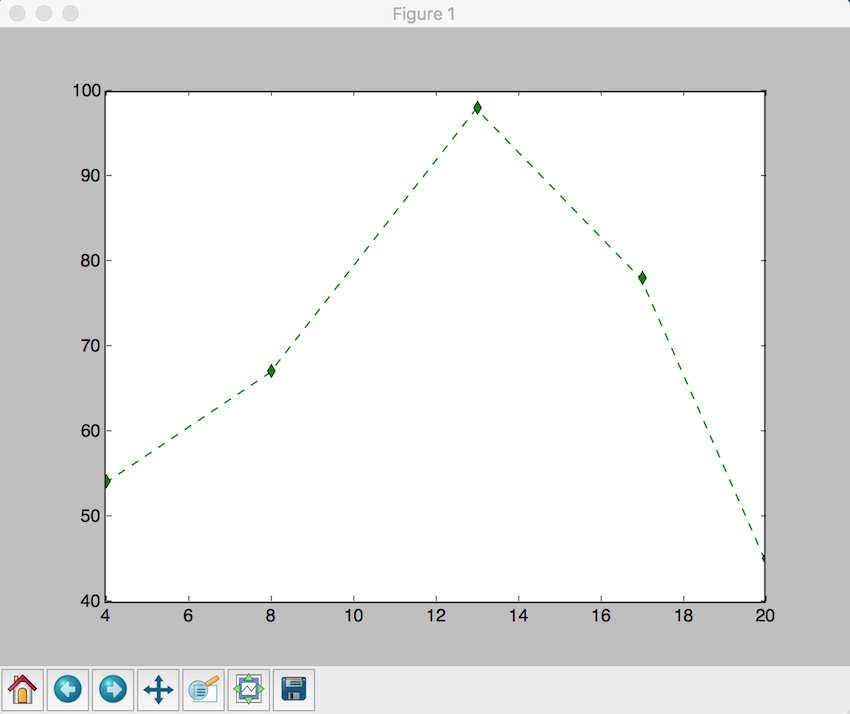
1。線圖
考慮繪製要點:,x = (4, 8, 13, 17, 20)。 y = (54, 67, 98, 78, 45)>
<code class="language-python">import matplotlib.pyplot as plt
plt.plot([4, 8, 13, 17, 20], [54, 67, 98, 78, 45], 'g--d') # Green dashed line with diamond markers
plt.show()</code>
<code class="language-python">month = ["Jan", "Feb", "Mar", "Apr", "May", "Jun", "Jul", "Aug", "Sep", "Oct", "Nov", "Dec"]
rainfall = [83, 81, 97, 104, 107, 91, 102, 102, 102, 79, 102, 91]
plt.plot(month, rainfall)
plt.xlabel("Month")
plt.ylabel("Rainfall (mm)")
plt.title("Average Rainfall in New York City")
plt.show()</code>

2。散點圖
說明兩個數據集之間的關係:
<code class="language-python">x = [2, 4, 6, 7, 9, 13, 19, 26, 29, 31, 36, 40, 48, 51, 57, 67, 69, 71, 78, 88]
y = [54, 72, 43, 2, 8, 98, 109, 5, 35, 28, 48, 83, 94, 84, 73, 11, 464, 75, 200, 54]
plt.xlabel('x-axis')
plt.ylabel('y-axis')
plt.title('Scatter Plot')
plt.grid(True)
plt.scatter(x, y, c='green')
plt.show()</code>

3。直方圖 直方圖可視化數據頻率分佈:
<code class="language-python">x = [2, 4, 6, 5, 42, 543, 5, 3, 73, 64, 42, 97, 63, 76, 63, 8, 73, 97, 23, 45, 56, 89, 45, 3, 23, 2, 5, 78, 23, 56, 67, 78, 8, 3, 78, 34, 67, 23, 324, 234, 43, 544, 54, 33, 223, 443, 444, 234, 76, 432, 233, 23, 232, 243, 222, 221, 254, 222, 276, 300, 353, 354, 387, 364, 309]
num_bins = 6
n, bins, patches = plt.hist(x, num_bins, facecolor='green')
plt.xlabel('X-Axis')
plt.ylabel('Y-Axis')
plt.title('Histogram')
plt.show()</code>

賦予研究人員有效創建具有視覺吸引力和出版物的圖表。它的易用性和廣泛的自定義選項使其成為數據可視化的寶貴工具。 探索
文檔和示例以獲取進一步的功能。 matplotlib
以上是引入Python&#39; s Matplotlib庫的詳細內容。更多資訊請關注PHP中文網其他相關文章!
陳述:
本文內容由網友自願投稿,版權歸原作者所有。本站不承擔相應的法律責任。如發現涉嫌抄襲或侵權的內容,請聯絡admin@php.cn
上一篇:Python中的直方圖均衡下一篇:Python中的直方圖均衡