
使用 Plotly 進行互動式擲骰子資料視覺化

- PHPz原創
- 2024-07-18 22:55:01999瀏覽
在本教程中,我們將學習如何使用 Plotly 建立互動式視覺化。我們的專案重點是分析擲骰子的結果。當滾動單一六面骰子時,從 1 到 6 的任何數字都有相同的出現機會。然而,當您擲多個骰子時,某些數字變得比其他數字更有可能出現。我們的目標是透過模擬擲骰子並創建資料集來確定這些機率。之後,我們將直觀地呈現多次擲骰的結果,以顯示哪些結果在統計上更有可能。
什麼是情節?
Plotly 是一個開源圖形庫,可讓使用者建立互動式、基於 Web 的視覺化效果。它支援多種圖表類型,包括線圖、散佈圖、長條圖等。 Plotly 對於創建可嵌入 Web 應用程式的視覺化效果特別有用,因為它提供縮放、平移和懸停資訊等互動功能。
劇情安裝
我們將使用 pip 安裝 Plotly。我們還需要安裝 pandas,一個用於高效處理資料的函式庫,因為 Plotly Express 依賴它。
$ python -m pip install --user plotly
$ python -m pip install --user pandas
造訪 Plotly 網站上的圖表類型庫,查看可以使用 Plotly 建立的不同視覺化效果。
創建模具類
首先,我們將建立以下 Die 類別來模擬骰子的滾動。我們將檔案命名為 Die.py。
from random import randint

class Die:
    """A class representing a single die."""

    def __init__(self, num_sides = 6):
        """Assume a six-sided die"""
        self.num_sides = num_sides


    def roll(self):
        """Return a random value between 1 and number of sides."""
        return randint(1, self.num_sides)
__ init __ 方法採用一個可選參數。建立 Die 實例時,如果未提供參數,邊數將為 6。如果給定一個參數,它將設定骰子的面數。
roll() 方法使用 randint() 函數傳回 1 到邊數之間的隨機數。此函數可以傳回起始值 (1)、結束值 (num_sides) 或兩者之間的任何整數。骰子依其面數命名:六面骰稱為 D6,十面骰稱為 D10,依此類推。
擲骰子
我們先使用別名 px 導入 Plotly Express 模組,以避免重複輸入plotly.express。我們將建立一個骰子實例來模擬擲兩個 D8 骰子。我們將此檔案命名為 dice_visual.py。
import plotly.express as px

from die import Die

# Create two D8.
die_1 = Die(8)
die_2 = Die(8)

# Make some rolls, and store results in a list.
results = []
for roll_num in range(500_000):
    result = die_1.roll() + die_2.roll()
    results.append(result)
分析結果
最小的可能結果是每個骰子上最小數字的總和 (2)。最大可能結果是分配給 max_results 的每個骰子上最大數字 (16) 的總和。變數 max_result 提高了產生 poss_results 的程式碼的可讀性。我們可以編寫範圍 (2,16),但這僅適用於兩個 D8 骰子。在模擬現實環境時,最好開發能夠輕鬆處理各種場景的程式碼。
# Analyze the result.
frequencies = []
max_results = die_1.num_sides + die_2.num_sides
poss_results = range(2, max_results + 1)
for value in poss_results:
    frequency = results.count(value)
    frequencies.append(frequency)
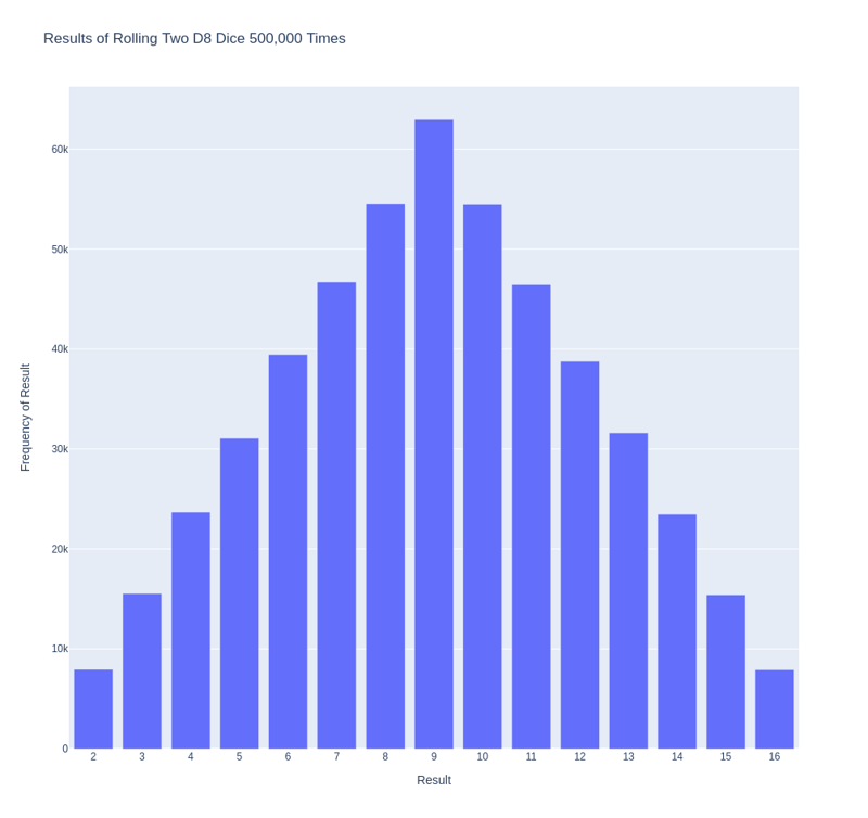
可視化結果。
我們定義了標題並將其指派給「title」。我們創建了一個字典來指定軸標籤。字典的鍵代表我們想要自訂的標籤,而值代表我們想要使用的自訂標籤。我們將 x 軸命名為“結果”,並將 y 軸命名為“結果頻率”。為了建立長條圖,我們使用 px.bar() 函數並傳入可選變數「title」和「labels」。
# Visualize the results.
title = "Results of Rolling Two D8 Dice 500,000 Times"
labels = {'x': 'Result', 'y': 'Frequency of Result'}
fig = px.bar(x = poss_results, y = frequencies, title = title,
 labels = labels)
fig.show()
產生的圖具有適當的標題和每個軸的標籤,如下圖所示。

進一步定制
我們需要解決剛剛建立的繪圖的一個問題。由於有 11 個條形圖,預設的 x 軸佈局設定使某些條形圖未標記。雖然預設設定足以滿足大多數視覺化效果,但如果所有長條圖都已標記,此圖表會顯得更好。
Plotly 提供了 update_layout() 方法,可讓您在建立圖形後對其進行各種變更。以下是如何指示 Plotly 為每個長條賦予自己的標籤。
# Further customize chart.
fig.update_layout(xaxis_dtick = 1)
fig.show()
#fig.write_html('dice_visual_d6d10.xhtml')
update_layout()方法適用於fig對象,它代表整個圖表。我們使用 xaxis_dtick 選項來設定 x 軸上刻度線之間的距離。我們將間距設為 1,以便對每個條形進行標記。當您再次執行 dice_visual.py 時,您應該在每個條形上看到標籤。
可以輕鬆自訂此程式碼以模擬滾動不同大小的骰子。若要建立 D6 和 D10,請在建立兩個 die 實例時傳遞參數 6 和 10。將第一個循環更改為所需的捲數,並相應地更改圖表的標題。
We can get our program to save the chart as an HTML file automatically by replacing the call to fig.show() with a call to fig.write_html().
The write_html() method requires one argument: the name of the file to write to. If you only provide a filename, the file will be saved in the same directory as the .py file. You can also call write_html() with a Path object to save the output file anywhere on your system.
Here is the complete code:
import plotly.express as px

from die import Die

# Create two D8.
die_1 = Die(8)
die_2 = Die(8)

# Make some rolls, and store results in a list.
results = []
for roll_num in range(500_000):
    result = die_1.roll() + die_2.roll()
    results.append(result)

# Analyze the result.
frequencies = []
max_results = die_1.num_sides + die_2.num_sides
poss_results = range(2, max_results + 1)
for value in poss_results:
    frequency = results.count(value)
    frequencies.append(frequency)

# Visualize the results.
title = "Results of Rolling Two D8 Dice 500,000 Times"
labels = {'x': 'Result', 'y': 'Frequency of Result'}
fig = px.bar(x = poss_results, y = frequencies, title = title, labels = labels)

# Further customize chart.
fig.update_layout(xaxis_dtick = 1)
fig.write_html('dice_visual.xhtml')
Refactoring
For clarity, the listings in this section use the long form of for loops. We can refactor the code by using list comprehensions for one or both of the loops. Here is the code using list comprehension:
import plotly.express as px

from die import Die

# Create two D8.
die_1 = Die(8)
die_2 = Die(8)

# Make some rolls, and store results in a list.
results = [die_1.roll() + die_2.roll() for roll_num in range(500_000) ]

# Analyze the result.
max_results = die_1.num_sides + die_2.num_sides
poss_results = range(2, max_results + 1)
frequencies = [results.count(value) for value in poss_results]

# Visualize the results.
title = "Results of Rolling Two D8 Dice 500,000 Times"
labels = {'x': 'Result', 'y': 'Frequency of Result'}
fig = px.bar(x = poss_results, y = frequencies, title = title, labels = labels)

# Further customize chart.
fig.update_layout(xaxis_dtick = 1)

fig.write_html('dice_visual_list_comprehension.xhtml')
Conclusion
In conclusion, analyzing and presenting statistical data becomes powerful and engaging with Plotly for interactive dice roll data visualization. By simulating dice rolls and visualizing the outcomes, we can better understand the probabilities of different results. Plotly's interactive features, such as hover information, panning, and zooming, enhance the user experience and make data more accessible. Additionally, the ability to customize and save visualizations as HTML files makes it easy to share and integrate them into web applications. This article demonstrates how to use Plotly's features to create informative and attractive charts. Plotly is an excellent tool for data analysis and presentation.
以上是使用 Plotly 進行互動式擲骰子資料視覺化的詳細內容。更多資訊請關注PHP中文網其他相關文章!