SVG shadow
Note: Internet Explorer and Safari do not support SVG filters!
<defs> and <filter>
All Internet SVG filters are defined in the <defs> element. The <defs> element definition is short and contains definitions for special elements (such as filters).
<filter> tag is used to define SVG filters. The <filter> tag uses the required id attribute to define which filter to apply to the graph?
SVG <feOffset>
Example 1
<feOffset> element is used to create a shadow effect. The idea is to take an SVG graphic (image or element) and move it a little bit on the xy plane.
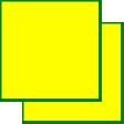
The first example offsets a rectangle (with <feOffset>), then blends the offset top of the image (with <feBlend>):

Here is the SVG code:
Instance
<!DOCTYPE html>
<html>
<body>

<p><b>Note: </b>Internet Explorer and Safari do not support SVG filters yet!</p>

<svg xmlns="http://www.w3.org/2000/svg" version="1.1">
  <defs>
    <filter id="f1" x="0" y="0" width="200%" height="200%">
      <feOffset result="offOut" in="SourceGraphic" dx="20" dy="20" />
      <feBlend in="SourceGraphic" in2="offOut" mode="normal" />
    </filter>
  </defs>
  <rect width="90" height="90" stroke="green" stroke-width="3"
  fill="yellow" filter="url(#f1)" />
</svg>

</body>
</html>
Run Instance»
Click the "Run Instance" button to view the online instance
For Opera users: View the SVG file (right-click on the SVG graphic preview source).
Code analysis:
- ##<filter>The element id attribute defines the unique name of a filter
- <rect>The filter attribute of the element is used to link the element to the "f1" filter
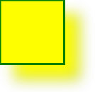
Example 2Now, offset The image can be blurred (including <feGaussianBlur>):
 Here is the SVG code:
##For Opera users: View the SVG file ( Right click on the SVG graphic preview source).
- <feGaussianBlur>The stdDeviation attribute of the element defines the blur amount
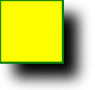
Now, make a black shadow:
Here is the SVG code: Example
 <!DOCTYPE html>
<html>
<body>
<p><b>Note: </b>Internet Explorer and Safari do not support SVG filters yet!</p>
<svg xmlns="http://www.w3.org/2000/svg" version="1.1">
<defs>
<filter id="f1" x="0" y="0" width="200%" height="200%">
<feOffset result="offOut" in="SourceAlpha" dx="20" dy="20" />
<feGaussianBlur result="blurOut" in="offOut" stdDeviation="10" />
<feBlend in="SourceGraphic" in2="blurOut" mode="normal" />
</filter>
</defs>
<rect width="90" height="90" stroke="green" stroke-width="3" fill="yellow" filter="url(#f1)" />
</svg>
</body>
</html>
Run instance»Click the "Run instance" button to view the online instance
For Opera users: View the SVG file (right-click on the SVG graphic preview source).
Code analysis:
<feOffset>The attribute of the element is changed to "SourceAlpha" to use afterimage in the Alpha channel instead of the entire RGBA pixels.
Example 4
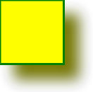
Now apply a layer of color to the shadow:

Here is the SVG code:
Instance
<!DOCTYPE html>
<html>
<body>

<p><b>Note: </b>Internet Explorer and Safari do not support SVG filters yet!</p>

<svg xmlns="http://www.w3.org/2000/svg" version="1.1">
  <defs>
    <filter id="f1" x="0" y="0" width="200%" height="200%">
      <feOffset result="offOut" in="SourceGraphic" dx="20" dy="20" />
      <feColorMatrix result = "matrixOut" in = "offOut" type = "matrix" values = "0.2 0 0 0 0 0 0.2 0 0 0 0 0 0.2 0 0 0 0 0 1 0"/>
      <feGaussianBlur result="blurOut" in="matrixOut" stdDeviation="10" />
      <feBlend in="SourceGraphic" in2="blurOut" mode="normal" />
    </filter>
  </defs>
  <rect width="90" height="90" stroke="green" stroke-width="3" fill="yellow" filter="url(#f1)" />
</svg>

</body>
</html>
Run Instance»
Click the "Run Instance" button to view the online instance
For Opera users: View SVG files (right-click on the SVG graphic preview source).
Code analysis:
- ##<feColorMatrix>The filter is used to convert the offset image to a color closer to black. The three values of the '0.2' matrix are obtained by multiplying the red, green and blue channels. Lowering its value brings the color to black (black is 0)


