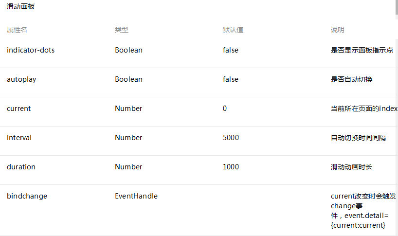
WeChat applet slider view container
WeChat applet view container: swiper sliding panel (also known as slider view container, common carousel image)

Note: Only swiper-item can be placed in it component, other nodes will be automatically deleted
swiper-item
can only be placed in the swiper component, and the width and height are automatically set to 100%
Sample code:
<swpier indicator-dots="{{indicatorDots}}"
  autoplay="{{autoplay}}" interval="{{interval}}" duration="{{duration}}">
  <block wx:for-items="{{imgUrls}}">
    <swpier-item>
      <image src="{{item}}" class="slide-image" width="355" height="150"/>
      <text class="textindex">{{index}}</text>
    </swpier-item>
  </block>
</swpier>
<button bindtap="changeIndicatorDots"> indicator-dots </button>
<button bindtap="changeAutoplay"> autoplay </button>
<slider bindchange="intervalChange" show-value min="500" max="2000"/> interval
<slider bindchange="durationChange" show-value min="1000" max="10000"/> duration
rrree


