刚刚接触iOS开发所以在屏幕适配上面有一些迷惑之处.
举个栗子
以下是我的约束条件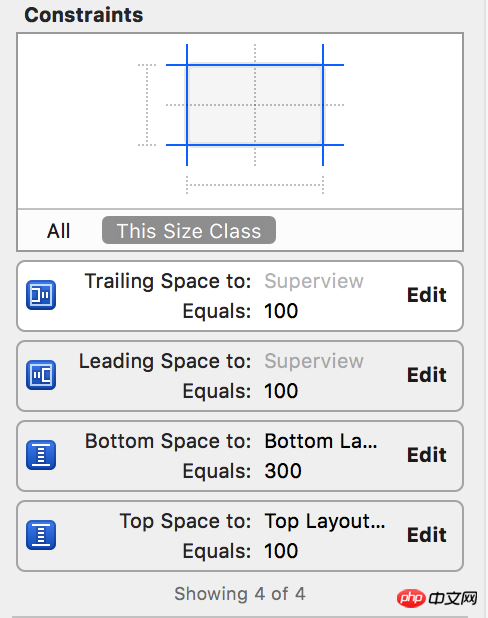
但是不同的机器上完全是不同的效果
4s
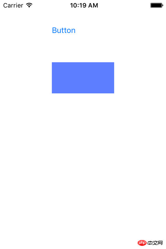
6sp
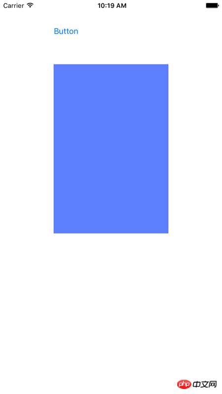
为了看起来更直观 ,实际上就是效果的差距甚远
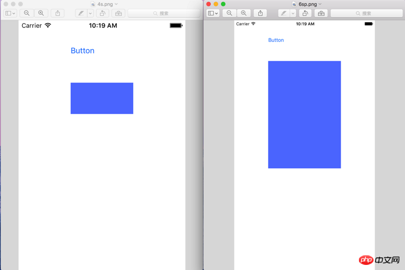
所以请教大家,大家平时在屏幕适配方面都是采取什么解决方案.
像我上面提出的需求改用何种方法才可以实现
感谢一楼的热心回答,在此处补充一下
可能是我思考问题的角度除了问题,实际上我想达到的目的是,我在iPhone6P上写了这么一套布局.而这套布局在应用到iPhone4上的时候,显示的比例可以不同,但是大体效果应该一致.变相理解为 iPhone4是iPhone6P的缩小版,请问这种需求该如何实现呢?
習慣沉默2017-05-02 09:23:00
When I was learning iOS development, I was not very comfortable with the usage of AutoLayout. I even thought that the code layout would be simpler. It wasn't until I discovered autoLayout's Aspect Ratio that I realized how useful AutoLayout is. According to my personal understanding, if you use aspect ratio, you can proportionally size the sizes of various controls.

First go to the constraint diagram on the storyboard. I just determine the position constraints in the X direction of the view and the position constraints in the Y direction. However, it is impossible to determine the size of a view with just two constraints. If you determine the distance up, down, left, and right like lz, then as long as the screen changes, the size of the view there will be stretched. Instead the 4 that lz asked for at the end is a smaller version of plus. Then use Asecpt Rotio. As shown in the picture.
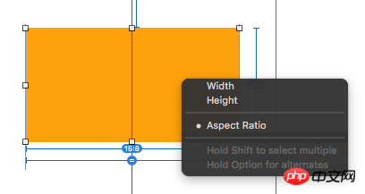
I am sure that the ratio between the width and height of the view is 15:8.
Next, make sure that the ratio between the width of the view and the width of the main View is a constant.
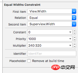
The width of the viewController on the storyboard is 320. The entire interface is a sample of the iPhone 5/5s, but one thing is that the screen width of the iPhone 4/4s is the same as that of the 5/5s. So the width of the view is determined by the width of the screen, then the size is obtained, and then the height of the view is obtained. Then we can make different models, 4 is just a smaller version of plus, rather than various stretching.
The picture above is more straightforward.
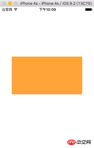
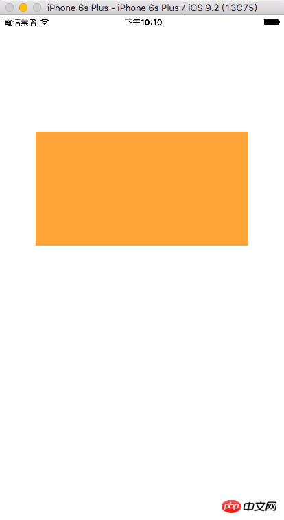
I am also just a new iOS user who has just started using iOS. I wish you go further and further on the road of iOS development.
習慣沉默2017-05-02 09:23:00
According to the rules you set, it can be simply understood as:
1) 100 meters from the left side of the screen;
2) 100 meters from the right side of the screen;
3) 100 meters from the top edge of the screen;
4) 300 meters from the bottom edge of the screen;
It is correct to display it like this according to your rules. The screen heights of iPhone 6 Plus and iPhone 4 are different, so the display effect should be different according to the rules you set.
I guess you may want to fix the height of your View. At this time, you can remove the Bottom Space rule and add a rule that sets the View Height to a fixed height.
滿天的星座2017-05-02 09:23:00
Very good autolayout tutorial.
Auto Layout Tutorial in iOS 9
You can understand automatic layout according to the above tutorial.
If you are a novice, you can start with frame and 4s, and use frame and other attributes to become familiar with how controls are placed on the canvas.
黄舟2017-05-02 09:23:00
The method mentioned by the people above is very good. You can view the layout of different screens in the preview in split screen. It is relatively intuitive.