
网上看到的代码,有些不理解的地方:
.custom-border{
width:200px;
margin:10px auto;
height:100px;
border:1px solid #333;
background-color:#eee;
padding:10px;
}
.scale-border{
margin:10px auto;
height:100px;
position:relative;
padding:10px;
width: 200px;
}
.border{
-webkit-transform:scale(0.5);
transform:scale(0.5);
position:absolute;
border:1px solid #333;
top:-50%;
right:-50%;
bottom:-50%;
left:-50%;
border-radius: 10px;
background-color:#eee;
}
.content{
position:relative;
z-index:2;
}
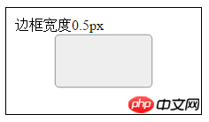
<p class="custom-border border-color">边框宽度1px</p>
<p class="scale-border">
<p class="content">边框宽度0.5px</p>
<p class="border border-color"></p>
</p>请问在这里CSS代码中的
top:-50%;
right:-50%;
bottom:-50%;
left:-50%;
是什么意思?实现这个0.5px的边框的原理是什么?
btw,transform:scale是不是在项目中挺少用到的?百度了好久关于scale 的详细用法甚少。。

PHP中文网2017-04-17 15:06:14
In fact, the main thing is to reduce it to 0.5px using scale(0.5); then use
top:-50%;
right:-50%;
bottom:-50%;
left:-50%;
Go and enlarge it to its original size. But this increase does not affect the size of the border;

大家讲道理2017-04-17 15:06:14
First of all, transform:scale(0.5); means scaling by 1/2, and it will become like this (the black outer border is specially added for comparison):
Because for zooming it is overall zooming down. So, after reducing it, you need to pull it back to its original size so that it looks like a 0.5px border, that is:
top:-50%;
right:-50%;
bottom:-50%;
left:-50%;
I felt that adding an extra <p> to indicate the size of 0.5px was not elegant, so I rewrote it like this:
.custom-border{
    width:200px;
    margin:10px auto;
    height:100px;
    border:1px solid #333;
    background-color:#eee;
    padding:10px;
}
.scale-border{
    margin:10px auto;
    height:100px;
    position:relative;
    padding:10px;
    width: 200px;
}
.scale-border::after{
    content: ' ';
    -webkit-transform:scale(0.5);
    transform:scale(0.5);
    position:absolute;
    border:1px solid #333;
    top:-50%;
    right:-50%;
    bottom:-50%;
    left:-50%;
    border-radius: 10px;
    background-color:#eee;
}
.content{
    position:relative;
    z-index:2;
}
<p class="custom-border border-color">边框宽度1px</p>
<p class="scale-border">
<p class="content">边框宽度0.5px</p>
</p>
天蓬老师2017-04-17 15:06:14
is meant to be enlarged to twice the size of the original .scale-border.
Because .border is absolutely positioned (position:absolute;), its positioning is determined based on its nearest non-position:static, while .scale-border is relatively positioned (position:relative;), so
top:-50%;
right:-50%;
bottom:-50%;
left:-50%;
is .border centered on the center of .scale-border, enlarged to twice, and then ransform:scale(0.5); reduced to 1/2, then it will be the same size as .scale-border. At this time, the 1px border becomes 0.5px.
transformYou should be able to use it with confidence.

伊谢尔伦2017-04-17 15:06:14
Brother, you will understand after watching this.
https://developer.mozilla.org...