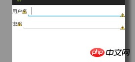
如图,我想通过如下代码实现第二个edittext与第一个edittext左边缘对齐,但是行不通,求指点。
<LinearLayout
    android:layout_width="match_parent"
    android:layout_height="wrap_content" >


<TextView
    android:id="@+id/textView1"
    android:layout_width="wrap_content"
    android:layout_height="wrap_content"
    android:text="用户名" />

    <EditText
    android:id="@+id/editText1"
    android:layout_width="match_parent"
    android:layout_height="wrap_content"
    android:ems="10" >

    <requestFocus />
</EditText>
</LinearLayout>

<LinearLayout
    android:layout_width="match_parent"
    android:layout_height="wrap_content" >

    <TextView
        android:id="@+id/textView2"
        android:layout_width="wrap_content"
        android:layout_height="wrap_content"
        android:text="密码" />

    <EditText
        android:id="@+id/editText2"
        android:layout_width="wrap_content"
        android:layout_height="wrap_content"
        android:layout_weight="1"
        android:ems="10"
        android:layout_alignLeft="@id/editText1" />

</LinearLayout>高洛峰2017-04-17 14:50:52
For your situation, the simplest way is to set the width of the two TextViews to a fixed value and equal them.
LinearLayout is a linear layout. The controls in the layout are arranged from left to right (or top to bottom). wrap_contentThe width is allocated according to its content. Due to the different content lengths of "Username" and "Password", the corresponding two TextViews are unequal in width, followed by EditText, which leads to misalignment.
The second method is to set the width of the component in LinearLayout to 0dp, and then set it android:layout_weight, for example, if TextView is set to 0.2 and EditText is set to 0.8, the two controls will allocate the width of the entire LinearLayout proportionally. The second LinearLayout is also set in the same way to ensure that the EditText is aligned.
The third method is to use RelativeLayout to set the left side of the View to align with the left side of the specified View through android:layout_alignLeft="@id/anotherViewId".
But your layout situation is very simple. I think methods 1 and 2 are more convenient.
怪我咯2017-04-17 14:50:52
Not much to say about setting weights, setting fixed values, relative layout, etc.!
It is recommended to use GridLayout
Using GridLayout layout can perfectly solve your problem and reduce the application of LinearLayout
Reference for specific usage: A brief discussion of GridLayout layout in android 4.0 development
Note: Systems above 4.0 can be used directly, systems below 4.0 need to import the v7 package
Someone in the comments mentioned using TableLayout, but it needs to be used in combination with TableRow for layout, which is not recommended.
TableLayout related usage reference: android layout------TableLayout (table layout) detailed explanation
Difference reference between GridLayout and TabLayout: GridLayout and TableLayout layout
大家讲道理2017-04-17 14:50:52
LinearLayout does not support the android:layout_align* attributes. If you want to use this series of attributes, you can change it to RelativeLayout.
But depending on your needs, you can actually use TableLayout (of course the official said it is outdated and is not recommended), or like the answer above, set layout_width to 0dp and set the width of the component through weight. This is also The most common way for everyone to write this kind of page.
巴扎黑2017-04-17 14:50:52
There is a super simple solution to align the password... Add a full-width space between the two characters of the password
巴扎黑2017-04-17 14:50:52
1. The simplest way is to change it to a relative layout and just drag it to align.
2. Lay out linear layouts for the two input boxes, and align the two linear layouts.
PHPz2017-04-17 14:50:52
Give you a suggestion, in LinearLayout, use the weight attribute of View to control the duty cycle of the subspace
For example, set the weight of Text to 1 and the weight of EditText to 2, then in the horizontal layout, the two The controls have a 1:2 relationship, so naturally the upper and lower EditTexts are aligned