
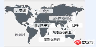
这样的一张图,需要放8个按钮对应八个地图位置,在不同尺寸的移动端设备上,图的宽度可能会发生变化。
按钮的position定位如何自适应准确?
按钮的宽高如何定?
求教解决方案。

PHP中文网2017-04-17 14:40:03
1. How did you draw your map?
2. If it is an ordinary p, it is ok to use relative positioning and absolute positioning
3. If it is drawn on canvas, just draw the corresponding copy prompt through x, y coordinates

巴扎黑2017-04-17 14:40:03
It is recommended to use canvas coordinates for positioning, which is more accurate

天蓬老师2017-04-17 14:40:03
It is recommended to use rem units, margin percentage + position positioning has compatibility issues in mobile UC browsers

PHP中文网2017-04-17 14:40:03
1. Use <meta name="viewport"> to define the device width
2. Use position, and then calculate the percentage position

阿神2017-04-17 14:40:03
What I understand about the question you asked is mobile terminal adaptation. There are many solutions. The rem solution used by Taobao is more recommended. For specific practices, you can refer to the multi-screen adaptation problem mentioned in this article.
http://www.html-js.com/articl...
