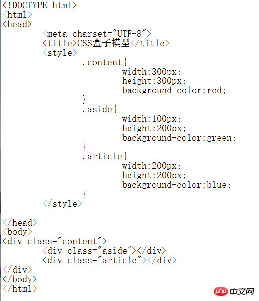
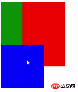
外层的p已经规定了height,为什么里面的p还能超出height的范围呢?尽管p是块级元素,但里层的两个p不是已经被包裹在外层的p范围了吗?
———————————————————————————————————————————
代码和效果

阿神2017-04-17 14:31:33
<p id="container">
  <p id="child1"></p>
  <p id="child2"></p>
</p>
#container{
width:100px;
height:100px;
background:red;
overflow:hidden;
}
#child1{
width:60px;
height:60px;
background:blue;
}
#child2{
width:70px;
height:70px;
background:green;
}The overflow attribute specifies what happens when content overflows the element's box.
Default overflow operation: visible. (Content will not be trimmed and will be rendered outside the element box.)
Possible values and options:
visible Default value. The content will not be trimmed and will be rendered outside the element box.
hidden content will be trimmed and the remaining content will be invisible.
scroll The content will be trimmed, but the browser will display scroll bars to view the rest of the content.
auto If content is trimmed, the browser displays scroll bars to view the remaining content.
inherit specifies that the value of the overflow attribute should be inherited from the parent element.
大家讲道理2017-04-17 14:31:33
p is a block-level element and will not be arranged horizontally by default. In this case, the two ps are aligned vertically. My understanding is that the current page structure is correct in the DOM, and the visual problems are only due to the CSS settings and have nothing to do with the DOM itself. But the poster’s question is a very good Bug issue about design, that is, if other elements are added to the current code, inexplicable gaps will appear. Therefore, when designing a website, you should also consider the DOM structure and how it is laid out through CSS.
Hope this helps.
PHPz2017-04-17 14:31:33
The p element defaults to a block-level element (display:block). Each p of the same level occupies its own line. The effect of your picture is because the combined height of the two inner p elements exceeds the outer parent The height of element p, so it overflows. If the height of your outer parent element is set to height:auto, it will be self-supporting, or you set overflow hiding (overflow:hidden) or scrolling effect (overflow-y:auto). There will no longer be the effect of the two p’s running out
黄舟2017-04-17 14:31:33
This is because you did not set the overflow value. By default, the overflow value of the element within your parent p content is visible, so the overflowed part will be displayed and exceed the height of the parent p. You can set it by
overflow:hidden
or
overflow:scroll
to prevent its child elements from overflowing due to exceeding the parent width and height, or by setting the height to
height:auto
Also.
大家讲道理2017-04-17 14:31:33
First of all, p is a block-level element, which means that the default p occupies one line. Even if you set the width, it will not prevent it from filling one line
The height of the parent p is 300, and the height of the first child p is 200, so it can be accommodated by the parent p and placed in the upper left corner, no problem
Because p occupies one line, the second child p must be placed below the first child p. The height is still 200, which exceeds the height of the parent p, so it overflows and is displayed
伊谢尔伦2017-04-17 14:31:33
p occupies one line by default, why not set: display:inline-block; to an inline element