
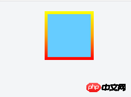
.border {
    width: 100px;
    height: 100px;
    background: #6CF;
    border: 6px solid #F33;
    margin: 20px auto;
    border-image: linear-gradient(to top, red, orange, yellow) 6;
    -moz-border-radius: 15px 25px !important;
    -webkit-border-radius: 15px 25px !important;
    border-radius: 15px 25px !important;
}
用border-image写了一个渐变,同时想要写一个圆角,写了border-radius但是并无作用,border-image不能实现圆角功能么

迷茫2017-04-17 13:42:45
<p class="border">
112233
</p>
.border{
position: relative;
border: 4px solid transparent;
border-radius: 16px;
background: linear-gradient(orange, violet);
background-clip: padding-box;
padding: 10px;
/* just to show box-shadow still works fine */
box-shadow: 0 3px 9px black, inset 0 0 9px white;
}
.border::after{
position: absolute;
top: -4px; bottom: -4px;
left: -4px; right: -4px;
background: linear-gradient(red, blue);
content: '';
z-index: -1;
border-radius: 16px;
}

大家讲道理2017-04-17 13:42:45
My personal understanding is, 1. border-radius is a border style, which will be applied to the background when there is no border. 
2.border-image is also an attribute of the border, but once this attribute cannot be displayed, the default style of the border will be displayed, such as
border:15px solid #F33;
So once the border-image is created and the browser applies it, this is why the border-radius and border are not displayed after the border-image is created.
3. If you want to have these two styles at the same time, I support the approach of the two masters above ~ because you can’t have your cake and eat it too.
The above is my personal opinion~ If there is anything wrong, please correct me. Thank you.
Attachment: a website where I checked information border-image

PHP中文网2017-04-17 13:42:45
Nest one more layer and set the outer rounded corners + overflow:hidden.

怪我咯2017-04-17 13:42:45
.border{
width:90px;
height:90px;
border:15px solid #F33;
margin:20px auto;
border-image:linear-gradient(to top, red, orange, yellow) 25;
border-radius:25px;
position:relative;
}
.border::after{
content:"";
width:100px;
height:100px;
position:absolute;
top:-5px;
left:-5px;
z-index:10;
border-radius:15px;
background-color:#6CF;
}