Home  >  Q&A  >  body text

html5 - css3 线性渐变实现间断线条效果


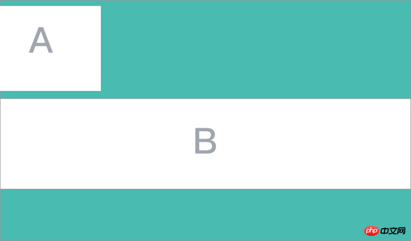
上图是我现做出来的效果!但是这个效果和我想要的还有差别,对比下面我要的效果图

我使用线性渐变做的,可是渐变带有渐变效果,有没有某种技巧让中间个文字交接的地方没有渐变效果呢?
css代码:

hr {
                text-align:center;
                box-sizing: content-box;
                height: 1px;
                border: 0;
                /*border-top: 1px solid #808080;*/
                width: 90%;
                margin-bottom: 20px;
                background-image: linear-gradient(to right,#808080,#808080, rgba(0, 0, 0, 0),rgba(0, 0, 0, 0),#808080, #808080);
            }
            
            hr.style-eight:after {
                content: "第三方登陆";
                display: inline-block;
                position: relative;
                top: -0.7em;
                color: #808080;
                /*background-color: #1D263B;*/
                padding: 0 10px;
            }

html代码:

<hr class="style-eight">
怪我咯怪我咯2714 days ago518

reply all(5)I'll reply

  • ringa_lee

    ringa_lee2017-04-17 13:32:33

    If your focus is on linear-gradient, you can write it like this without using pseudo elements
    background-image: linear-gradient(to right, #fb3 40%, #58a 0,#58a 60% , #fb3 0);

    reply
    0
  • 巴扎黑

    巴扎黑2017-04-17 13:32:33

    Use pseudo-element: after :before

    reply
    0
  • ringa_lee

    ringa_lee2017-04-17 13:32:33

    If you don’t add gradient, there will be nothing

    reply
    0
  • PHP中文网

    PHP中文网2017-04-17 13:32:33

    Why should we insist on gradient? Just use a long line and make a square p for the "third-party login" in the middle. The background color should be the same as the background color behind it. Just cover the middle of the line segment.

    reply
    0
  • PHPz

    PHPz2017-04-17 13:32:33

    My final solution:
    Click to view
    html code:

    <p class="style-eight">
                        第三方登陆
                    </p>

    css code:

    .style-eight {
                    box-sizing: content-box;
                    margin-bottom: 20px;
                }
                
                .style-eight:after {
                    content: "";
                    display: inline-block;
                    position: relative;
                    top: -6px;
                    padding: 0 10px;
                    width: 20%;
                    height: 1px;
                    background-image: linear-gradient(to right, #808080, #808080);
                }
                
                .style-eight:before {
                    content: "";
                    display: inline-block;
                    position: relative;
                    top: -6px;
                    padding: 0 10px;
                    width: 20%;
                    height: 1px;
                    background-image: linear-gradient(to right, #808080, #808080);
                }

    reply
    0
  • Cancelreply