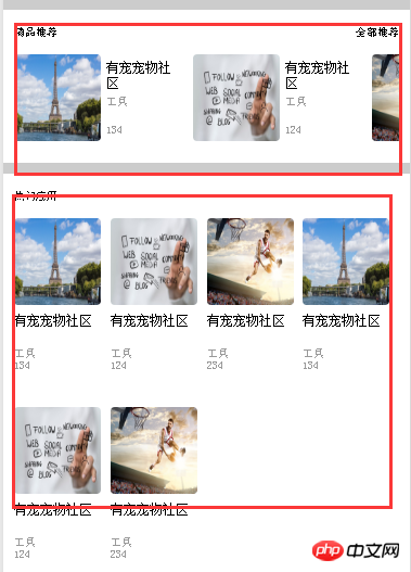
如图所以,用flex布局方式,如何让热门应用的的右端与边框对齐,达到两端对齐的效果,因为是循环列表,不是单行,不知道该如何控制,请大神指点一下!
高洛峰2017-04-17 12:02:25
It is better to teach a man to fish than to teach him to fish.
flex layout
伊谢尔伦2017-04-17 12:02:25
Set display:flex on the outermost p; then set styles on three p’s inside
.row{
    display: flex;
    width: 100%;
}
.col-33{
    flex: 0 0 33.3%;
    max-width: 33.3%;
    }
.text-center{
    text-align:center;
}
<p>
<p class="col-33 text-left"></p>
<p class="col-33 text-center"></p>
<p class="col-33 text-right"></p>
</p>天蓬老师2017-04-17 12:02:25
Use justify-content: space-between; on the container to align both sides
ringa_lee2017-04-17 12:02:25
The parent container uses justify-content: space-between; to align both ends, and the space between items is equal!
You can refer to this
justify-content : 在主轴上的对齐方式
                    flex-start    做对齐
                    flex-end    右对齐
                    center        居中
                    space-between    两端对齐,项目之间的间隔都相等
                    space-around     每个项目两侧的间隔相等,所以,项目之间的间隔要大与与边框的距离
PHP中文网2017-04-17 12:02:25
This scenario is more suitable for layout using percentage width instead of flex. Any layout has its limitations and must be used flexibly. If there are 3, set width:33.33%
迷茫2017-04-17 12:02:25
One more thing, if you want to use flex on the mobile side, it is recommended to only use the flex attribute.
You can refer to Taobao’s approach, use flex and box together, reference link: http://h5.m.taobao.com/mlapp/...
Other references:
https://css-tricks.com/old-fl...
https://www.html5rocks.com/en...
大家讲道理2017-04-17 12:02:25
The parent element sets display:flex;
The child element sets justify-content: space-between;