
如果在移动项目中使用像weui这种样式库怎么结合rem布局?
比如想用淘宝的flexible方案布局,会改变dpr
[data-dpr="2"] p {
    font-size: 24px;
}

[data-dpr="3"] p {
    font-size: 36px;
}
weui里面字体就会出现异常,请问怎么解决这种问题?
或者说在用第三方样式库/组件库的时候不用把px改成rem?

PHPz2017-04-17 12:00:07
If you don’t want to change the dpr, you can specify the value of dpr in the meta tag, so that the problem you mentioned will not occur

大家讲道理2017-04-17 12:00:07
Tell me what I know
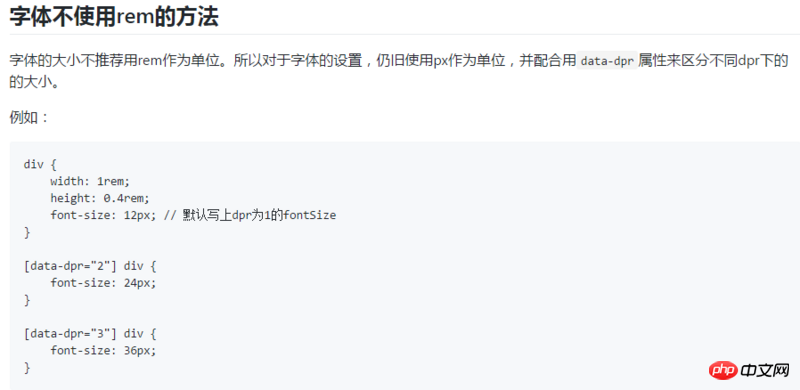
Taking into account the bitmap information of the font, generally the text size will use the equivalent of 16px 20px 24px,
If you specify the text size with rem, values such as 21px and 19px will be generated, which will result in ugly fonts, burrs, and even black blocks , so Use px units to set, and then set different font-size according to the resolution of the device. Since most of the device-independent pixels on the mobile terminal will not differ too much, you can set different dpr according to the resolution of the device. Make settings.
[data-dpr = "2"] p {

font-size:24px;

}

[data-dpr="3"] p{

font-size:36px;

}
/* 或者使用媒体查询的方法设置 */
may also require screen scaling, and considering that this type of text is generally larger, if exceeds 30px, you can also use rem to set the font.
Using Taobao's flexible scheme layout will not automatically convert your set unit px into rem. Of course, it can be achieved with a plug-in.
The mobile shopping solution will dynamically generate the initial-scale,maximum-scale,minimum value, use rem for layout width and height, and then html tag settings font-size, and use fone-size to control rem Width and height, and use Device pixel ratio to set the dpr来适配screen density display of different mobile devices
flexible.js source code