
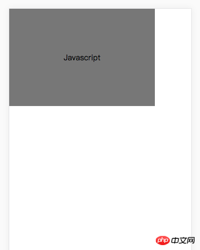
原始图形如下:
想旋转90度, 如下:
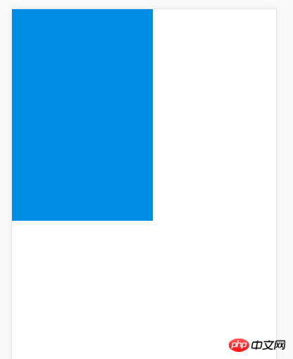
问题来了: 使用
transform-origin, 使用哪个值旋转90度都到不了这个图形, 请问:如何实现??
总结
感谢各位, 已解决, 效果可以看下采纳的答案, 我总结一下, 这个旋转和宽度没有关系, 只要transform-origin的两个值都设置成为高度的50%即可
.content {
    width: 300px;
    line-height: 200px;
    background-color: #777777;
    position: absolute;
    top:0;
    left:0;
    transform-origin : 100px 100px;
    text-align: center;
}
ringa_lee2017-04-17 11:57:27
Please see the case: http://jsbin.com/qewubuz/edit...,
The statement above is correct

PHP中文网2017-04-17 11:57:27
Just set the value of
transform-origin to half of the short side (i.e. half of the height)

伊谢尔伦2017-04-17 11:57:27
Need to use: transform-origin:50px 50px 0;
transform-origin: 50% of height 50% of height 0;
http://runjs.cn/code/ovvcgcbg
ringa_lee2017-04-17 11:57:27
<!DOCTYPE html>
<html>
<head>
<style>
p
{
margin:30px;
width:200px;
height:100px;
background-color:yellow;
/* Rotate p */
transform:rotate(90deg);
-ms-transform:rotate(90deg); /* Internet Explorer */
-moz-transform:rotate(90deg); /* Firefox */
-webkit-transform:rotate(90deg); /* Safari 和 Chrome */
-o-transform:rotate(90deg); /* Opera */
}
</style>
</head>
<body>

<p>Hello World</p>

</body>
</html>
