
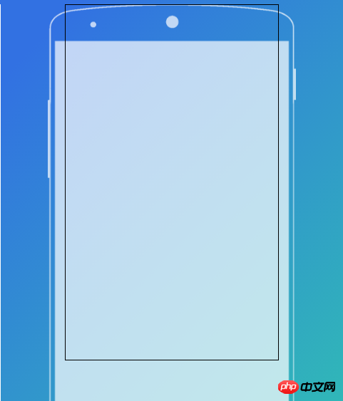
如图我有个总的大p,宽度和高度都是不定的,里面的手机线框是背景图,用的
1 2 |
|
定位的,黑框是我想要操作的p,想让他能覆盖手机模型的屏幕,而且放大缩小都会刚好限制在手机屏幕内,该怎么定位呢,能不能实现?

迷茫2017-04-17 11:53:55
Thank you, this kind of thing doesn’t need a background image at all.
Written a demo, click on it to see the css code and preview the effect directly.
https://jsfiddle.net/vpgL5535/

怪我咯2017-04-17 11:53:55
From what I understand, "zooming in and out will be just limited to the phone screen" refers to width adaptation. If you want to use a picture background, you can consider using percentage layout. The reference code is as follows (omitting unimportant parts):
1 2 3 4 5 |
|
1 2 3 4 5 6 7 8 9 10 11 |
|
is:
The key points are:
background-size: 100% auto; to make the background image always scale to the same width as the outer p and maintain the aspect ratio.
padding: 13.77% 14.13% 0; takes the distance from the mobile phone model screen area to the edge of the background image, and converts the px value into a percentage value (the ratio is obtained by dividing the pixel value by the image pixel width)
(optional) max-width: 559px; so that the outer p does not exceed the size of the background image (the background image size is 753 x 559), min-height so that the entire phone model can be seen even when the content is small.

高洛峰2017-04-17 11:53:55
The color scheme is quite beautiful, wow.
This black wireframe can be directly written as a "mobile phone" sub-element. Put it inside and use the percentage width and height to control the size, and it will be adaptive.
For example:
1 2 3 4 5 6 |
|