
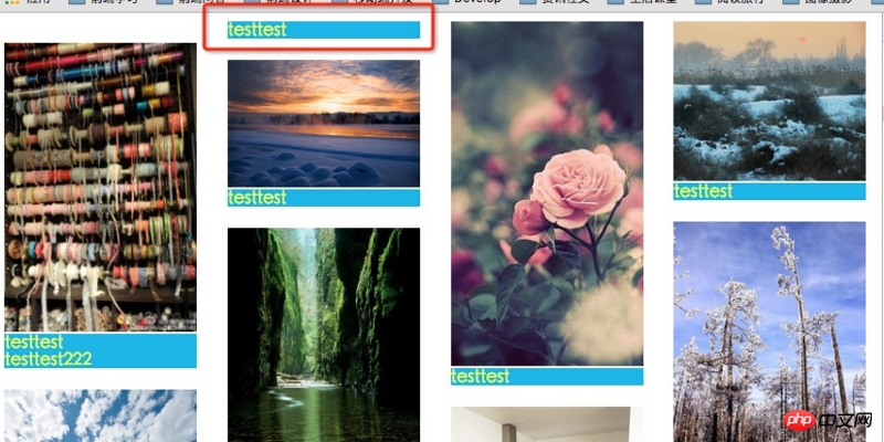
各位亲,你们是否有人在使用 css3 的column-width多列布局,然后是否有碰到过内容被截断分开的问题?然后你们是怎么解决的呢?谢谢~
如图(正常情况下,标题是要位于图片下方的):
css代码如下:
<style type="text/css">
  .container {
    -webkit-column-width: 180px;
    -moz-column-width: 180px;
    -o-column-width: 180px;
    column-width: 180px;
    -webkit-column-gap: 25px;
    -moz-column-gap: 25px;
    -o-column-gap: 25px;
    column-gap: 25px;
  }

  .container .ul {
    width: 180px;
    margin: 20px 0;
  }
  .container .ul img {
    max-width: 100%;
  }
  .title {
      color: #ff0;
      background-color: #00b5e9;
  }
  </style>
html示例代码如下:
<p class="container">
    <p class="ul"><img src="images/P_00.jpg" />
      <p class="title">testtest
      </p>
      <p class="title">testtest222
      </p>
    </p>
    <p class="ul"><img src="images/P_01.jpg" />
      <p class="title">testtesttest
      </p>
    </p>
    <p class="ul"><img src="images/P_02.jpg" />
      <p class="title">testtesttest
      </p>
    </p>
 </p>
ringa_lee2017-04-17 11:39:12
Brother, how did you solve this problem in the end? I also encountered it

伊谢尔伦2017-04-17 11:39:12
You need to set a height100% in the content box; overflow: auto; it won’t work if the box is not enough
Classification area (waterfall label box)
内容区域盒子标签(宽度100%,高度自动, width:100%,overflow: auto;),这里的100%代表的是瀑布流中一个盒子的100%(比如是分的3栏,就代表33.333333%的百分之百;如果你区的是四栏就代表25%的百分之百) 内容盒子( height100%;overflow: auto;)This structure is perfect.
Since it is better to teach a man to fish than to teach him to fish, I will not post the code.
