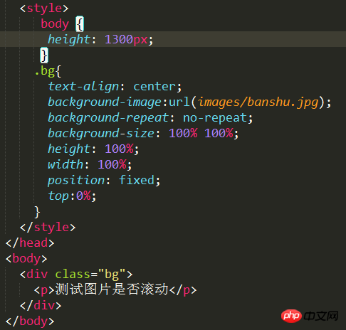
使用height:100%和background-size:100%的话只是屏幕可见区域撑满,如何能够让滚动到下方区域也能够撑满?
补充一下是移动端的,并且背景图需要同时滚动,楼下的cover方法试过还是不行
ringa_lee2017-04-17 11:36:40
Try using the css3 attribute background-size:cover, which adapts to the screen by default and will stretch the image.
Supplement: If it is a mobile version, such as: 
It has been tested and the effect can be viewed on mobile phones - link: http://yulei521.github.io/input_autofocus/background .html
PHPz2017-04-17 11:36:40
background-attachment:fixed;
Fix the background image so it doesn’t move when you scroll!
阿神2017-04-17 11:36:40
There are many ways to achieve this. In addition to the two methods above, there is also the simplest position: fixed
伊谢尔伦2017-04-17 11:36:40
This can be achieved and has been tested. However, background-size has compatibility issues and is not compatible with IE6 (7|8). You can try it specifically
   body{
        background: url(img/Koala.jpg) no-repeat;
        background-size: cover;
}阿神2017-04-17 11:36:40
body{ background:url(images/a-1.jpg) center no-repeat; background-size:cover;}