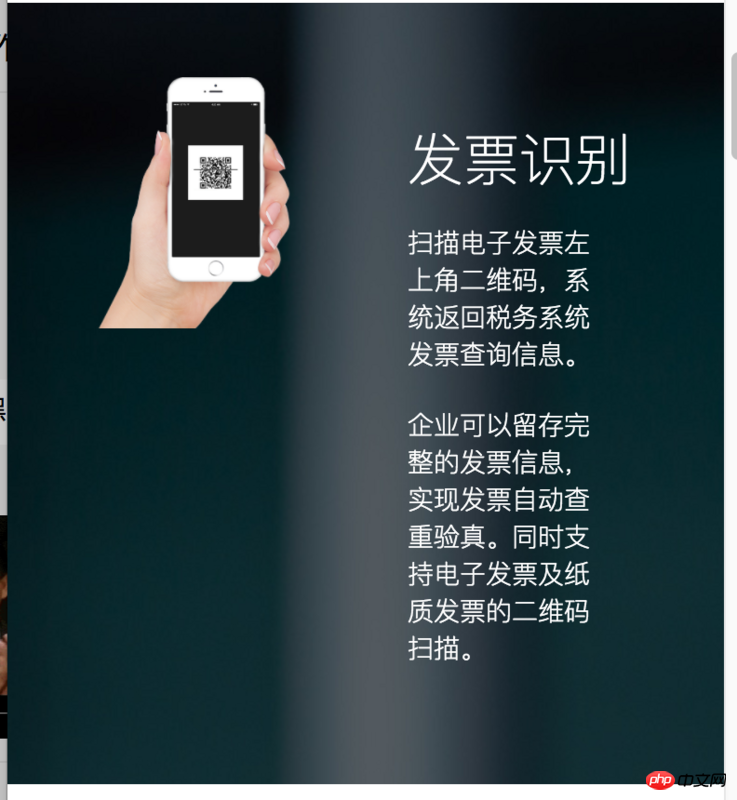
Similar to this. Now I want to make a component with a background image, but the background image cannot be 100% size. Then there must be content in the middle. The image on the left and the text on the right. How to make it responsive
phpcn_u15822017-07-06 10:39:20
background-position, used in conjunction with background-size, have you tried it
大家讲道理2017-07-06 10:39:20
You can carefully study some of Apple's pages. Some of its pages use background images and are adaptive - of course, its layout is relatively simple. Its principle is CSS3 Media Query.
I usually use 2 solutions:
12 column grid layout system (width, float, sequential response);
Media Query adaptation (use position attribute or flex layout, font size, adapted flow-saving image);
If it is component development, you can still use props to define inline parameters, and then the component will internally determine the layout style (several layouts are preset);
For background images, you can use the background-size or background-position: center center attributes to achieve adaptive display (automatic filling) of images, or you can use Media Query to specify different displays on different devices (such as: Desktop pictures are wider than tall, mobile vertical screen pictures are taller than wide) pictures (to save traffic).
I think: Try not to use the background as part of the content layout, unless the designer provides you with enough image-adaptive sizes and plans!