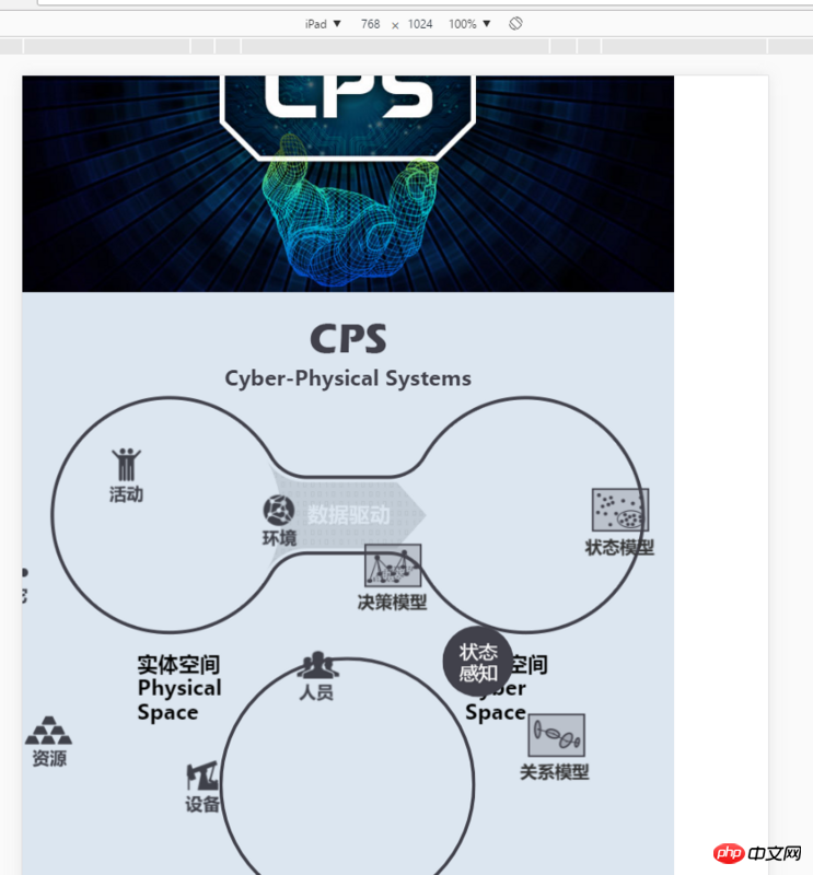
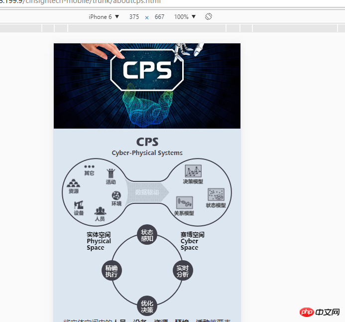
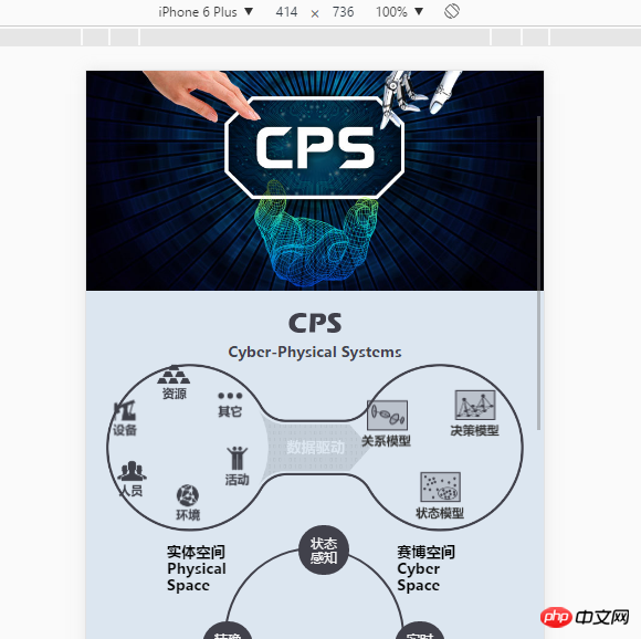
Now I am working on the company's mobile official website. I use the rem layout. The psd is 750 and is made according to the iPhone 6 standard. However, it hangs when I switch to other devices. How do I need to adjust this? Do I need to use media query? I feel like this needs to be done. Change a lot of styles


曾经蜡笔没有小新2017-07-05 10:55:23
Personal opinion: For large containers, such as the positioning of the graphic composed of your two big circles, you can use rem as the unit, but some internal details, such as resources, equipment, and personnel. . . It is best not to set these small icons in rem units, but use px to position them. Because the positioning distance set by itself is not very large, the values calculated using px and rem are actually not very different, and using px as the unit will not cause confusion depending on the device.
typecho2017-07-05 10:55:23
Because it does not belong to the square layout, if there are so many circular and irregular elements, for the sake of development efficiency, it is recommended to make pictures in several classic sizes (or those with the largest number of customers), and other resolutions can be adapted nearby.
typecho2017-07-05 10:55:23
If you don’t need to click, you can directly create a picture. If you need to click or interact, you can write it yourself
大家讲道理2017-07-05 10:55:23
The browser will vary greatly. Just watch it on your device. You can give the window a fixed width and let it stretch by itself
扔个三星炸死你2017-07-05 10:55:23
It is simply delusional to rely on one design draft to make a picture into one screen to adapt to different devices. Your 16:9 picture will definitely not be fully adaptable to 4:3 devices, and there are also various browsers mixed in. , and some messy apps such as WeChat. All you have to do is make a choice. Should you spend a lot of money to fully adapt, or should you downgrade under tolerable conditions? Generally, pages that can be easily made into one screen and adapt to most devices have relatively small content, and the background is not a complex picture.
The one like yours is obviously intercepted. You have to either create a scroll bar (actually I think this is nothing) or manually adjust the content position. There is actually no problem with using rem. The key is whether you have a fixed range. Most of my H5 is written in rem, as well as flex layout.
For example: When you calculate the position, you must calculate it based on the position on the design draft ----- If the position of your picture is left: 320px; top: 80px of the design draft (750 width); assuming font- size: 120px; position is 320/750 = 0.427rem; 80/750 = 0.107rem;
Please make sure your container width is 750px (max-width: 6.25rem) when laying out; no matter how the browser window changes to the container It has always been scaled proportionally. From now on, you only need the font-size of media html
You can take a look at the style.css and custom.css of my project #container http://lonelymoon.linux2.jiuh...