Follow the official example code
this.picChart = echarts.init(document.getElementById('myPie'));
        var pic_option = {
            color: ['#404040'],
            center: ['50%', '50%'],
            legendHoverLink: false,
            series: [
                {
                    type: 'pie',
                    radius: ['100%', '80%'],
                    avoidLabelOverlap: false,
                    data: [
                        {value: 0, name: ''},
                        {value: 1, name: ''}

                    ]
                }
            ]
        };

        this.picChart.setOption(pic_option);
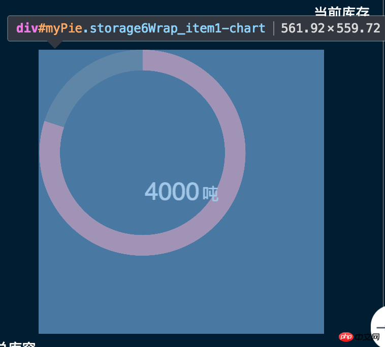
But the position of the pie chart is always not in the center of the parent container
 The second layer (the one generated by echarts itself has begun to distort)
  This is a very crooked result
The questioner found that this happens only if the type is pie, but not for bar graphs and the like. Is there something wrong with the setting? I added two pieces of code here to center it.
     $('#myPie').children().css('width', '100%');
        $('#myPie').children().css('height', '100%');
        $('#myPie').children().children().css('height', '100%');
        $('#myPie').children().children().css('width', '100%');
黄舟2017-06-29 10:11:58
The yellow area of #myPie in your picture looks like the corresponding part of margin.
The margin part is not included in the content area, so the content area of the parent element is the area on the left, excluding the yellow part.
So it is recommended that when writing CSS styles for #myPie, in addition to defining the long style, you should also define margins, as follows:
#myPie {
    width: 406px;
    height: 406px;
    margin: 0 auto;
}
No margin: 0 auto;Example (default left layout)
Add margin: 0 auto;Example (because the left and right margin is auto, so it is automatically calculated, and the distance is divided equally)
In addition, it may be due to scaling, the image size will not change according to scaling, just add the following code
window.onresize = this.pieChart.resize;