
Excuse me, there are several situations in bootstrap to set adaptive layout col-md-,col-sm-,col-lg-*,
Then my question is, although I understand what they mean, when writing class=col- and so on, do these situations need to be written? If I don’t need to write all four, then how should I choose the right one among md, sm, and lg. . .
Please give me some advice from the master.

天蓬老师2017-06-27 09:21:09
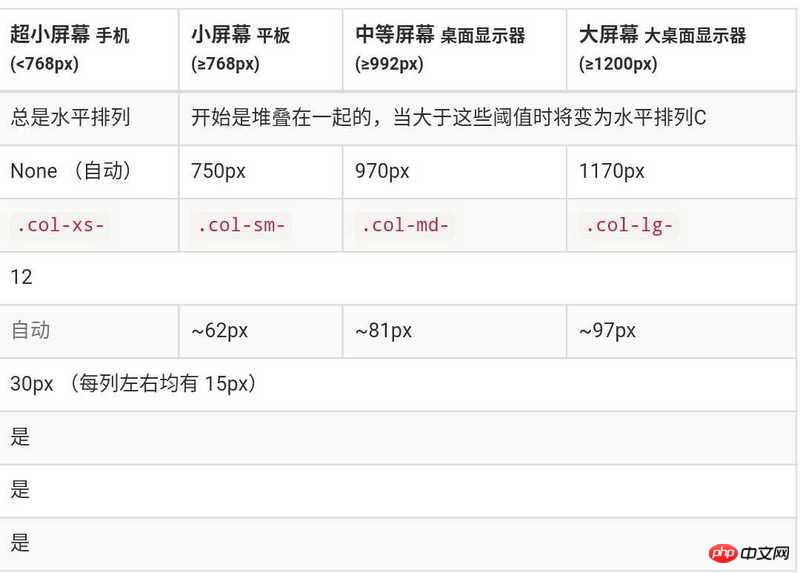
col-xs is adapted to ultra-small screens, generally refers to mobile phones; col-sm is adapted to tablets; col-md is adapted to desktop computers or notebooks; col-lg is adapted to high-resolution screens Desktop, laptop or widescreen, but generally not used.
Also note that it is not necessary to write in full, col-xs-6, which means that in small-screen mobile phones or devices larger than small-screen mobile phones, it only accounts for half, so there is no need to write additional col-sm -6, col-md-6 and col-lg-6.
The large column layout will override the small column layout settings in corresponding cases. The small column layout is the default value of the large column layout.
For example, col-xs-6 col-md-12 means that it occupies half of the columns on mobile phones and tablets, and occupies 12 columns on computers (whether ordinary or high-resolution screens).