
When I was learning vue.js, I encountered such a strange phenomenon
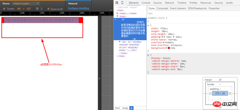
When I set width:375px padding: 0 22px 0 12px
It is displayed as follows

You can see that there is a blank space on the left and no
Console display

Complete css
  .bulletin-wrapper
        width: 375px
        height: 28px
        line-height: 28px
        padding: 0 22px 0 12px
        white-space: nowrap
        overflow: hidden
        text-overflow: ellipsis
Why when the width is set to 375px (iPhone6), the padding on the left can be displayed, but not on the right. Isn't it already set to full width? , in fact, the same is true when padding is changed to margin

伊谢尔伦2017-06-26 10:58:30

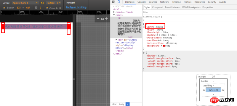
The first screenshot is a screenshot of an iPhone 6, and the second screenshot is a screenshot after increasing the width. As can be seen from Figure 2, the padding settings on both sides are correct, but the width of the parent element of the p element is less than 12px+ 375px+22px, so the padding and ellipses at the back are just invisible.
p element is a block element and will be filled with the parent element by default, so if there are no special needs, can your width: 375px; be deleted? The screenshot after removing the width attribute is as follows.

大家讲道理2017-06-26 10:58:30
The width of iPhone6 is 375. If you look at the picture of your box, the content width is 375. Plus padding, it must exceed the screen width. Of course, you can only see the padding on the left.
After setting box-sizing: border-box, width The set width will be the width of the content + the width of the padding

学习ing2017-06-26 10:58:30
In your case, there must be a horizontal scroll bar. You can try dragging it left and right and you will know. If the screen is 375, you set the width to 375 and padding: 0 22px 0 12px, but the actual width is 409. You add the box-sizing:border-box; css attribute. After adding it, the width includes padding and border, which is normal. For example, the width setting is 375, padding: 0 22px 0 12px. In fact, the width is 341 (375-22-12);
PS: I don’t understand something. Is the above style calculated by compilation, or was it written by you? If you wrote it, do you only adapt to the screen size of 375 for mobile websites?
