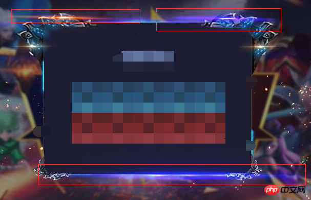
In the project, I was asked to draw the strip of light in the red box as shown in the figure. I tried some methods but couldn't fully realize it, especially the tail parts at both ends. Of course, I also know that converting img to css is the fastest, but The converted code was so large that it was rejected. So I am very curious, is there really a CSS or canvas method to achieve it?
大家讲道理2017-06-15 09:25:32
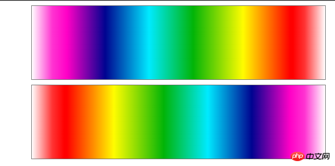
You can also use css gradients
<p class="toLeft"></p>
<p class="toRight"></p>
p {
width: 600px;
height: 150px;
border: 1px solid #666;
line-height: 150px;
text-align: center;
font-weight: 900;
font-size: 30px;
color: #fff;
margin: 10px auto;
}
.toLeft {
background-image:-webkit-linear-gradient(
to left,
rgba(255,0,0,0) 0%,
rgba(255,0,0,0.8) 7%,
rgba(255,0,0,1) 11%,
rgba(255,0,0,1) 12%,
rgba(255,252,0,1) 28%,
rgba(1,180,7,1) 45%,
rgba(0,234,255,1) 60%,
rgba(0,3,144,1) 75%,
rgba(255,0,198,1) 88%,
rgba(255,0,198,0.8) 93%,
rgba(255,0,198,0) 100%);
background-image:linear-gradient(
to left,
rgba(255,0,0,0) 0%,
rgba(255,0,0,0.8) 7%,
rgba(255,0,0,1) 11%,
rgba(255,0,0,1) 12%,
rgba(255,252,0,1) 28%,
rgba(1,180,7,1) 45%,
rgba(0,234,255,1) 60%,
rgba(0,3,144,1) 75%,
rgba(255,0,198,1) 88%,
rgba(255,0,198,0.8) 93%,
rgba(255,0,198,0) 100%);
}
.toRight {
background-image:-webkit-linear-gradient(
to right,
rgba(255,0,0,0) 0%,
rgba(255,0,0,0.8) 7%,
rgba(255,0,0,1) 11%,
rgba(255,0,0,1) 12%,
rgba(255,252,0,1) 28%,
rgba(1,180,7,1) 45%,
rgba(0,234,255,1) 60%,
rgba(0,3,144,1) 75%,
rgba(255,0,198,1) 88%,
rgba(255,0,198,0.8) 93%,
rgba(255,0,198,0) 100%);
background-image: linear-gradient(
to right,
rgba(255,0,0,0) 0%,
rgba(255,0,0,0.8) 7%,
rgba(255,0,0,1) 11%,
rgba(255,0,0,1) 12%,
rgba(255,252,0,1) 28%,
rgba(1,180,7,1) 45%,
rgba(0,234,255,1) 60%,
rgba(0,3,144,1) 75%,
rgba(255,0,198,1) 88%,
rgba(255,0,198,0.8) 93%,
rgba(255,0,198,0) 100%);
}
It is recommended that you read: ww.w3cplus.com/css3/new-css3-linear-gradient.html