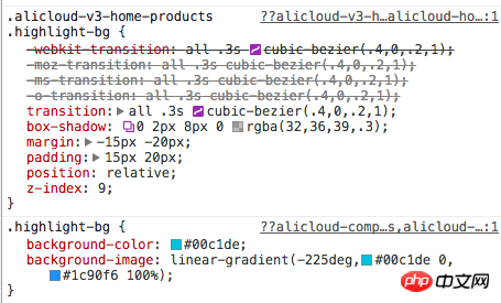
The following is a link to the Alibaba Cloud website. How is the switching effect of a quick place in it achieved? I can’t see it in the css: 
Website link address
扔个三星炸死你2017-06-12 09:34:10
 After hovering, add a highlight-bg class. The transition effect (transition) is defined in the CSS corresponding to this class. The transition effect only transitions margin and padding. margin:-15px -20px; padding:15px 20px, one positive and one negative, the effect is that the overall area becomes larger, but the content area remains unchanged, so we see the enlargement effect. But the actual situation is that not only is it enlarged, but the entire content is also moved up. After a quick look, the reason for the move up is that while adding the highlight-bg class, the upper and lower half of the content are processed. , the processing of the upper half area is: lower the height, and reduce the padding-top of the icon, so the overall feeling has been moved up
ringa_lee2017-06-12 09:34:10
Look for .navbar-fixed-dropdown-menu .tab-menu in the style, you should be able to find what you need
过去多啦不再A梦2017-06-12 09:34:10
I didn’t find this page, but there is a very simple way to implement it: For example, here are 4 pictures. The "heights" are actually the same, but the tops of the 1st, 3rd, and 4th pictures have the same color as the background, so visually they are the same. Think they are a bit shorter than the second one.
Of course, I just used pictures as an example.